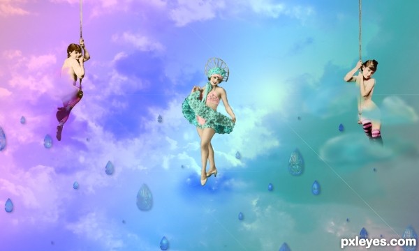
many thanks to inspyretash-stock at deviantart.com for the lovely vintage ladies that inspired this chop. Background sky image is my own. and thanks to lavica-photoshop for the diamond brushes.
(5 years and 3724 days ago)
![vintage [updated]](http://www.pxleyes.com/images/contests/green pattern/fullsize/green pattern_4bd03849e1a99.jpg)
thanks to withmycamera and gojol23 from deviantART for the brushes used (5 years and 3746 days ago)
excellent
Superb...Its totally brilliant....Simply beautiful....
yup it is.. its very beautiful.. good luck.. 
good work...best of luck
very nice job good luck
Nice bird there in the middle ! 
Hey, author... You shouldn't feel bad for being last if you do. I saw your entries... You shouldn't just upload any picture, just to be placed in a contest and hope to be one of the first 7. I was just like that, but I learned not to upload something just for it to be there... Look at all of these comments; excellent; superb; brilliant; beautiful; good work; very nice job...
Howdie stranger!
If you want to rate this picture or participate in this contest, just:
LOGIN HERE or REGISTER FOR FREE

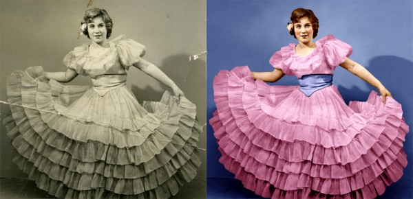
This photo of my mother was taken in 1954. This is the most difficult thing i ever did in photoshop. Don't know wich background works best green or blue?? Hope you like it :-) (5 years and 3848 days ago)
Very very good indeed! =) The hair could do some tweaking, but the resti is good! =)
Excellent work! Wow..!!
I tried fixing the hair, but i keep on messing it up. I will give it another try. Thx for comments
 ..........this is wonderful....the skin tones, and the colors in the dress are remarkable.......someone in this contest said they did this work professionally, this is way above the entry they have submitted.........keep up the good work.
Great theatrical makeup!
Fixed hair, changed color of flower and used a little color in the eyes. Thx for advice. Always welcome
xcellent wrk.....................................gl
Also has have a tip for you. Cutting or masking the selection should be based on the sharpness of the image. By this I mean how sharp or how much in focus the image is. For example if you blow up an image to 200-300% and see how far the pixels merge or overlap between to objects. It may be in a high resolution image this is only 1 pixel but in a lower resolution or scan of an old photograph with large grain, it may be 3 or 4. It is this “focus†that your image selection should be based on.
good advice, but you didn't do this in your coat rebuild......there are large differences there...
Phew! PhotoRepair, I don't think i understand what you mean :-b. Is there a problem with the image? Please let me know 
Is it a problem that i cut out everything with the pen tool, and that the edges look too sharp...?
author, stick with your instincts, this is a great job, don't be put off by comments.
You did a great job. I did see that you cut out part of her neck. If you zoom in on the neck you can see the collar bone line is missing from your final image.
yes, I see this, I missed it first time. You have mistaken shadow for body line!!...in the original, it is not easy to see, so i think you could be excused..........
Yess i can see it now, i'll try to fix it if i still got time, thanks anyway 
Thanks adeincyprus & dmspaulding07, fixed it. Boy that was a nasty gap  I was going to print it on a large canvas. Glad i could fix it first.
Well done! One of the best I've seen. You got the colors perfect! Good luck to you! 
FYI: If your concerned about comments and who you should take advice from, I'd stick with someone who well.. has a higher level, since they probably know what they are talking about. All opinions can be good but when it comes down to it, only yours really matters  2nd opinions are good too.
My opinion? This is a winner 
Agreed!!....this is a great piece of work...........the very best of luck to you.
Perfectly restored! 
This is awesome work!
nice one
I thinks that this is awsome , color are used in maximum..
great job 
Congrats on your placement. 
Congrats for your second place, Clinge!
Congrats,
Thx for nice comments to all 
congratulation =)
Congrats!
Wow, really well done, you know there are people that do this for a living = )
Howdie stranger!
If you want to rate this picture or participate in this contest, just:
LOGIN HERE or REGISTER FOR FREE

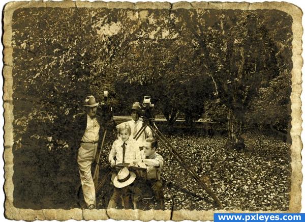
Only vector masks, filters, adjustments and layer masks.
(5 years and 3900 days ago)
nice mood the shirt lady wearing is more bright when compared with other
Oh, but this is from the original image, I didn't edit her shirt
Good image, but tripod leg wouldn't have that shadow...
the shadow on the tripod leg, and the shadow on the trees don't match......
Fabulous!
Nice aging effect. Well done.
shadow conflick has been highlighted, love your final image.
I would fix the shadow, but I'm in holidays until monday and I can't access my psd file  for the time being, just imagine there is an artificial light source in front of the actors
  .
.
Very effective! 
very nice 
Congratulations for 1st
congrats on your first place..
Congrats for your first place, Feodora!
congrats! for 1st place.
Congrats, beautiful work 
congrats on your first place
Howdie stranger!
If you want to rate this picture or participate in this contest, just:
LOGIN HERE or REGISTER FOR FREE

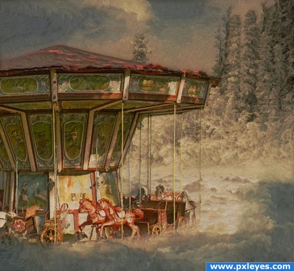
credit to luizsilvei from sxc for the base clouds.
Used a plugin called paint engine for this. It is a freebie, please see links for download site..... (5 years and 3986 days ago)
Looks GREAT!!
looks like an old xmas card... good luck author
Nice blend! Like the overall feel of this. Would like to see an SBS, though...
very nice!
man gota hand it to you i like this allot it feels authentic gj
lovely image. no more to be said
author great work. i like the finish you have chosen for creation. lovely chop
Bravo! Wonderful!
cool! has a grungey effect
don't know why, but this reminds me of my early childhood.. great work!
Great job, light on the merry looks amazing this way
Howdie stranger!
If you want to rate this picture or participate in this contest, just:
LOGIN HERE or REGISTER FOR FREE
You may want to whiten the cloud on the third girl so it doesn't look like an eraser mark... just a thought.. very cute Idea and image
i really didn't want to shock or offend with any sort of nudity, so i had to be careful about how much i let show through the clouds. She was faced in a direction that showed her lower regions, and i found this to be a little more tasteful way of covering that up.

Thank you for your comments. I took it back and did a guassion blur to that layer and it seems to have helped lighten them up without exposing too much.
whiten.. not lighten.. hehehe.. but your vision is fine!!! (the blue cloud covering her naughty bits looks more like eraser marks) but that is IMHO!! good luck author
:lol: right right. whiten. got it. Thank you again. i whitened them a bit. seems to give more depth to the piece. always appreciate your comments!
I like the colorizing of your vintage pics. (BTW are your sources mislabeled?) Your SBS doesn't explain what the white lines are all about. Why are the diamonds only in the lower half of the image? It seems a little odd that the side girls are obviously hanging from something but the middle girl appears to be standing on something in the middle of space. [Better choice IMO: a girl on a swing.] Diamonds floating in the sky have nothing to cast a shadow on, so your drop shadows merely make it look like they're hovering just in front of a picture of clouds. The fuzzy near clouds over the naughty bits seem out of place with the in-focus near girls and far clouds. (And shouldn't your title say "Sky" singular?)
Good work.
haha. sources ARE mislabeled. i will get that fixed up when i upload the next yet again revised edition. :-P thank you for your comments and critiques. you've given me some things to work on, Dan.
Just a few answers to some of your critiques though... first off.. lucy takes center stage, and since this is all fantasy, she can be standing on a cloud. after all. this is Lucy in the sky with diamonds. nothing can be what it appears. The diamonds...well, they are supposed to be "rain" which is why i chose the shape that i did. the white lines are lens flares. i explained that in the last step.
I really like this one.. the softness is awesome....and I agree with the author on this is "Lucy in the sky with diamonds. nothing can be what it appears" I feel the lady in the middle is perfect...
cooool
Great job.....love the colors and have to love those vintage ladies.......GL
nice......... all the best..........
Howdie stranger!
If you want to rate this picture or participate in this contest, just:
LOGIN HERE or REGISTER FOR FREE