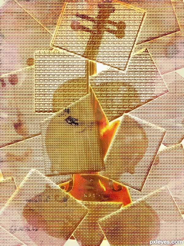
behind the bamboo blind (5 years and 3550 days ago)
- 1: source1
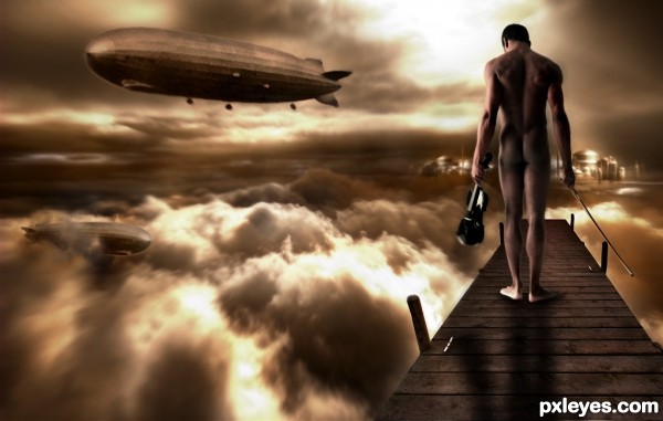
Thanks to ''mjranum" for source 4
Thanks to ''artist-3d.com" for source 5 (5 years and 3600 days ago)
Good color. Light on figure is from upper left, so shadow should be adjusted accordingly.
Great colors author and fantastic mood...I agree about the shadow,light coming form the left so body have to cast shadow to the right...He is standing in medium dark part so,u have to make his feet darker...Best of luck
beautiful entry ..........but i agree with erathion and cmyk ......... the shadows need some work .............. all the best to u.............. 
Howdie stranger!
If you want to rate this picture or participate in this contest, just:
LOGIN HERE or REGISTER FOR FREE
(5 years and 3653 days ago)
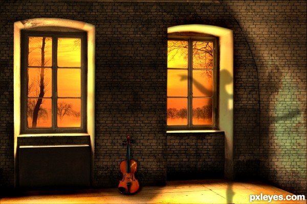
Idea is fine... But I feel the brick style is not merging with the back ground. It's looking so flat. You should look the your right side wall. I think there should be some perspective according to that wall. But rest of that your color combination & idea are just cool man...
Awesome! 
As debdyutsarker noted, the brick is lacking appropriate perspective. At a minimum, you should skew each wall so that the horizontal mortar lines are parallel to the edge where the wall meets its side of the floor. (That will also fill in the missing brick course along the top edge of your image above the right-hand window.) Ideally, a bit of perspective tapering would also be needed. What is the source for the brick? [BTW I think a title that provided some hint as to why there's a shadow ballerina could make this more compelling.]
nice mood and colors! gl
like it
Congrats for your second place, Lolu!
Congrats for 2nd
Congrats!
congrats........
Congrats!!
Congrats!
Howdie stranger!
If you want to rate this picture or participate in this contest, just:
LOGIN HERE or REGISTER FOR FREE
(5 years and 3821 days ago)
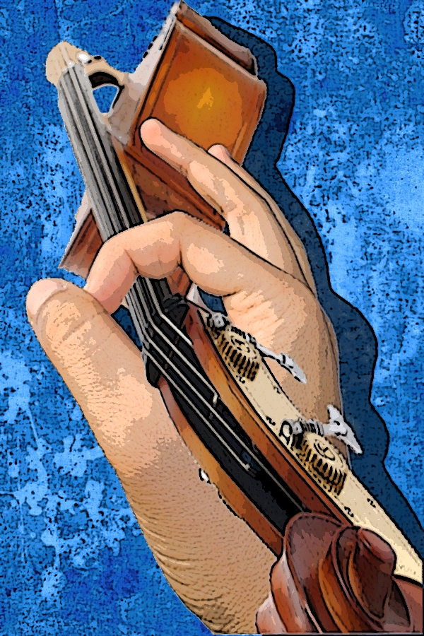
What original use of source!
With some cleanup, step 5 would be much better...
I agree, the edges need some work. I do like the idea but something just bothers me that there is no grip on the violin, why is it staying floating? 
nice
nice job 
Howdie stranger!
If you want to rate this picture or participate in this contest, just:
LOGIN HERE or REGISTER FOR FREE
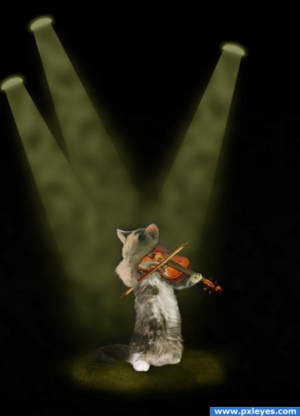
I have used three sources for the cat, and one for the violin. The lights I have drawn by 1) draw a rectangle, 2) use gaussian blur (with gradient mask), and 3) distort. I have also rendered clouds, and added a structure for the floor.
Hope you like it! (5 years and 3832 days ago)
Is it mee...or does that shadow below the cat's left ear looks like an eye of a mouse...Regardless, good job
Ahhh so cute! Nice work.
cute
Not crazy about the render clouds in the light beams (could be way more subtle) , but everything else is fine...good luck!
Wonderful!
That shadow appears to look like the head of a spotted mouse or hampster. LOL. Good Job!
LOL
great 
Howdie stranger!
If you want to rate this picture or participate in this contest, just:
LOGIN HERE or REGISTER FOR FREE
cool
Howdie stranger!
If you want to rate this picture or participate in this contest, just:
LOGIN HERE or REGISTER FOR FREE