
...to play with pearls.
I asked my children what to put in the hourglass and pearls was one of the suggestions. :)
I made the background myself. (5 years and 3698 days ago)
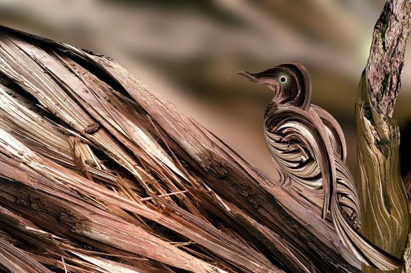
Source used.
(5 years and 3721 days ago)
great work.
wonderful!
Sweet bird, great resul!
this is an awesome bird... good luck.! go on...
the bird is exclusive..very nice modulation of the given source..cheers!!!
very nice work...gl
good use of source!
Congratulations for 2nd
Congrats for your second place, Lahiripartha!
Congratulations! great work!!!!!!!!!!!
Howdie stranger!
If you want to rate this picture or participate in this contest, just:
LOGIN HERE or REGISTER FOR FREE
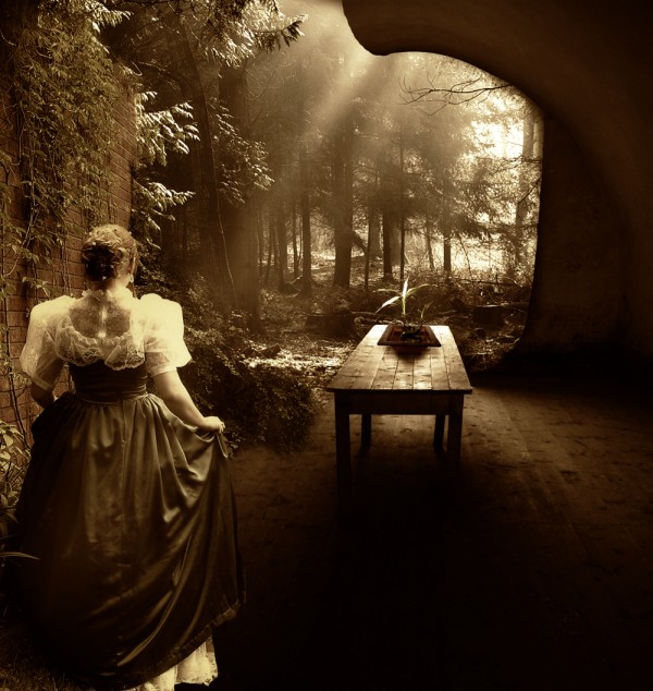
Thanks to angel1592stock.deviantart.com and http://eirian-stock.deviantart.com (5 years and 3748 days ago)
Nice ligthing, and a great blend of different sources, i would try to add a blue overlay with a low opacity to help contrast the harsh browns and oranges. Otherwise, great job!
now that's amazing and creative, definately a work i can learn from, thumbs up
Thanks ponti, have made changes. 
Agree with ponti... Good work on light and shadows and blending 
I like step 6...just personal opinion.
Well done
Congrats for second place.....
Congrats,
Congratulations! 
Congratulations!
congrats
Congrats for your second place and a Happy New Year, Nasir!
COngratulations on the top-three, Nasir! Great entry 
congrats 
Howdie stranger!
If you want to rate this picture or participate in this contest, just:
LOGIN HERE or REGISTER FOR FREE
(5 years and 3768 days ago)
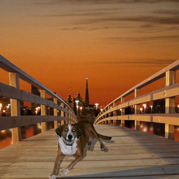
Change the shadow...light source is from left. Foreground edges of railings are cut off...
top of the handrail abruptly ends too. great concept
Hey thanks CMYK46 you say shadow is wrong? I thought if shadow was reflected on left from rail that it would be same on dog? no?and thanks forgot the rails let me know on shadow
Don't you see the cast shadows from the railing at left??? Where is the wood lightest? On the LEFT side...shadows are on the RIGHT side...the light source is on the LEFT for cryin' out loud.
Yea I had them like this but thought I was wrong because even with a sunset the railing shadow was coming down on left my wife was saying shadows were always on same side so I wasn't sure hope this is better again Thanks
Yeah, i agree with CMYK46 there... The shadow is definitely wrong
numbsock are you saying shadow is still wrong?
nice idea but i thinnk you need to work on the shadow of the dog.. instead of useing the drop shadow. make a duplicate copy of the dog layer select the 1st layer by pressing ctrl+click then go to select modify and feather and fill with black ctrl+D to deselect and then work on that layer as your shadow .. its one of the main ways i do it . g/l
I'm just wondering why you picked a background that's so gritty and pixelated? Even in low res you can tell.
nice sentiment work author.
Howdie stranger!
If you want to rate this picture or participate in this contest, just:
LOGIN HERE or REGISTER FOR FREE
(5 years and 3768 days ago)
well done author... i dont even know how to start making an image like this without actual pre made images lol 
Very dood.
 i meant 'good', next time i shall wear me glasses
@ Clinge: You could edit your comments ;P anyways. nice pic. I don't see how u , ya , make it 
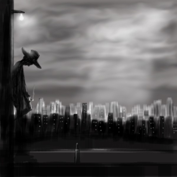
Great mood.. i love the sky.
Niiice
Really nice -- reminds me of Lucky Luke.
Pretty cool.
nice image!
nice
congrats on your placement. all were winners in this comp..
Howdie stranger!
If you want to rate this picture or participate in this contest, just:
LOGIN HERE or REGISTER FOR FREE
what is it....
Nice work making the beads look like they're falling, but there would be a dual shadow...one for the beads, as you have, and another lighter shadow for the glass.
CMYK: I will fix that tomorrow, it´s a good observation. Tnx
youri: It´s art...
oooohhh oke
 !! thanks for saying..:P
srry
nice!
Good work...nice shadows and overall effect....
Howdie stranger!
If you want to rate this picture or participate in this contest, just:
LOGIN HERE or REGISTER FOR FREE