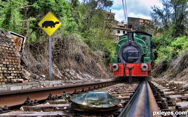
(5 years and 3064 days ago)
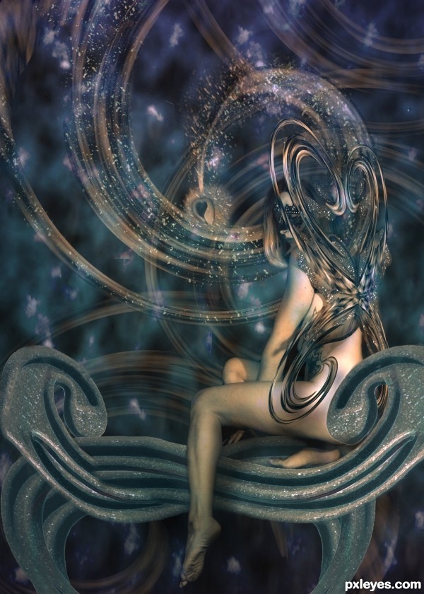
Used my own stock and source image provided by pxleyes. The SBS describes the basic steps but not every detail. There was a lot of trial and error.
UPDATE: fixed the wings, hope they loop better. Tried to smooth bench and changed splats around heart to a more astral natural look. I didn't like the way the previous one looked in high res. (5 years and 3064 days ago)
this entry needs more votes
Very nice choice of images and great work on getting them into this -- one small thing is that the edges of the "Seat" need some touch up they are a bit ragged and still show some trace of the original background -- maybe some blur or soft brush on the mask would smooth it out.
Thanks for the suggestions. I'm working on fixes for it right now. I did some changes to the middle splatter section and am unsure which is better.I didn't care much for the splatter in high res so I changed it to light-like specks but it might be too busy now. Decisions,
decisions...
The things seem out of perspective, they're placed as if the model had her back to us when she gives one side. Otherwise very good abstract concept.
My fav!..
Great work, only point I'd make is, I would have (if had had been able to create the rest of the image) soften the skin, especially on the legs as they look far to real in this lovely fantasy image.
Thanks for all the faves everyone!!! Its always nice when hard work is recognized 
Congrats!!
Nice Congrats
Howdie stranger!
If you want to rate this picture or participate in this contest, just:
LOGIN HERE or REGISTER FOR FREE
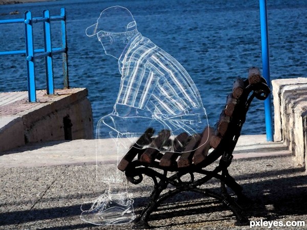
(5 years and 3104 days ago)
its perfect..
Thank you...zendeginameh...
A very good entry ! Well done !
waiting to get more opacity ............ great entry
Thankyou harvester & designed....
I think if you added a bit of a blur to the super straight lines (visible in high res) might help a bit.. but that's just IMHO.. overall a very good job! GOOD LUCK
Very good idea and execution, good fix on the seat beneath him.
I love the effect!!
this is a fav!..
great effect!
nice entry, well executed 
Great Work with white...good...
congrats
Congrats on your 2nd place...
Howdie stranger!
If you want to rate this picture or participate in this contest, just:
LOGIN HERE or REGISTER FOR FREE
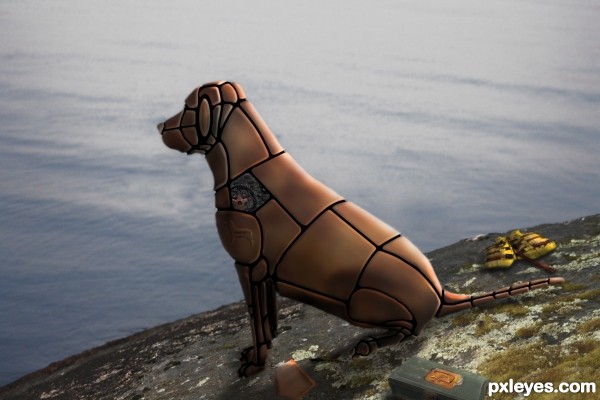
he had been working on Rex most of the day and decided to go fishing...that was 3 weeks ago...
base my pic of my daughter's dog "Shamus"
special thanks to Micheal O.. fantastic work (5 years and 3105 days ago)
Very nice! I'd shorten the ends of the black seams, though...they're protruding when they should be recessed. Other wise it's a great job! 
Very cool entry author.. looks just like a machine 
Very nice concept, cute back story. Good job!
Nice job, author. 
I think you did a good job putting the metal together. Hello to Shamus....!

Howdie stranger!
If you want to rate this picture or participate in this contest, just:
LOGIN HERE or REGISTER FOR FREE
transform, flip, brigntness & contrast, hue & saturation (5 years and 3107 days ago)
source is copyright author
Edit: sorry author my mistake, I was looking at the company copyright under the photo.
Nice Image but you may want to crop it to leave out the black faces on the left, best of luck
Thks for the comments Geex...i will take care of it in my future wrks..
But Geexman, this site is given in the Resource Photo stock..and no copyright is written there..
Thks for your comments Geexman...
Howdie stranger!
If you want to rate this picture or participate in this contest, just:
LOGIN HERE or REGISTER FOR FREE
I just wont say anything this time
Super cool entry...very realistic...all elements have that touch of realism so IMO the filter on train is a bit to strong, maybe to leave it in original state and u will get super cool realistic image...best of luck author
funny and colorful, very well done technically too
I don't know, somehow I get this message from the poor guy's expression:
Turtle: "Huh? What the! Now why would they place it up so high?"
:-P
Oh oh run little turtle run!!..LOL
my fav author!!! GL.
Aww, I used to have a Myrtle the turtle.... great blending, author. Perfect finds of the externals' angles.
Congrats!!
Congrats
Howdie stranger!
If you want to rate this picture or participate in this contest, just:
LOGIN HERE or REGISTER FOR FREE