(5 years and 3107 days ago)

(5 years and 3132 days ago)
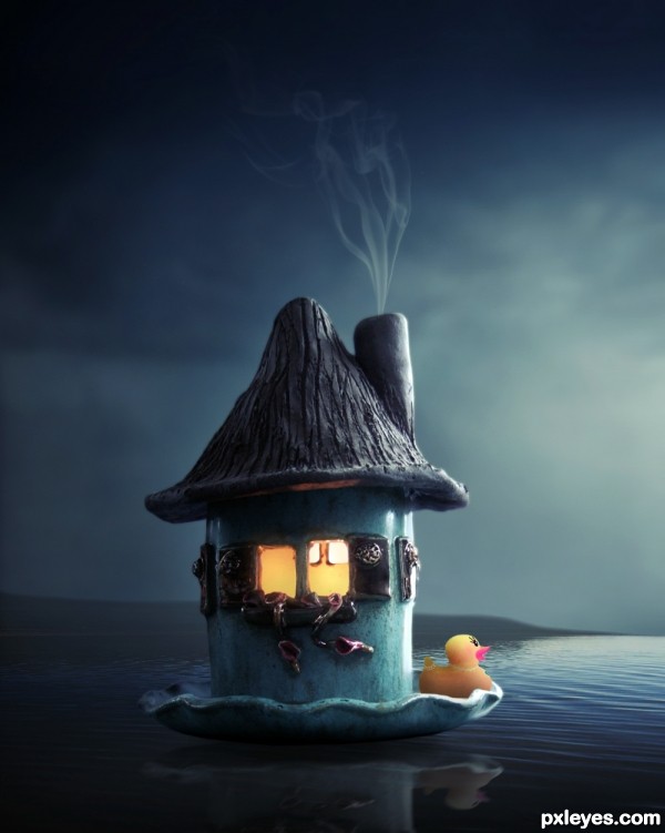
have to admit, that little candle house was a super web find.. perfect for this image GOOD LUCK
very nice...
thanks Drivenslush and Dekwid...
nice..
Wow, it's magical, and the duck colour has been desaturated to match the overall theme. I wish I'm enjoying my night on the "candle house" 
Good thaught & good mood author...
But i think increse the contrast & levals of the duck & in the background increse the black point using levels than image should be looking very attractive..
All the best author..
thanks passionboy riady and thanks mounika for suggestion..
awesome idea and execution! 
thanks Amanda...
Nice mood, I like it.
thanks Mikael..
Great image author...interesting mood and very very nice details...best of luck
thanks Nebojsa
Great 
Beautiful image again author..... good luck!
Very Nice!!
I like it.Nice mood
Amazing work author!!!!!
Congrats, well done 
Congrats my friend.... beautiful entry.
Congrats!!
CONGRATS!!!
Congarts... 
thanks a lot my friends Cornelia, George, Mina, Kathy, Carla, Megan, Spaceranger, Drivenslush and Mounika...
Congrats !
congrats kush..
This would make the coolest iPad wallpaper ! A belated well done - its great.
Howdie stranger!
If you want to rate this picture or participate in this contest, just:
LOGIN HERE or REGISTER FOR FREE

(5 years and 3170 days ago)
Howdie stranger!
If you want to rate this picture or participate in this contest, just:
LOGIN HERE or REGISTER FOR FREE

come back soon.....
thanks and credits to
Krzysztof Czerwinski(cgtextures.com),Lisajen-stock (deviantart) and Fairiegoodmother(deviantart) (5 years and 3185 days ago)
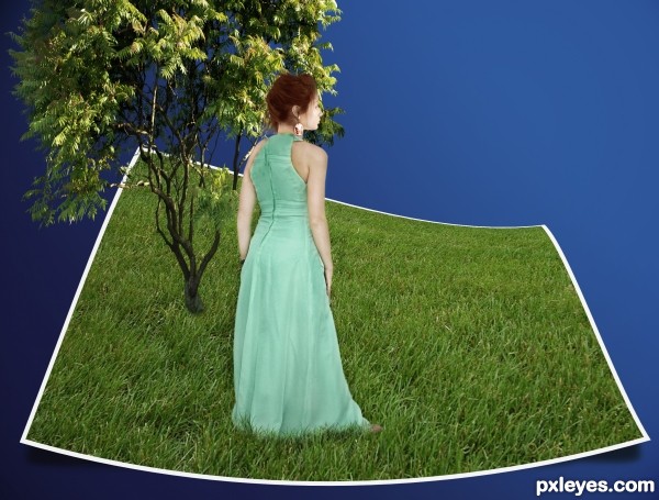
The lighting on the face is inconsistent with the background you are using. You might try selecting the face, and going to Image>Adjustments>Selective Color>Whites, and try bringing down the white tones in the face to better match the rest of the head and neck...
thanks and corrected it.
The face still is noticeably lighter, with the sun shining DOWN from behind her.
Her hair and shoulders show NO lighting on them at all, while you have a VERY strong shadow coming off of the bottom of her dress, although the dress shows no corresponding shading away from the sun light source.
I'm sorry, but whatever corrections you've made have not helped the inconsistencies between the contest source, the woman's body and dress, and the background you've selected...In competitions like this, such inconsistencies will probably have a negative effect on your score.
Nice idea with thinking outside the box with the source, author!
Nice concept author, GL!
Howdie stranger!
If you want to rate this picture or participate in this contest, just:
LOGIN HERE or REGISTER FOR FREE

I made ​​some changes, hope you like (5 years and 3249 days ago)
I like this image 
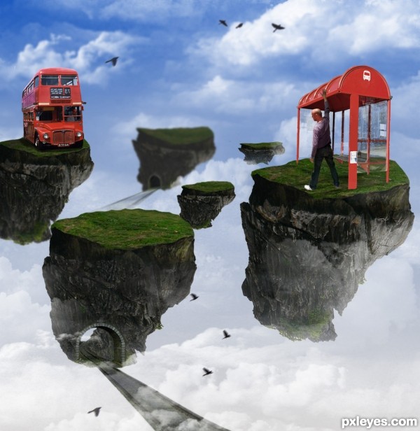
Love the concept, but your SBS doesn't show how you assembled the elements, and the islands are all basically the same. Try to introduce a little variety.
you're right, I tried to differentiate a bit, by the way I add some more details as the tunnel, birds ... thanks for your comments
I like that with the islands you're also telling a story. Good job!
thanks, tried to be a bit unusual in a subject as seen, and there are many castles, lol
Howdie stranger!
If you want to rate this picture or participate in this contest, just:
LOGIN HERE or REGISTER FOR FREE
natural... lacks 'wow' factor too
nice placement, a little work needed on the bright sunlight that only seems to be hitting the man and nothing else. Best Of Luck
Well blended, just the light needs to be adjusted in the man, good luck!
Howdie stranger!
If you want to rate this picture or participate in this contest, just:
LOGIN HERE or REGISTER FOR FREE