(5 years and 3259 days ago)
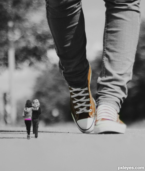
Photo of my daughter and bff taking a stroll in the park.. (5 years and 3362 days ago)
They look like they are floating, they need a shadow similar to the giant.
The idea is a good one, but the depth of field is too shallow on the background image to make a convincing blend.
Edited the image, @solkee and @ponti55 tried to solve the problem with the shadow and depth by adding a solid color adjustment layer and used the clone stamp to create a similar shadow. Thank you very much for you comments!
Oh and almost forgot.. There was a greenish color on the shoe laces, got rid of that too 
Nice I like this = )
Nice! GL!
Fantastic feel on this work...love the color selection and mood is simply amazing...instant fav from me...well done author
Thanx so much for the nice comments! That puts a smile on my face 
Howdie stranger!
If you want to rate this picture or participate in this contest, just:
LOGIN HERE or REGISTER FOR FREE
(5 years and 3439 days ago)
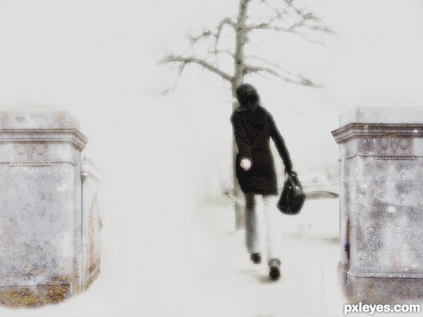
A bit too high contrast. It's almost too bright to look at...Generally you only want to use "bright white" (with no toning or shading) very sparingly as highlight accents. Also, the columns look crooked, throwing the angle of the image off.
Thanks for the input i have tried to correct the angle of the columns and take on broad about the high contrast. I have updated the image so you can now at least look at it without your eyes hurting! 
Nice mood. 
Unusual image ... I like it; I would like to see it printed as I think it might have more impact than on the screen. Sometimes the "light" can detract from softer, less contrasty images.
IMO 
Arca thanks for the comment. Printed on a canvas i think would look good. Would need more work though as only had a laptop and mouse pad to do this whole image.
Howdie stranger!
If you want to rate this picture or participate in this contest, just:
LOGIN HERE or REGISTER FOR FREE
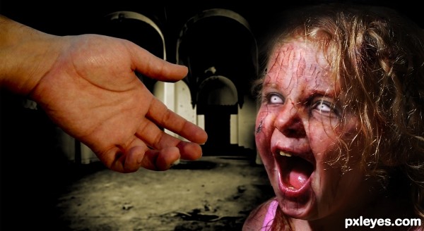
Thanks to Felly1000, Pepo, Jascha400d,
Roppa uk & Dafeba for the very nice stock images ;-) (5 years and 3486 days ago)
Has a nice childre of the corn and pet cemetary feel! dont like the pretty pretty chops!
this is very scary thing...great job author
Thx erathion, woodztockr, please, what do you mean with 'don't like the chops?? 
Author I meant I like your spooky scary photoshop (chop) and not really the others that make zombies like pretty... g/l
Ok woodztockr, i understand  THX
THX
That spooked me! Convincing (as convincing as dead walking could be) Really nicely done.
Thx Sunzet 
Her colour is very healthy for someone who's dead. Just my opinion...
Howdie stranger!
If you want to rate this picture or participate in this contest, just:
LOGIN HERE or REGISTER FOR FREE

source (5 years and 3487 days ago)
very imaginative idea very well done == like the face
Great idea.
I think the pattern in the face kinda makes the nose and the mouth unnoticeable.
very eye catchy entry well done!!!!!!!!!
Lovely and creative idea!
Well done!
GL 
So cute... The eyes are very tender! 
WOWOWOWOWOOWOWOWOOWOWOWOOWOOOOOOOOOOOOOOOOOOOOOOOOOOOOOOOOOOOOOOOOOOOOOOOW 
Great work...this creature is so so cute,i love it...colors are great and u make some cool shapes here...well done author...
Howdie stranger!
If you want to rate this picture or participate in this contest, just:
LOGIN HERE or REGISTER FOR FREE
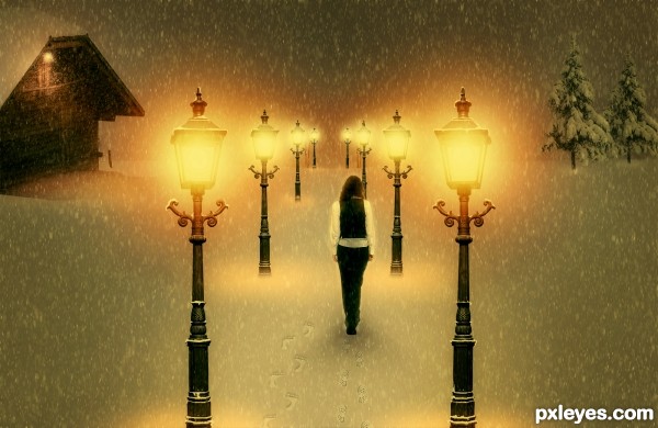
Very cool work author...IMHO she is a bit big compared with the rest of the image...also perspective of the laps is for few degrees wrong...try to fix that and this will be great...by the way great touch with adding foot steps in the snow...best of luck
She's way too big, and the perspective on the tops of the lamps is wrong. Good idea & mood, though.
Also, symmetry doesn't help this image, two identical buildings is a bit weird. Find one or some tries for one of the sides.
edit: I made changes. Thanks erathion, CMYK46 and greymnal for your useful suggestions. But I don't understand how can I make my lamps perspective better...tell me
well done!
From the angle at which the lamps are shot, I don't see what you can do about the perspective issue.
You could transform the lamps just a bit , so that those in the foreground appear bigger, but Make Sure you Don't split the image with them. Splitting image = failed composition.
Also make the far distance foggy, so that you can't perceive horizon, but just image it. Check works of ponti & arca if you don't understand what i mean. I usually do it with some scatter common brush on a layer which I gaussian blur. But internet has many tutorials, try them.
Last tip: since all your elements are vertical, image might be plain - try to tilt the snowfall, a few degrees.
You're doing good, and you're also the only guy with warm mood!
Howdie stranger!
If you want to rate this picture or participate in this contest, just:
LOGIN HERE or REGISTER FOR FREE