Thanks a lot for the stocks:
Mill: http://two-ladies-stocks.deviantart.com/art/Mill-131369475?q=boost%3Apopular+in%3Aresources+mill&qo=0
Model:http://lisajen-stock.deviantart.com/gallery/#/d1h1ag5 (5 years and 3524 days ago)

(5 years and 3604 days ago)
Wonderfully magical... 
Nice.....GL
nice work ...........gud luck to u ...........
beautiful job
Howdie stranger!
If you want to rate this picture or participate in this contest, just:
LOGIN HERE or REGISTER FOR FREE

Layer mask, selection tools, clone stamp tool.I mage adjustment with hue, saturation. (5 years and 3638 days ago)
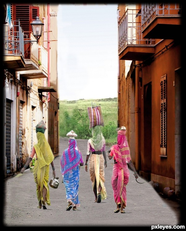
It seems like you a litte to much fade when cropping.For some reason the women seems to small comparing to the background. I would also move the woman with green scarf so she has houses as background, cause the scarf are confusing to the bushes.
Otherwise - nice idea
From a distance this looks like a good overall feel. When in full view you can tell more focus needs to be put on masking.
thanks all...will keep in mind for next.....
Hmm... there's a lot of road in front of them 'til India... from Sicily, there's a sea to swim first! 
You had to mask better the right side of the road, specially beside the orange house base. Don't forget it next time! 
Howdie stranger!
If you want to rate this picture or participate in this contest, just:
LOGIN HERE or REGISTER FOR FREE

(5 years and 3638 days ago)
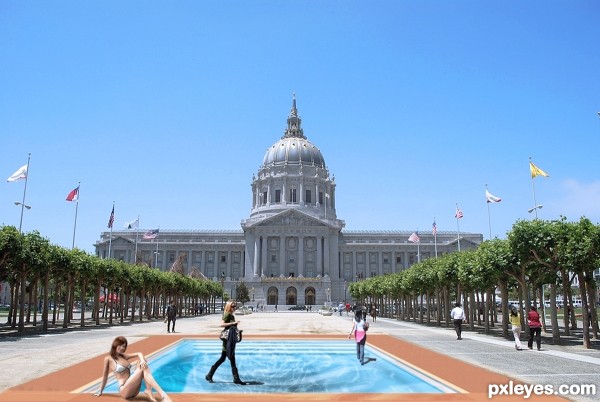
the virtual lady you added to this piece should be moved downstage so her head is inside the frame (she has no shadow so I figure she's part of the drawing) if you look where her head is, it would have to be drawn all the way up the promenade to match the perspective..) the shadow girls are just brilliant...good luck (the girl is a very nice add on.. but imagine how stretched her head would look if you were viewing from the side.. it would be a long stretched head to be viewable from the front 
(really fantastic and very well thought out)
EDIT: PERFECT (the girl looks grrrrrEEAAAATTTTTT!.. now her head is in the right realm and you can really see her now 

cool that you drew the pool, very nice work!

coooooool work . gl 
Nice Work!! It is very convincing! GL!
It's so perfect that people looks like walking on water indeed (like Jesus's done?)... 
Howdie stranger!
If you want to rate this picture or participate in this contest, just:
LOGIN HERE or REGISTER FOR FREE

(5 years and 3719 days ago)
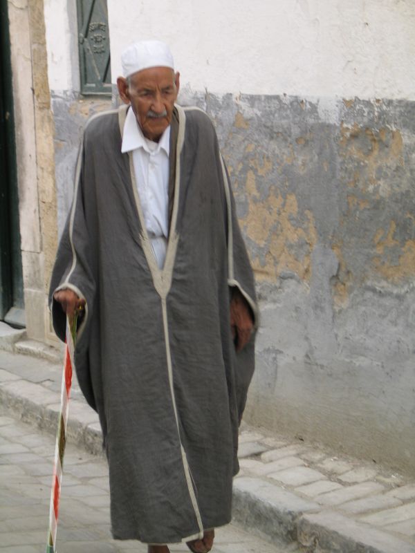
The idea is good, but your source is blurry and the stick is sharp. Besides, I think you should get rid of the white edges you left after cuting the cane out. Reducing the vibrance (or luminosity, depending on your PS version) and adding some shadows will help to give your work a natural look.
I'm sure that this man is egyptian,lol!
Agrees with Divair
Have changed luminance as suggested, haven't added shadows as there are no shadows of the stick on the original source picture.
the stick is too blurry... imo
much better!
too simple man.. and need more work to realism......more time to work too thx
Howdie stranger!
If you want to rate this picture or participate in this contest, just:
LOGIN HERE or REGISTER FOR FREE
very cool
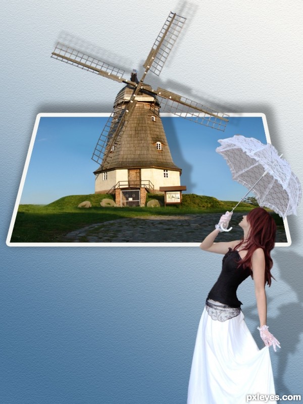
cool work author,but if u look windmill light comes from the left,so shadow should be on the right side,also it would be nice touch if u add some rain image to fall on the girl's umbrella...any how,i like this image because is nice clean chop...best of luck
VERY NICE ! G L
Actually the light is coming from the right, not the left. Unless you mirrored the image since erathion commented.
congratulations... It's one great job !!!
good one,and good luck
Your shadows are on the opposite side of the shadows on windmill; unfortunately you don't have time to fix them... But it's a nice work!
Howdie stranger!
If you want to rate this picture or participate in this contest, just:
LOGIN HERE or REGISTER FOR FREE