(5 years and 3766 days ago)
(5 years and 3796 days ago)
Sweet image!
Really nice use of source image!
This is really pleasing! Nice!
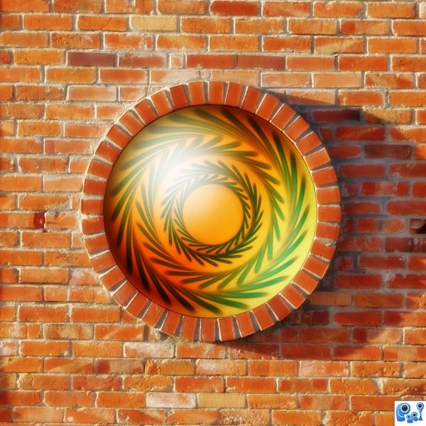
Big glass button on the wall! Great idea 

I'm sorry, other than the circular bricked window being round like the source, I don't see the source. SBS and high res would have been nice.
Howdie stranger!
If you want to rate this picture or participate in this contest, just:
LOGIN HERE or REGISTER FOR FREE
not very good at reporting.. I do try though (5 years and 3831 days ago)
good, something different, i like the fact it's against the wall! Good luck 
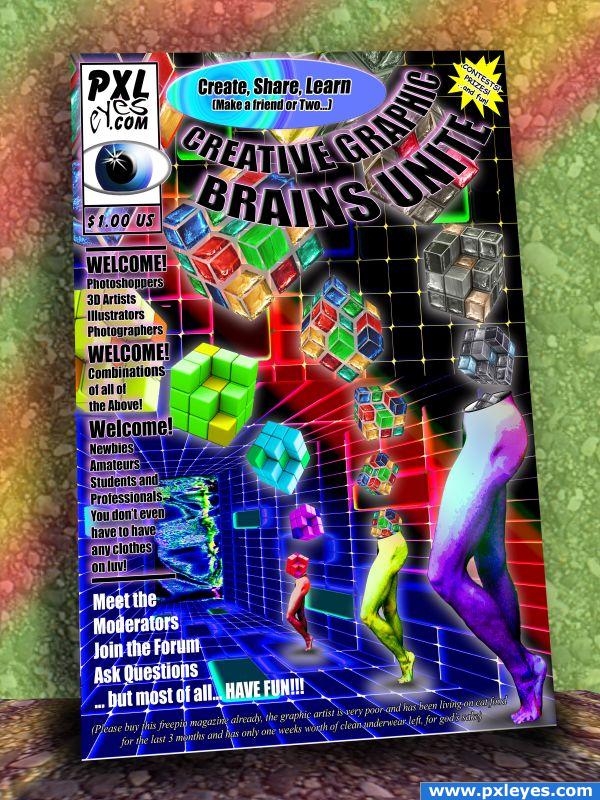
Edit: The only spelling error I see is Combonation instead of Combination. 
got it 
nice
hahahahha...great stuff!! Good work!!! 

A fantastic entry - love it - a little cheap though, I'd pay at least $4.99 for a mag that had a cover that attractive. I think it's also great to have put the mag against a background.
The cover has an eyecatching graphic, would certainly get your attention. I'm not completely sure about the contents or in fact what I should expect in the first place since there's nothing explained but the lay out of the page is there for sure with consistant use of typograpy. Perhaps you can put some text above in white, so it's in better balance with the lower texts (which are already white). Good luck!
the actual art/manipulation of this is pretty interesting, but lose the bevel on the "create, share, learn" it's totally out of place for a magazine cover. I would focus on an edit that wasn't so "busy"
the oval at the top looks as if it standsout from the magazine, so sets it off from it.
Annabat and Tapiona GOT IT (I think it happened when I was shrinking the image and I forgot to flatten the oval.. It sure got fat right quick LOL (fixed).. and Waz.. thanks.. I used the white text to counter balance the white in PXL logo (I thought there was too much).. I think Flattening the oval did the trick .. THANKS GUYS
great graphic cover. I LOVE THE PRICE> bets the heck out of the $15-$25 Australian average cost here. GL 
read the SBS...really good job there...good luck 
oh my eyes!!!Too much colors
not bad at all author, atleast you used your OWN imagination lol.... goodluck, you got my vote.
very nice 
Howdie stranger!
If you want to rate this picture or participate in this contest, just:
LOGIN HERE or REGISTER FOR FREE
(5 years and 3877 days ago)
realistic... Good Luck.. 
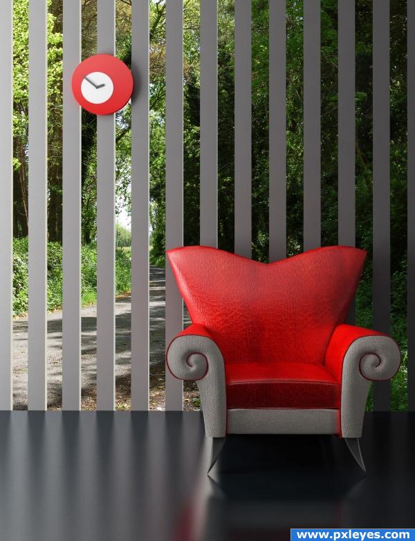
Nice idea, but you need to reflect the outside parts on the floor as well.
LOL...why? What would be reflected? It's all too far away.
Very nice idea, original and great result.
thats a wonderful work.This looks better than the original.
I like it 
I like the slats neat. It could use a little reflection and the glass (if there is any there) should have a reflection as well. Very nice.
if it's too far away so the floor should reflect the sky...btw good job already realistic 
EDIT: eheh yeah it can be LOL you win 
Giallo, it is reflecting the sky...can't you tell? 
Siple and Nice Work!
Howdie stranger!
If you want to rate this picture or participate in this contest, just:
LOGIN HERE or REGISTER FOR FREE
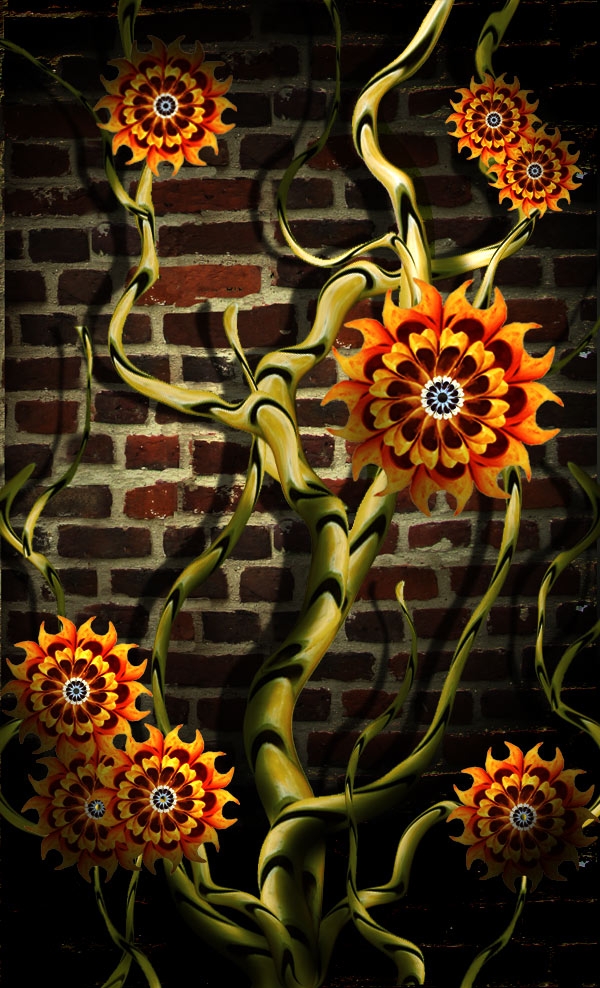
No outside images. Just the one provided by pxleyes. (5 years and 3896 days ago)
Very well constructed.. i like it!
Why would the light source be from underneath when it's dark there? It should be from above....
EDIT: OK author, I guess we can split the difference.  Good luck!
Thank you Ponti55. CMYK, for me the light is coming not from underneath, it is coming from the center right of the picture, but, I will check it. Your comment in "light source" is always appreciated.
Very original! I think you should add some more shadows to the petals.
Akassa, thanks, let me see what I can do about the shadows in the petals.
Love the brick wall! Good luck.
awesome~
Howdie stranger!
If you want to rate this picture or participate in this contest, just:
LOGIN HERE or REGISTER FOR FREE
Very nice GL
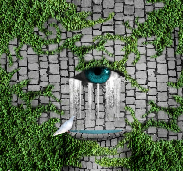
Pretty nice surreal image. Maybe would be interesting if you could make the eye really in the wall. That is, that you transform the stones and holes/joints (or how to call the space inbetween the stones) that way around the eye so that the eye looks part of it. I'd skip the dove's reflection. Good luck!
wazowski, i added the dove reflection because i thought that a lot of people would tell me i need to add it. it makes sense for it to be there but sense you are a mod i guess you are probably right.
i see......
haha
Howdie stranger!
If you want to rate this picture or participate in this contest, just:
LOGIN HERE or REGISTER FOR FREE