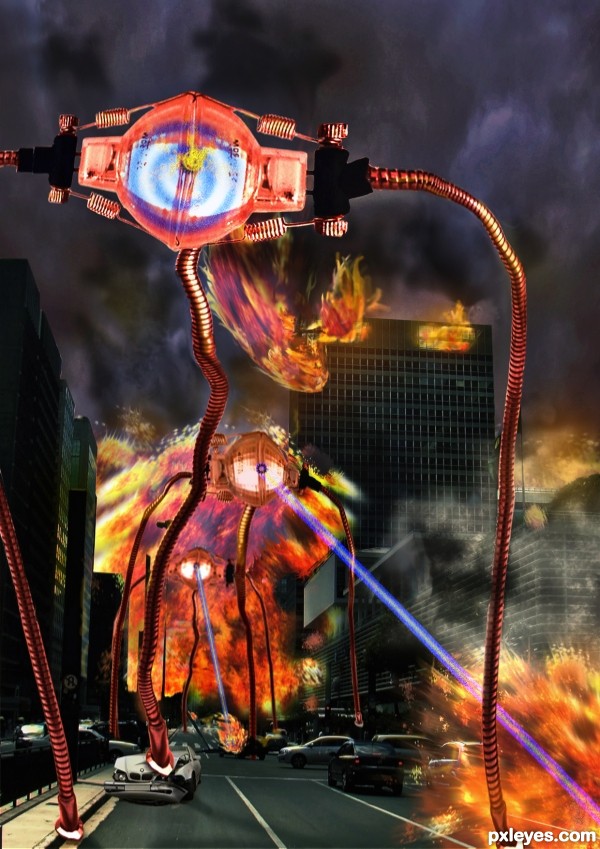
Thanks to Wanner Cavagnolle,
for the street scene. (5 years and 3490 days ago)
- 1: city street
- 2: Sky
- 3: wreck
(5 years and 3503 days ago)
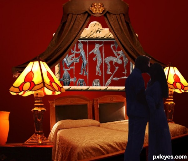
The lamps are gigantic...out of scale. Shrink them, & enlarge the figures.
Perhaps the perspective of your source image needs a little attention? And there is quite a bit of white ouline remaining on the couple.
I agree, lamps are out of scale and the warriors on the head board that you cut and pasted, they need work as well. I can still see the background of the original behind them and the guy to the left between his legs you can still see the stone background.
nice idea
Howdie stranger!
If you want to rate this picture or participate in this contest, just:
LOGIN HERE or REGISTER FOR FREE
(5 years and 3522 days ago)
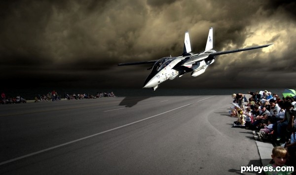
Wrong shadow, look at the angle of the shadows on the spectators. IMO there wouldn't even be a shadow of the plane at that angle....
True.. I changed it a bit, hope it looks better now.
not bad
Howdie stranger!
If you want to rate this picture or participate in this contest, just:
LOGIN HERE or REGISTER FOR FREE
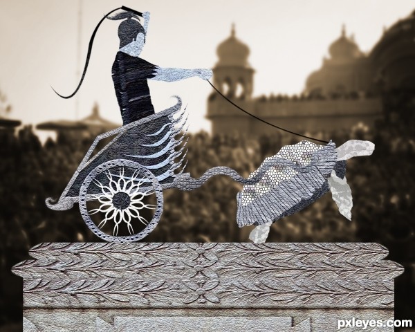
Friends some of u might think that it is over manipulated but hope that the hard work pays off and u guys like it....!!!! Plz do check out the full resolution image...thank you (5 years and 3530 days ago)
It's a very nice CBR! Beautiful design. 
not bad
it is nice work ,but
i like it alot; the texture patters are very nice, making the image pop... having said that i feel it holds too little relevance to the original image..the parts you used and shopped might very well have come from anywhere without changing the outcome. but overall, the idea is original making it a success!
The idea is nice but all components are to flat...use a bit dodge and burn tool author to achieve better depth and to give some roundness to image...good luck
Howdie stranger!
If you want to rate this picture or participate in this contest, just:
LOGIN HERE or REGISTER FOR FREE
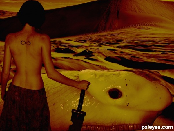
We ride at dawn...
A big thanks to Szeke from Flickr for the desert image and tomdev for the eye image.
All credit to blooDovestock on Deviantart for the awesome photo of the girl. Check out their awesome stock here -> http://bloodovestock.deviantart.com/ (5 years and 3531 days ago)
cool
very good... congratulations !!!!
The colors are very beautiful. 
gud entry 
Thanks everyone!
Howdie stranger!
If you want to rate this picture or participate in this contest, just:
LOGIN HERE or REGISTER FOR FREE
i think this is incredible work author, incredible job on the machines, its not repetitive!!!!!!!!!!
What a chaos! Pls, call the FBI, Nasa, the SVU, Psych members, dr. House...

I like the explosions effect, it's perfect...
Very cool! The perfect right angle of the flame edge below the middle Martian's left armpit is odd, made more so by not being how that area of the image appears in the 'Final result' of the SBS. I think this would be more dramatic if the middle Martian weren't the only one shooting some sort of ray; they all should be doing that. The white edges on parts of the legs and some head elements seem like poor blending.
EDIT: Armpit issue has been resolved. Added ray is spot on.
Very cool work author...work on a construction of a machine/creature is amazing...crashing cars is fabulous little touch...because of big contrast of the major machine and background,maybe would be cool to add some adjustment color layers...just and idea...
Love it, great work, especially on the explosions, author!

Nice addition of the "target rings" for the closer Martian. The other two shooting already have found their targets, so it makes sense that this one is looking for one and not shooting yet.
Sweet!!!!! am working on one like this donno if I'll finsh it or not
nice work like the explosions
I love the stuff you guys do. So much fun!
hehehe.. love the violent chaos
Well done author

filmy scene. nice . need more finishing
very good work
Howdie stranger!
If you want to rate this picture or participate in this contest, just:
LOGIN HERE or REGISTER FOR FREE