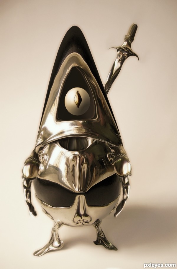
as you can see no external source is used.:) (5 years and 3726 days ago)
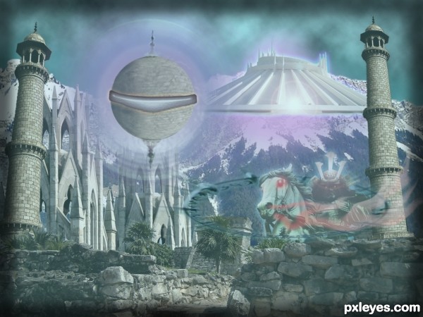
Basic photoshop techniques and tools used to create this image. Duplicated part of the Taj Mahal to make the 'ship', drew a shape at its side, added layer styles, used a couple of layers behind it and in front, with radial blurs. Created the sky with clouds, difference. Made several adjustment layers (hue/sat, levels, brightness). Painted the horse's breath white, liquified a little, then painted a layer above in red, clipped the color layer to the white one. Used a few lens flares for good measure. Added glows to everything that moves, and finished with an additional low opacity aqua layer in front, and painted the edges black. (5 years and 3735 days ago)
Seriously, I don't know the game...SORRY! But I think you made a mix that worked!! 
Very nice chops! 
A lot of cool stuff, but it's like it's all boring beige with no focus. I don't get the super-giant horse and rider with their off-center halo (even though that's apparently the title element). The sphere with the aura and the 'space mountain' have a totally different vanishing point than the Taj Mahal spires. And the border adds nothing IMO.
Well done! 
Amazing work.
This is so amazing.. with the lightness.. the actual print work would be OUTSTANDING.. definitely looks like something you'd put into a magazine in the real world.. (Back light is SO hard to work with when you need to print it)
Nice stuff here a real good fantasy piece, just like the game...a fantasy world. You have captured the essence of that well. I know I am not color blind, it does not look beige too me.
nice 
The composition is quite chaotic to me and I prefer the real sky. However, your combination with the nice colors results in the good overall feeling. Good luck, author.
PS: the low-res deteriorates your image 
very nice work ,good luck ! 
goodluck
nice work with this...gl
Nice work Author I like it.  good luck
Howdie stranger!
If you want to rate this picture or participate in this contest, just:
LOGIN HERE or REGISTER FOR FREE
(5 years and 3741 days ago)
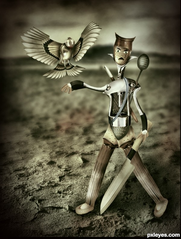
Author, no camera can take a photo with the blur region like that, I mean that it should be only vertical or horizontal. Also, the light comes from the left (based on the shadow on the ground), but the rope has the reverse shadow on the chest, and from the available shadow on the ground, your man needs some darker shadow underneath. It's a nice work and gud luck to you!
langstrum thanks for your great suggestion. Fixed and updated entry.
nice bird
ALL SLICEY DICEY... great JOB!!!
nice construction..... Very welldone
nice work 
nice usage of the accesories
Nice job! 
the best one
great job
Cute kitchen knight! 
great!
I'm with no words... incredible! 
I love it......the bird reminds me of the mechanical owl on the original Clash of the Titans. Wonderful work, best of luck to you
Congrats for your second place, Nasir!
Congratulations for 2nd
Congrats Nasir!
congrats nasirkhan
Congrats 
congrats nasir.........
Congrats!!
Congrats 
Congratulations!!! 
Howdie stranger!
If you want to rate this picture or participate in this contest, just:
LOGIN HERE or REGISTER FOR FREE
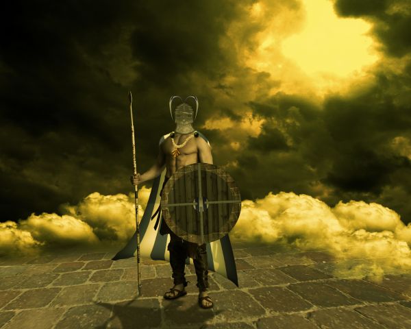
Marcus J. Ranum-http://mjranum-stock.deviantart.com/
Julia Starr-http://www.sxc.hu/profile/night_fate
Mila Vasileva-http://milavasileva.deviantart.com/
Thanks guys for the great images... (5 years and 3782 days ago)
You've done good 
Great Image!..but IMO, the helmet would be better without the plastic wrap..good job otherwise
Thanks guys...@fatz-u are right my friend...i did not apply plastic wrap to get metallic look,i do that for one other thing...plastic wrap give symmetric ornaments to helmet...i know that is not perfect but,that was idea...
The shadow doesn't quite match.
fantastic scenario... and very well done!
Howdie stranger!
If you want to rate this picture or participate in this contest, just:
LOGIN HERE or REGISTER FOR FREE
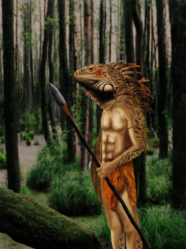
Will upload SBS in a few hours, so please don't complain. Sorry. (5 years and 3786 days ago)
Skin needs better blending
i agree about blending and maybe to play just a bit with head perspective...good luck
work on ur dodge man otherwise its nice .........gud luck
i probably should have used a regular person for the body. I thought this would be cooler but i believe this was my first time to actually use the burn tool and smudge tool together.
think if you have a photorealistic background the image object also needs to be realistic, otherwise use or create a 'cartoony' background and the 'object' will fit better. Only my opinion mind you, good idea though !! 
Howdie stranger!
If you want to rate this picture or participate in this contest, just:
LOGIN HERE or REGISTER FOR FREE
hahahahah...love it!!!!!!!!!
Very cool work...good luck author
OMG - how cute!!! Love it!
Looks great ! Great use of source!
haha! this is awesome. and i love how you wrote the title. intentional or not..its like i can haz cheezeburger. i thought i am warrior...
thanks to all for your comments..and jadedink..I've never heard that.. ..
..
hehe this is so cute :p
A cyclope warrior...
Cool Entry.. gL
amazin
nice entry Author and good luck
Congrats for your third place, Rakib!
Congratulations for 3rd
Congrats! for 3rd
thanks to all for the congrats
congratulations!!
Congratulations
congrats
Congrats on 3rd Rakib!
Congrats!!!!
Congrats!
Congrats!!
Howdie stranger!
If you want to rate this picture or participate in this contest, just:
LOGIN HERE or REGISTER FOR FREE