Something that has nothing to do with earthly affairs ;-)
...
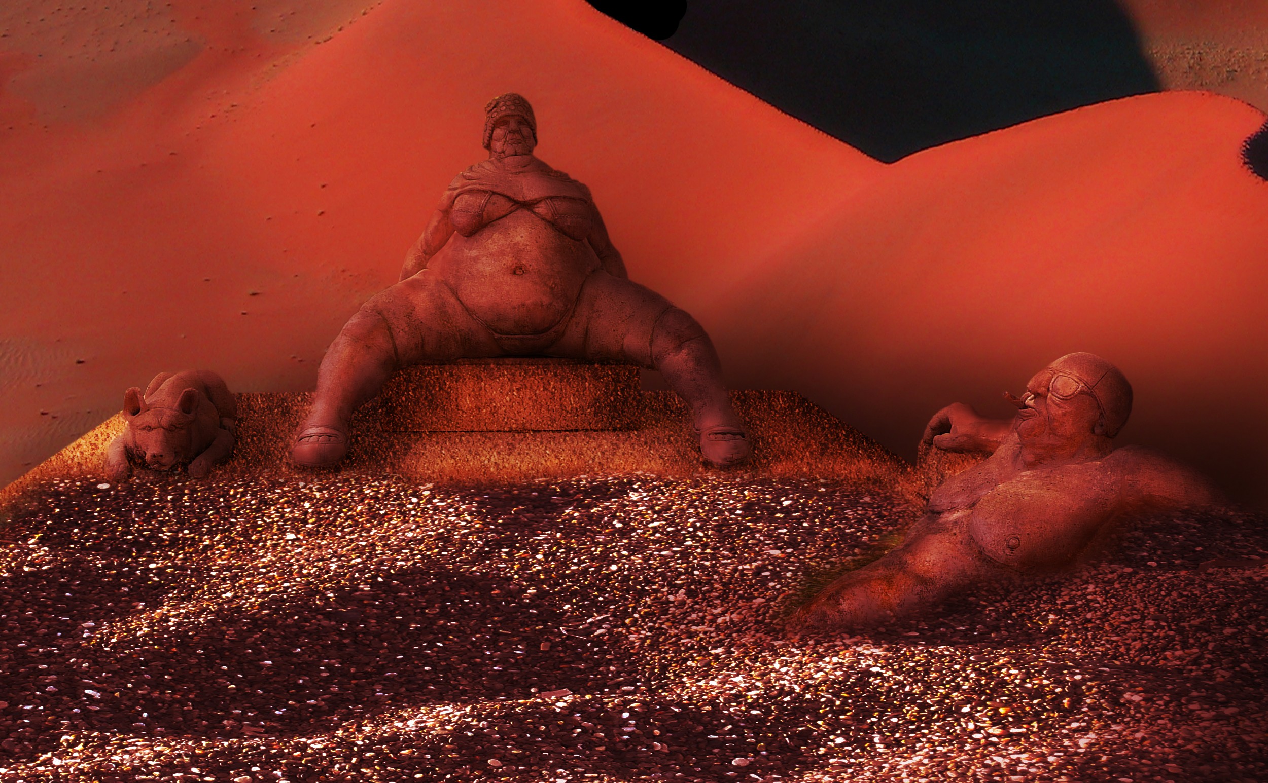
Texture is P default (rock patterns - Dirt) (5 years and 3852 days ago)
No external sources.
(5 years and 3921 days ago)
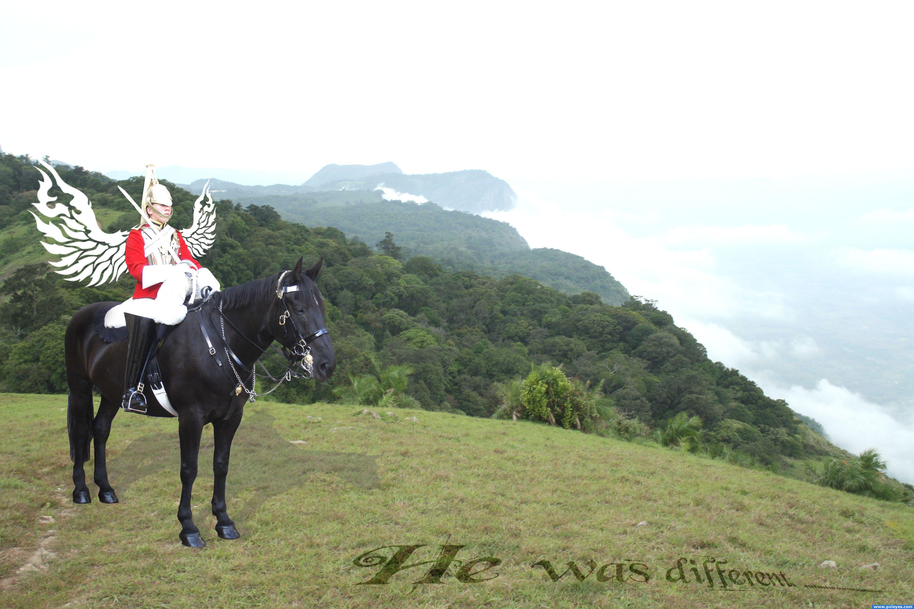
The wings could use a little thickness.. you could bevel emboss or burn them ... IMHO.. the text on the picture is redundant to the title (text makes an image into a greeting card.. not a bad thing but it may be frowned upon by some voters.. if you leave the text in the image/change the title... only if you want to.. sweet vision over all.. good luck
i agree with golem
Howdie stranger!
If you want to rate this picture or participate in this contest, just:
LOGIN HERE or REGISTER FOR FREE
(5 years and 3950 days ago)
Nice montage - but your light sources are from different directions.. Maybe flip the background? GL
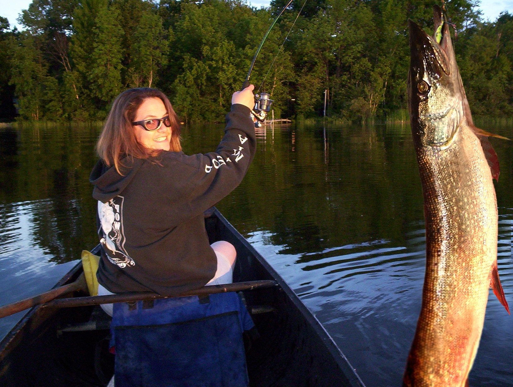
A pike is very light on its underside. I put the lightsource on the left side. I'm not sure what to do--I tried to darken the RGB on the belly side of the fish and it looked funny. I tried to bring the lightness down on the belly side of the fish and it looked funny also. I'll try your suggestion.
Thanks animmax, I took your advice and it seemed to work out.
All good - much better.. GL
This is not a montage it's just a real picture.... Nice job!
http://en.wikipedia.org/wiki/Photomontage it would be considered a montage 
good job, looks like the real thing! 
Howdie stranger!
If you want to rate this picture or participate in this contest, just:
LOGIN HERE or REGISTER FOR FREE

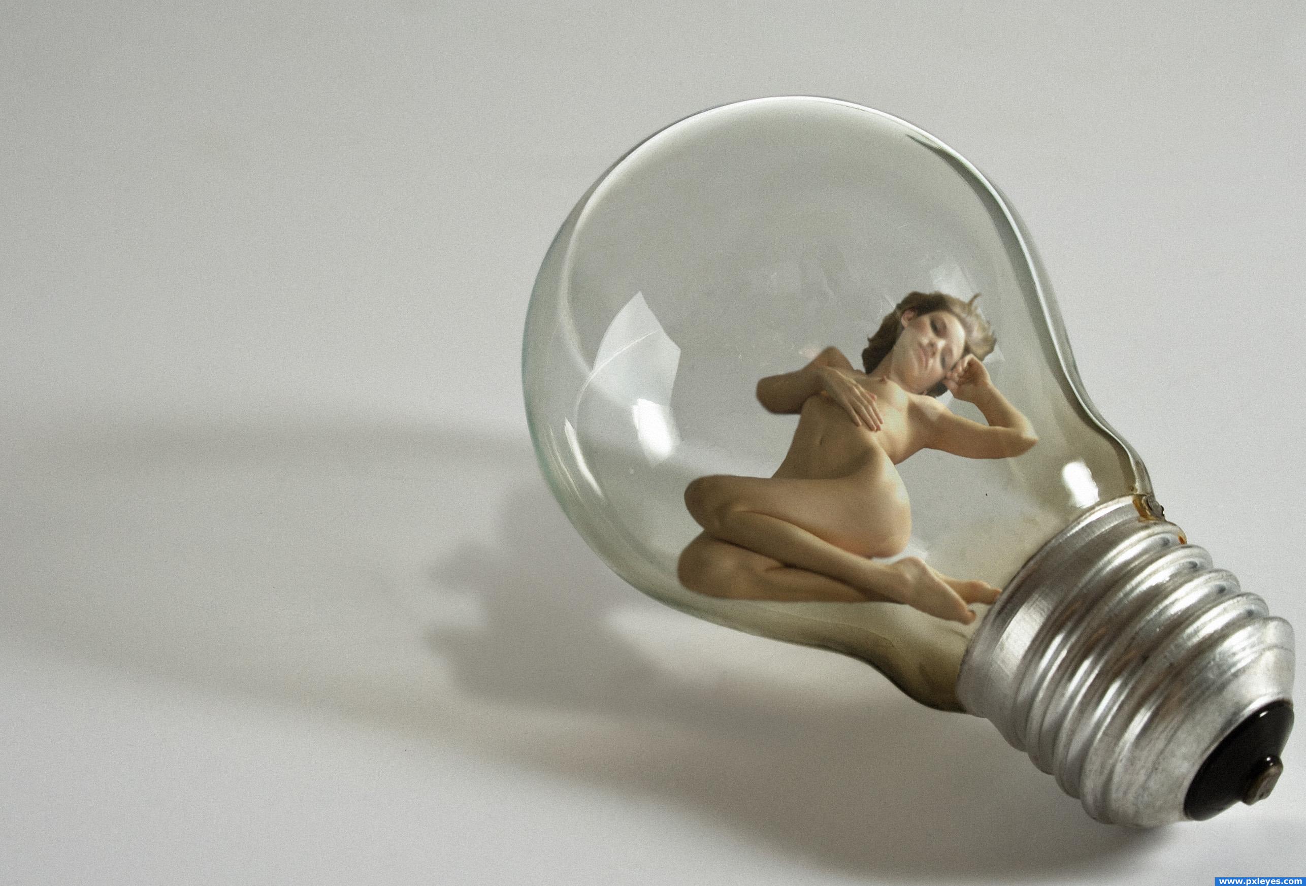
Credits and thanks to:
- faestock (http://faestock.deviantart.com).
- Zela (5 years and 3976 days ago)
great blending! i don't know why, but she looks kinda weird.. maybe it's the eyes.. but nevermind, great image!!
Thanks... she looks a bit strange because of the eyelashes i guess, they're not really of a child's. I already removed most of the make up and arranjed up, dunno if i can do more >.
all you have to do is lighten the base lashes... children's bottom eyelashes are usually not dark in slovak/caucasions (I have over 20 nephews and nieces) the darkness of the bottom lashes causes the ADULT eye effect (sorta like how they dress all the teen age girls on the Disney Channel to look like sluts.. they just darken the base eyelashes and put them in tight crappy clothes) lighten ONLY the lashes, or she may end up with eye bags (you could also remove them completely, like the original photo, keep the top ones so it still looks like a transformed adult.. beautiful image 
EDIT: MUCH BETTER.. the lighter lashes make her more sweet.. good luck and very good work author
My understanding is thast you ars supposed to use an image of an adult and make them young again. What you have here is a image of a child already.
i agree with JustinCase in contest goal says "grab any image of an adult"...but this image is quiet nice but out of theme, good luck
This is cute though--it reminds me of one of those porcelain dolls that look so real. I did this project before I realized it was for a higher level---I put the results in my album (or in ART)
how is this off theme? "revert them back to early childhood, in other words, turn them into babies!" i think the author did a pretty good job doing that!
excellent blending, her bottom lip could do with a bit of adjustment, it looks lik she's pulling it to the righ (screen right)
Well this is supposed to be the model's from faestock, baby's version for that i needed a child's stock ~~
Edit: Made the eye lashes lighter; fixed the lips; added more shadows/lights to the eyes.
Woah.. quick change.. looks a lot better in my opinion now, good luck!
personaly i think the child you submitted looks older than the original ( more defined ) i thought you were suppost to take an older person and make them young, not take a young person, and make them look like a different young person ?
very good blending on this image, good job!
I think the problem i sthe left eye, it's a little bit to big,needs to be rotated a bit and maybe add some perspective to it. All just some minor adjustments
Great work BTW and on-theme if you ask me
The two images are too similar in age to make this much of a transformation....
Well i'm sorry if this is not really in theme i guess i didn't understand well what's the goal of this contest o.o
to take a old person and show what they looked like young. don't get me wrong this is a very nice image, just a tad off theme.
awwwww! so cute
How is this off theme? Other people are doing the same, working on a child's stock using adult's parts on it T.T
I would like to see the "older" version in your SBS. The mouth needs to be shifted screen right a bit and if you use the transform feature I'm sure you could get it more into perspective. All in all I like it...off theme or not!!!
The older version is the girl in source 2 by faestock.
Congrats for your second place, Akassa!
Congrats!
congrats
Congratulations for 2nd
Congrats!
Howdie stranger!
If you want to rate this picture or participate in this contest, just:
LOGIN HERE or REGISTER FOR FREE
God had some great ideas, but that had to be one of his all time greats
Thanks to Marcus J Ranum for the girl stock
see www.ranum.com (5 years and 3986 days ago)
interesting though, i think the female's shadow should be stretched a bit more like the lamp is, but i like the image! Good luck!
ye bro good idea for shore nice work good luck
ah and source for girl is not working 
hahaha someones a nauty guy! lol i like the image
Howdie stranger!
If you want to rate this picture or participate in this contest, just:
LOGIN HERE or REGISTER FOR FREE
Photography and photoshop contests
We are a community of people with
a passion for photography, graphics and art in general.
Every day new photoshop
and photography contests are posted to compete in. We also have one weekly drawing contest
and one weekly 3D contest!
Participation is 100% free!
Just
register and get
started!
Good luck!
© 2015 Pxleyes.com. All rights reserved.


Your image looks good. Who knows, if there was life in Mars, I think, yes, probably. Good luck author
Thank you guys! Nator, given the finishing I'm used to giving to my works, they not often look nice in low-res
great idea
Clean cut chop and yes just as Nator said, it does look good in high res. Well done, a deserving winner.
Howdie stranger!
If you want to rate this picture or participate in this contest, just:
LOGIN HERE or REGISTER FOR FREE