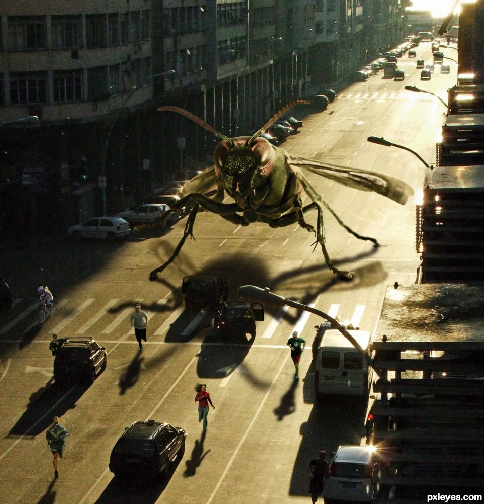
Cloned out some cars and stuff from source. Added people running which was a challenge. Added and colored the giant wasp. (5 years and 1023 days ago)
(5 years and 2939 days ago)
What a dramatic title!!! 
What does this have to do with no smoking
This isn't a theme contest dear, it's a photo manipulation contest, you can make fuzzy bunnies if you want, just as long as you incorporate the skull photo into the entry
Yeah but still look at the title ---No Smoking - Photoshop Contest
The Goal is "Download the photo on the left and manipulate it in any way you want."
ANY WAY YOU WANT!
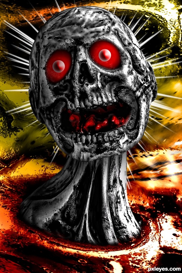
This is awesome! The colors are very bold and the contrast is excellent. Great work author!
I love it, can't stop from laughing every time i see it! There's need to set it between my favs!  Also the title played a great rule this time!
I learned a lot living in the south for about 3 months... I was called a HOOT 5 times and had to call a local radio program for information about it (before internet) and the DJ laughed and laughed 
So many good entries in this contest... however, this one is awesome and also provides an SBS that helps others learn what photoshop is about! 
Great manipulation, author! Title reminds me of when my dog either was bitten - or chewed on a wasp! and her face swelled up like crazy. Nice contrast between BW of image and bkgd colors. Image makes me want to scream - now that's some impact! 
Congratulations Driven.... scary second!
 Super congratulations!
Congrats !
Congrats!!
Howdie stranger!
If you want to rate this picture or participate in this contest, just:
LOGIN HERE or REGISTER FOR FREE
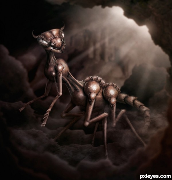
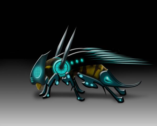
Decided to make some sorta wasp ant like creature. Something that has possibly been growing and evolving deep in a cave some where....well not so deep that there can't be sunlight :) (5 years and 3258 days ago)
Very impressive, I wouldn't like to meet this critter 
Nice evolution, but the light reflection doesn't work with the sunlight shining from behind the creature... Better to ditch that back entrance, and make an opening above and to the right, so that the lighting is consistent.
Very cool and well crafted work! To be honest I perceive the light as coming from above, right and just in front of the creature, not behind it. So it looks correct to me.
Light spreads, this works for me. Great concept and painting, author! 
Light looks fantastic to me..., but I really don't care about the light, I think the manipulation and overall result is just fantastic! Great Job author 
Thanks everyone! and I do see what you mean Mossy, but I had the light just coming from the top right. Having the bright white corner just sorta threw of my composition so I put that rock in front of it. The beams of light were coming in front of him for a while, but I just didn't like what that did to the shadows. Also for all we know there is another hole up above to the right that we just cant see!  perhaps if I have time I'll do some tweaking thought
Great, great work!!! Impressive!
Why thanks you!!!! 

Yeeeees, the Evolution could play very eccentric tricks 
Congratulations!!! Great work!!
thanks 
thanks 
Congrats!!
Super duper congrats!!!
Congrats 
congrats for 1st. Really great work.
SUPER DUPER THANKS EVERYONE!!! 
Howdie stranger!
If you want to rate this picture or participate in this contest, just:
LOGIN HERE or REGISTER FOR FREE
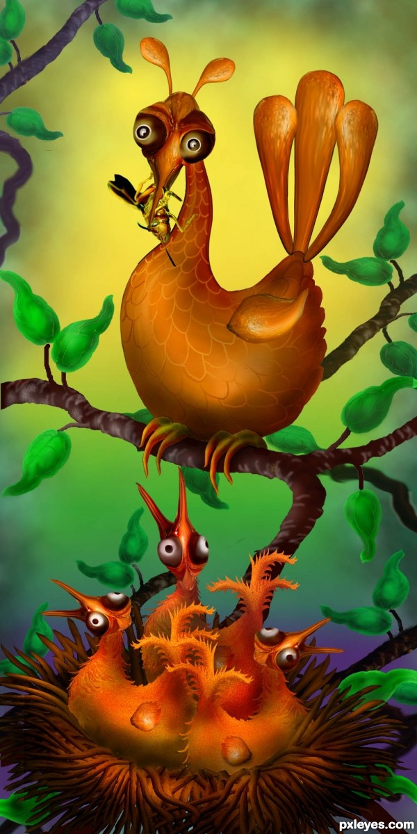
No outside sources used. Birds are made from parts of wasp which they are now eating for lunch! (5 years and 3262 days ago)
Funny image, but I'd really get rid of the different clouds background. It's too recognizable as standard clouds render and imo wont support your own creations. Good luck!
EDIT: background looks better this way, imo 
CUTE!
Will see what I can do with the background, Wazowski. Appreciate your advice!
How Cute!!!
ooh... another cutey! ... only suggestion, make the wings less sharp and a better blending to the bodies 
super cool funny image author...great usage of the source image...best of luck
Funny & original 

Awesome! 
Adorable - love this concept! Love your colors for the 2nd background. 
The early bird catches the first wasp, he-he-he 
Yuk! I don't think I'll be early then!! lol
Thanks for the kind comments everyone.
Congrats!!
Howdie stranger!
If you want to rate this picture or participate in this contest, just:
LOGIN HERE or REGISTER FOR FREE
biborné veres dorottya-http://www.sxc.hu/profile/vdori
Thanks for the great image of the wasp...
Please watch High Resolution before voting....Thanks guys (5 years and 3762 days ago)
He is SO BEAUTIFUL.. good luck author
nice job 
nice job, good luck
great drawing and use of photoshop!
That sting must be sharp and painful... 
good work but the shadows are not convincing... need to work on that... still this is awesome.. GL
High Resolution looks so better,well done author
Very nicely done!! My favorite so far in this one. Excellently executed!! Good Luck!
Howdie stranger!
If you want to rate this picture or participate in this contest, just:
LOGIN HERE or REGISTER FOR FREE
Good image...try to match the added shadows to those in the source pic.
TY CM. I can try but I really struggled with this chop as is. Maybe make them less blurred with more color type noise in them?
Great job on the chop. I would feel safer inside a car though. I think they would be more likely to get caught and eaten trying to run away.
This one chews through cars.
In that case I would hide in a reinforced concrete building.
Congrats again BWR
TY madamemonty. Always wanted to do a giant creature Photoshop. Was fun.
Congrats!
Thanks filantrop. Just broswed your Photoshop portfolio. you have some nice PS work.
Congratulations. Well deserved.
Mahalo SA!!
Congrats BW!
Thanks bunny girl.
Howdie stranger!
If you want to rate this picture or participate in this contest, just:
LOGIN HERE or REGISTER FOR FREE