(5 years and 3213 days ago)
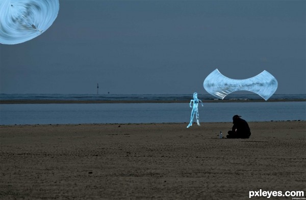
Quiet nights on a deserted beach is a good place for an encounter with a water sprite from another world. All from Contest source photo. (5 years and 3220 days ago)
Drop shadow effect is not a good idea for this photo since it makes them look like they are on top of an image, not in it.
I see where your coming from there. Thank you.
Also it would help blurring the edges of your objects. Easiest way is ctrl click on layer icon to select its contour, then go to Select modify contract by a few pixels, invert selection and apply gaussian blur.
The further an object is the more desaturated will appear, use this to create perspective.
Howdie stranger!
If you want to rate this picture or participate in this contest, just:
LOGIN HERE or REGISTER FOR FREE
(5 years and 3258 days ago)
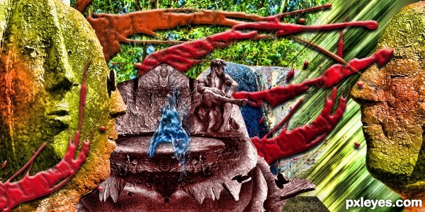
I still don't get the concept of this one...but who cares anyway, the site is all about arts and talents.
(This might help)
I'm a whisper in water
A secret for you to hear
You are the one who grows distant
When I beckon you near
Leave me now, return tonight
The tide will show you the way
If you forget my name, you will go astray
Like a killer whale trapped in a bay
~Bachelorette Lyrics
Thanks author...I'm just lost... lol! Goodluck to your entry!
Howdie stranger!
If you want to rate this picture or participate in this contest, just:
LOGIN HERE or REGISTER FOR FREE
THANKS A LOT TO:
Brushes:
http://www.obsidiandawn.com/
Rock:
Credit must be given in the artist's comments as either : devLitari-Stock : or : iconLitari-Stock : without the spaces
Hands:
http://fantasystock.deviantart.com/
Birds:
http://fairiegoodmother.deviantart.com/
Waterfall:
http://www.sxc.hu/profile/laholden
Balloon:
http://www.flickr.com/photos/ericlbc/
(5 years and 3263 days ago)
nice brush usage 
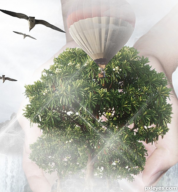
Great job of cutting out the pieces, but for me, the uniform lack of saturation (except for the birds which are curiously flying away from whatever is happening here) results in just 'blah' with no real focal point. It's a struggle to make out the hands. Relative to the tree, the balloon seems too small and the birds seem too big.
Thanks DanLundberg,,,,
I don't agree,,, sorry.... It's surreal!!!
And the hands ??? small or big ????? And the waterfall ?????
sorry
Howdie stranger!
If you want to rate this picture or participate in this contest, just:
LOGIN HERE or REGISTER FOR FREE
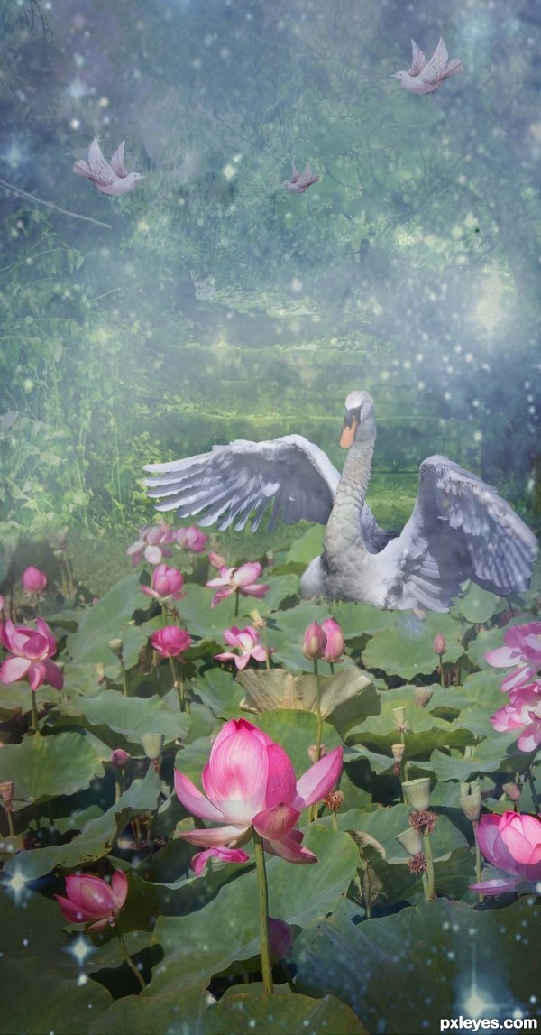
I have really, truly wanted a water garden behind my house for so long. Thanks to David Hegarty at flckr.com for the swan source; thanks to gotmeamuse at pxleyes.com for the background trees; to badastronomy at pxleyes for the nebulae; (5 years and 3270 days ago)
Nice image author, very interesting effect with the nebulae in front. Hope you get your garden one day! 
Awesome
Congrats!!
Congratulations for your third place!
Congrats
Howdie stranger!
If you want to rate this picture or participate in this contest, just:
LOGIN HERE or REGISTER FOR FREE
good imagination......
Great chop!
this is awesome! great creativity.
fantastic composition! good luck author!
thanks guys!
great sources. good balance of colours and a creative use of source.
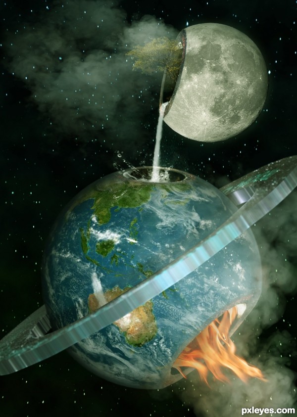
Nice surreal image! I like everything except for the texture on the ring. Although I can't recommend any solution to make it better. Good luck!
I'd get rid of the ring, less is more, you have a great concept, the ring doesn't have anything to do with it, and catches up the eye too much...
Oh happy day!!! wonderful imagination
Mike is totally right on the ring, it's distracting.
Beautiful, but I hope such dreams will never come true
Howdie stranger!
If you want to rate this picture or participate in this contest, just:
LOGIN HERE or REGISTER FOR FREE