(5 years and 3432 days ago)
(5 years and 3436 days ago)
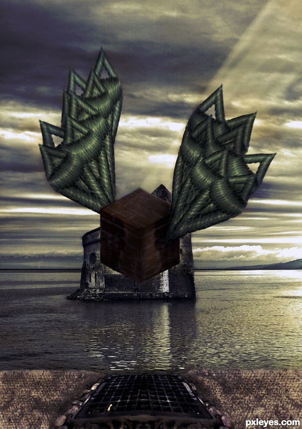
Motion effect should be on the entire object, (wings too) not just one part.. Interesting use of source.
Very interesting approach...maybe u could use some color adjustment layers to achieve more dramatic result...with colors like this i suggest dark blue overlay layer,dark brown color layer, maybe gold-ish color layer and at the end blue/gray soft light layer...Of course all layers must have adjusted opacity...just an idea author...best of luck ...
Howdie stranger!
If you want to rate this picture or participate in this contest, just:
LOGIN HERE or REGISTER FOR FREE
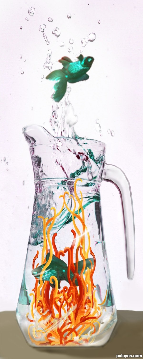
Thanks to bliss at morguefile.com for the fish source photo; also, to kblount at mfile for reference I used to do the shapes from the lemon in the main source photo. (5 years and 3441 days ago)
Great job adjusting the color reflections at the top of the pitcher!
cool work author...
To Moderators: wow I'm screwing up all over the place, first I gave a VERY wrong vote, I accidently pressed enter too soon and the author ended up with a VERY low vote that was not intended, then I wanted to redflag you to let you know and forgot to write it in the text box there, very sorry. And sorry to you, author, a low vote was not intended for you, I like your creation. 
Howdie stranger!
If you want to rate this picture or participate in this contest, just:
LOGIN HERE or REGISTER FOR FREE
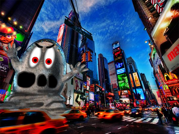
They water monster is gobbling up Times Square in new york city!! (5 years and 3441 days ago)
The monster is cute...even though it is evil hehe. I would have done a softer beveling around the mouth, but other than that I don't know what else to say. Lotsa luck! 
Howdie stranger!
If you want to rate this picture or participate in this contest, just:
LOGIN HERE or REGISTER FOR FREE
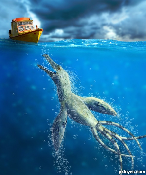
The bubbles were done with a BUBBLE BRUSH... not from a source image.
The credits for the brushes go to http://lordandre.deviantart.com/gallery/?offset=24#/d1b4naj (5 years and 3448 days ago)
Nice entry. Here are my tips:
1.The creature should have a blue-ish overlay in order to look like it's in water, i would even lower the opacity to 90-95.
2. the lower part of the mouth doesn't look 3d (perspective is off). try to add the other layer of teeth behind and something like a tongue between them. 
3. The are 2 types of bubbles : soap ones & water ones. You need the second type that looks like this:
http://www.pixshock.net/pic_b/31f006131aa76bed5f1dec01cc6d4203.jpg
You see,they are not round, cause water is heavy and makes them squashed. I think you can fix this from jitter.
Hello greymval, I really apreciate your comments and your tips, this is the way a criticism must be done 
I fixed the things you help me to see.
For the bubbles, I used liquify 
Thank you!
That's pretty scary! Really stunning details.
this is awesome
Thanks for the nice comments.
Great job man, now it's a kick-a$$ entry.
Yep, really nice now. GL!
Nice surprise! 
Nice entry, well done
Amazing creature,great perspective,fantastic work...well done author
Very nice and cool focus here.
good work...
Thank you , I apreciate all your comments, votes and critiques. 
Creepy ... very creepy. Sorry I missed photoing on this contest ... it would have been fun but hard, there is some really stunning work here ... this included! Bravo!
Howdie stranger!
If you want to rate this picture or participate in this contest, just:
LOGIN HERE or REGISTER FOR FREE
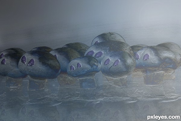
Cute little shroom people.
Howdie stranger!
If you want to rate this picture or participate in this contest, just:
LOGIN HERE or REGISTER FOR FREE