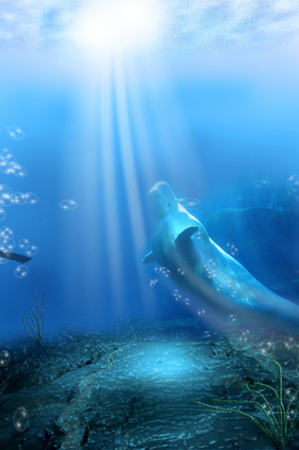
thanks to surrahman for " Beluga Whales, Vancouver Aquar" image (5 years and 3697 days ago)
- 1: source1
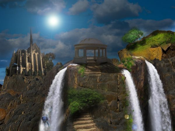
dis one is my 1st matte painting,i try to give my best
(5 years and 3701 days ago)
fab
Beautiful image...IMO the climber has a highlight on his back that is coming from a light source that isn't there, soften it and blend the trees into the walkway a little more..Make it crisper..Hope this helps and Good Luck =)
Nice idea, I agree with the climber comments, and i think a little subtle use of the 'dodge' tool to give some sharper highlights on the central structure would really make it 'pop'... well done
Congrats!! 
Howdie stranger!
If you want to rate this picture or participate in this contest, just:
LOGIN HERE or REGISTER FOR FREE
Thanks for view and comments. (5 years and 3701 days ago)
We'll be lost if such thing happens!
Woah! Fantastic!
Nice and clean picture...good blending,nice color ...from a long time I didn't see a picture like this...one of my favorite
Fantastic work...i like small details...shadows are very good...good luck author
Great imagination....Nice work...
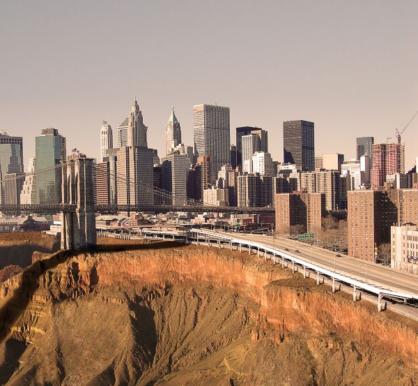
No SBS? Everything is great, except the shadows. The light sources for the bridge and the city are different in your image.
Congrats for 2nd
Congratulation! I had the same idea but I'm sure I can't do better than you 
congrats on 2nd place
Thanks everybody!!
Congrats for 2nd!
Congrats! 
Congrats for your second place, DML!
Howdie stranger!
If you want to rate this picture or participate in this contest, just:
LOGIN HERE or REGISTER FOR FREE
(5 years and 3702 days ago)
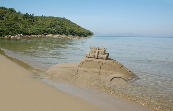
Erase some of the sharp foreground edge at the shoreline to blend it in & this will be great! 

It's fading... 
That´s so clever. Nice work!
Great work...fantastic blend...good luck author
Great idea but the blend still needs some work....
Wher ?????????????
It's obvious you liquefied the side we are looking at. That's where you could have better blended it. Sorry it's too late now but just thought you would like to know.
jawshoewhah thank you
Howdie stranger!
If you want to rate this picture or participate in this contest, just:
LOGIN HERE or REGISTER FOR FREE
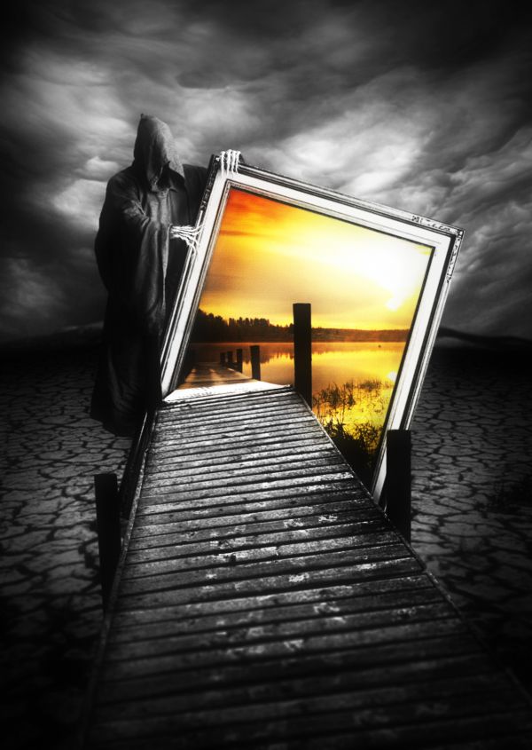
Sorry if the resolution is not that high, it depends on the sources. Also, to avoid misunderstanding that this work can be off theme, I explain the center image is just the photo, so actually this is the world without water. (5 years and 3703 days ago)
ohhh wow.. well done gl 
I don't know if you didn't put the stakes of the bridge of this side on purpose, but it's only a detail. Very, very impressive work! GL! 
Why doesn't the reaper have a right hand?
great work...good luck author
Thank you for commenting. @erikuri: hmm, it'll be better with some stakes, right? So I'm doing on that ^^. @jawshoewhah: he doesn't have foot and face, too :p. However, because of your question, I will make some changes  , thank you very much
oh.. scary......good job! 
love it, very clever. 
Wonderful! 
love this
Well I'm glad you could see where I'm coming from. Looks better now. GL! I think you got another winner 
dammn thats nice
very nice good luck
wonderful ! 
light come from behind as yo see by the reaper so i miss some shadows, just my mind, but a really great job gl.
realy scary, gr8 work!
Stunning work....Amazing creativity and imagination.....Great vision.....
Congrats, nice work and really creepy 
Congrats for 1st
Congrats, very creative!
Thank you for your congratulations, I love you all 
gratz
Congrats! Nicely done!
Congrats! 
Congrats for your first place, Langstrum!
Congrats
Great work,Congrats ! 
Thank you my friends ^^
I can see how this got first place. Simply amazing work.
Howdie stranger!
If you want to rate this picture or participate in this contest, just:
LOGIN HERE or REGISTER FOR FREE
nice image, the light rays are a bit too intense, i recommend a gradient mask so that as they go further down into the water they lose intensity. I also suggest spreading them out more. Other than that - great, creative image!
done ,thanks for the tip
Beautiful image!... How about to soften the plastic wrap filter?
i agree plastic wrap is too noticeable =)
A bit poor use of the source file, but the idea is very good. :P
do u know where i used the source image in this image??!
plz Gary be objective
Congrats for your third place, Basem!
thanks lelaina
congrats Basem !!
Congrats!!
Congrats!!
thanks to all ))
))
Howdie stranger!
If you want to rate this picture or participate in this contest, just:
LOGIN HERE or REGISTER FOR FREE