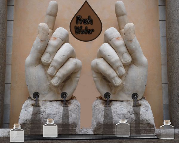
No outside sources used (5 years and 3823 days ago)
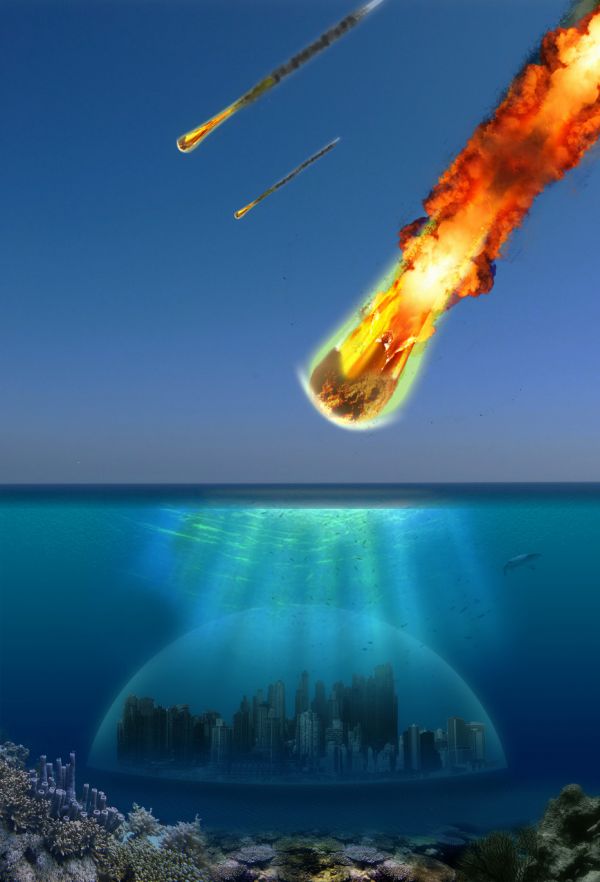
(5 years and 3823 days ago)
Source link for the city...?
k, sec
what about a SBS?
Recycle your last entry????
it was removed because it was placed under the wrong topic. It had its 3 minutes of fame, but I hope it will last longer now
you need to adjust the sun rays, as there is no sun, or sign of a sun in the sky, but the rays are shining over the city, which looks like the sun is right above the city. just and idea, overall it looks good 
You have a few perspective issues, but its an interesting idea. You might want to add another layer of coral further back, add some depth? Also your middle comet would have a smoke trail that runs off the edge of the screen. GL.
I agree.. I'll see what i can do
Congrats 
Howdie stranger!
If you want to rate this picture or participate in this contest, just:
LOGIN HERE or REGISTER FOR FREE
(5 years and 3823 days ago)
SO?
good idea, but it looks too unrealistic for me to vote higher
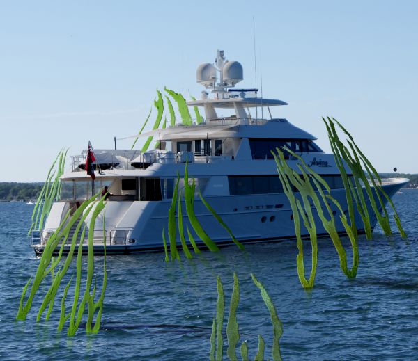
I think you should lose the one behind the boat. It seems a lot larger than the rest even though its further away.
Sooo what are these supposed to be?
i need to understand first what did u intend to make in this??..jus using any external souce image and then addin those plants around it..i mean i don get the meanin at all..
Howdie stranger!
If you want to rate this picture or participate in this contest, just:
LOGIN HERE or REGISTER FOR FREE
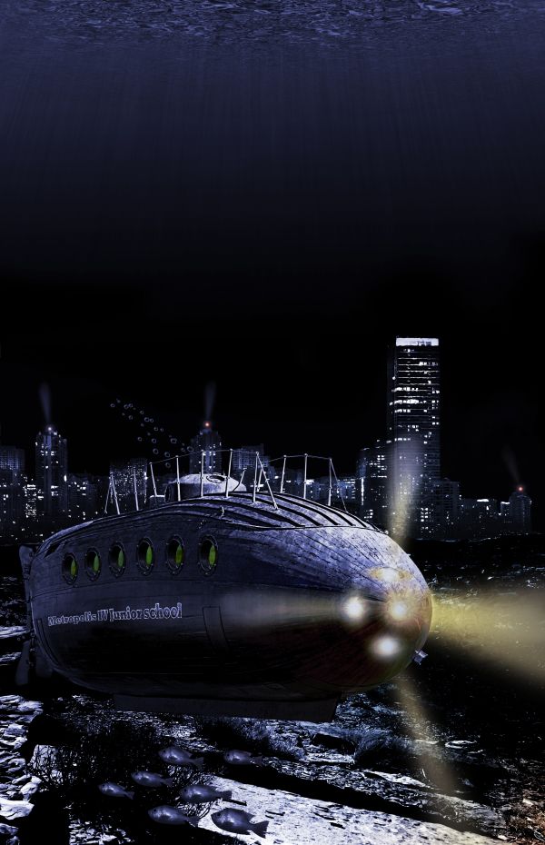
2027, The kids from the 'Metropolis IV Junior school' located in the underwater city 'Sub Metropolis IV' are having a field trip today to explore there new world in the school submarine...
Thanks to Antonio Jiménez Alonso, Ken Lund, ben kaye-skinner, Robson Oliveira & Renato Sakamoto for the great stock :-) (5 years and 3828 days ago)
Nice looking pic, but remove the supports underneath the sub! (And maybe make the conning tower a bit more blue to match the rest...).
I agree with both cmyk and Nator. Also front of sub is very badly chopped in high res. You used magnetic lasso too or magic wand, didn't you? Adjust the contrast if you want to use magic wand but I would have just used polygonal lasso with a 2px feather. It will give you a better chop. There are vague children’s faces in the window rims. Are they from a source or your own creation? I'd just try to make them looking through the glass. You should put the “School Sub IX†back, it was a nice effect. 
Thx for advice, i wil try to fix them. There are no children in the window rims. I used the source without changing it. 
Well put some in there then. 
EDIT: I see you added lights but you should at least remove the stilts. They just don't look right if it's a sub underwater. It would not need them. Remember realism is the key to this contest.
Voila, it was a lot of work, but i think it's ok now ?? 
You got your work cut out for ya because it looks MUCH better. Glad you decided to put a name back on the sub, fix it's edges and remove the stilts. Glad I held off on voting. I can give you a better vote now. 
Thanks jawshoewhah 
Lots better. 
I will not be surprised to see you place because you decided to use our tips, you have quite a contender.; 
Great image... looks very apocalyptic.. very nice take on the theme. Good luck.
very nice 
Very good, You seem to have a put a lot of effort into the sea floor (which i liked) at the beginning of your SBS and i dont see it anywhere, how come?
Thx for comments all  . PhotoRepair the first ocean floor was just a stock photo and i just pasted it in, but i did not like the combination with the city. It was a bit boring for my likeing
Congrats on your placement. It should have been 1st.
Congrats for your third place, Clinge!
Congrats
Howdie stranger!
If you want to rate this picture or participate in this contest, just:
LOGIN HERE or REGISTER FOR FREE
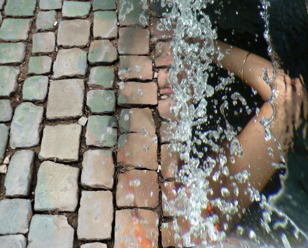
Thanks to Muzo for the stock photo.
LOTS of masking going on here. I believe at some point I had to mask my masks. I hope you like. Constructive comments are most definately welcome. (5 years and 3842 days ago)
Very nice indeed, i like it. GL 
pretty slick
Howdie stranger!
If you want to rate this picture or participate in this contest, just:
LOGIN HERE or REGISTER FOR FREE
very creative and well done
The water bottles are very 2 dimentional. Try using an external source.
I agree with jawsh comment, you may use distortion of the background and shadows on the bottles to make them look more realistic
Thanks ... I played with it alittle does it look any better? I went this way because I couldn't find much on internet that wasn'y copy righted
It doesn't look too much bettter. Did you try flickr? You'd be amazed what you can find.
Howdie stranger!
If you want to rate this picture or participate in this contest, just:
LOGIN HERE or REGISTER FOR FREE