Thanks:
http://www.sxc.hu/photo/311998
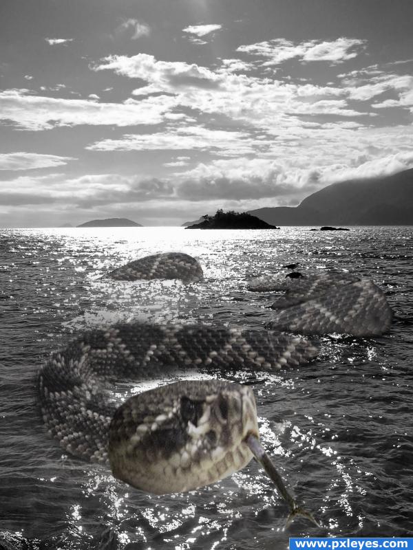
Snake
bubbels (5 years and 3848 days ago)
- 1: snake
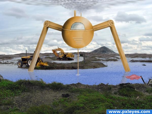
Pumping water to construct. (5 years and 3850 days ago)
ACK... invader invader.. hehehe..good luck!!!
Very nice, i'd like to see it look a bit grittier.. if you wanted to you could overlay some kind of metal scratches texture on the pump, just to make it feel more mechanic and more sterile, but really good job on the whole image! I'll leave my vote in case you change it, buit even if you don't.. i'll give you high marks!
thanks you for the comments. I'll try going grittier. I was having a hard time thinking of what to put as the main focus. Didn't want to copy other ppl's entries.
Hmmm. The perspective on the legs is wrong? Or at least you need a third at the back or something? GL
Yes i need to put the two legs behind the sphere. then perhaps create more legs.
The waters edge is in serious need of blending. Maybe use the 'blur tool'.
A reflection on water would help this greatly. Nice job.
cool idea
Howdie stranger!
If you want to rate this picture or participate in this contest, just:
LOGIN HERE or REGISTER FOR FREE
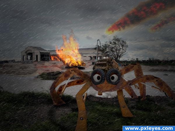
Hope you like it.
The mechanical spider or whatever you'd like to call it is made from parts of the digger in the source.
Do see SBS. (5 years and 3850 days ago)
I like it, but i'd definatley like to see an SBS. Good luck 
Thanks ponti55, I will get to work the SBS.
Good image...flames should have the same intensity above roof line...
Thanks CMYK46, and yeh I know what you mean. I'll work on that.
Made that change now CMYK46.
Love the take on the source Author.. I love the eyes.. keeps the mood light  Perspective expansion on the feet is awesome
Thankyou for such an encouraging comment GolemAura.
SBS is now up and running.
hahaha love how wacky the spider looks almost cute ! :>
it's coming to take me away haha, it's coming to take me away hehe
Howdie stranger!
If you want to rate this picture or participate in this contest, just:
LOGIN HERE or REGISTER FOR FREE
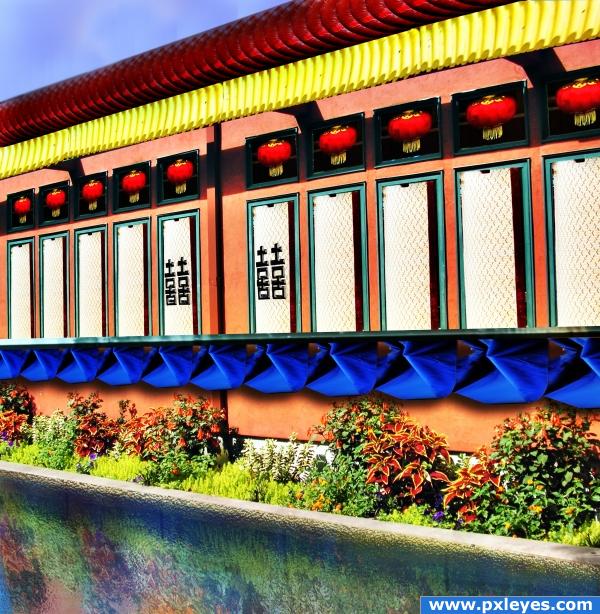
source and my pic (5 years and 3854 days ago)
It looks nice, but i think you should add some ripples on the water, because even though on the source they look realistic, they're not too convinving on your entry. Good luck!
Perspective on letters is off, agree about reflection...
EDIT: Looks better now. 
fixed
Very nice idea! But it hink the picture looks a bit blurred.
colorful
good job redesigning that snack bar; I also like that you used your own picture
very artistic!
Howdie stranger!
If you want to rate this picture or participate in this contest, just:
LOGIN HERE or REGISTER FOR FREE
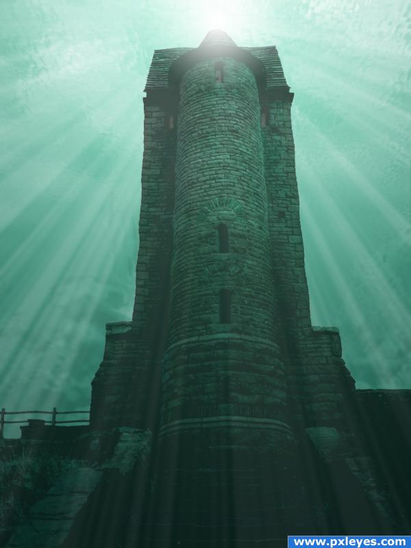
I have not used any external source.I have worked on different layers using the gradient toul, image adjustments,blend mode, opacity and the photoshop filters.
Correction:Add noise to the seabed with the external source.Corrects hue and saturation. Apply gaussian blur, blend mode to Luminosity, low opacity and High brightness and contrast.
Correction: Apply filter distort wave to the birdhouse water ripple.Maybe not a good idea with these parameters.
(5 years and 3859 days ago)
Maybe a little simple, it's very nice, but you should try changing its location or doing something a bit more complicated. Good luck!
This kinda reminds me of the story of the fish and the bird who fell in love but the fish could not live in the air and the bird could not live under water. So they were eternally sad. But I think the location is perfect. And the light source and the beams are well done. I would, however add some other underwater elements. Really excellent job on the surface, too. I will hold off on my vote in case you decide to add more underwater stuff to it.
wow awesome!
You could add a water ripple to the entire building to give it a more under water effect... just be careful not to over do it.. sound Idea all round though 
This is very well done but I feel it's missing something. Add some more atmoshpere. Maybe find some sources of fish, shipwrecks and/or underwater plants. This entry really has the potential to go that little bit further.
You say you have used no external sources but you have linked one anyway. Explain?
neat colors
Howdie stranger!
If you want to rate this picture or participate in this contest, just:
LOGIN HERE or REGISTER FOR FREE
Try to work on the selections a bit more, there's a halo around the tongue. Good luck.
also, the edges (of the head) are too sharp and pointy
great idea, but not the right source, the image is nice and crisp while the snake is a bit grainy, id try to find a more vivid snake to do the image with. nice job
holy cow! It is coming out of my screen!
Howdie stranger!
If you want to rate this picture or participate in this contest, just:
LOGIN HERE or REGISTER FOR FREE