(5 years and 3996 days ago)
- 1: source1
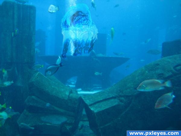
The Water Monkey is a mythical creature in Chinese folklore. In stories, it is an animal that lives underwater in one of the many lakes of China. The Water Monkey reportedly likes to drag people under the water, sometimes resulting in a drowning death. The tale of the Water Monkey is used by adults to keep children from playing in the water.
http://en.wikipedia.org/wiki/Water_Monkey
When I saw Monkey. I knew I knew I had to do this one. Especially since it was a 'Water' Monkey. So the basics came to mind and thought for more realism, keep it as real as possible. So I kept everything underwater. Found the monkey that looked evilish. Great underground city stock. Also used a 'Splash' image of water which i blended and wrapped around the monkey to give it some type of depth.
A while back on good-tutorials.com I saw a tutorial on which to turn people into water. Obviously it works on monkeys too, go figure lol. Link provided to tutorial as well below. Great tutorial. Must say I did go off and do my own thing on a few of the steps and skipped some of theirs. But without their idea of 'plastic wrap', one filter I used a lot way back in the day. But forgot about it. Hope everyone likes
-NOTE-
I did find several mythical creatures on the wiki page that were identical to many others. Basically there were many duplicates.
----------
please view high res for better features
----------
From DeviantArt.com Photographers
Cotton-Top Tamarin by ~Skelton-Stock
Splash V by ~BestStock
Atlantis Stock by ^Cedarseed (5 years and 3997 days ago)
BTW will add my own SBS later after i get comments and fix my image best i can. THANKS ALL in advanced for rating and tips.
-NOTE-
Please do look at the HIGH RESOLUTION for a clearer image, it is VERY hard to make a monkey out of water, maintaining its face and features.

Very nice effect. Good job!!
you need to give credit names to all the deviantart artists you have used, also you need to put links on all their pics so they can see what you have made here.... otherwise its not following their rules  goodlucj, would hate to see your entry removed
  also im glad you put in the tutorial, ive not tried to make an image like this yet...
ty oliviasarts, i forgot to send them comments n stuff, i will put their names. ur welcome for the link on the tutorial. it was an amazing tut forgot bout it till i read water monkey, and im like hmmmmmmmmmm i remember seein somethin like that
cooooooooooool
very nice 
Beautiful. Although I had trouble finding his face in your composition. I understand that water animals are difficult to pull off. Nice job. Good luck.
chakra1985 u stole my MONKEY!!!!  LOL
LOL
Howdie stranger!
If you want to rate this picture or participate in this contest, just:
LOGIN HERE or REGISTER FOR FREE
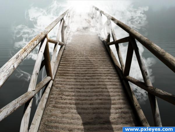
Song by Paul Simon and Art Garfunkel. Source links noted. Thanks to mjio for water image, thanks to jhonnyt for bridge. (5 years and 3998 days ago)
cool!
Howdie stranger!
If you want to rate this picture or participate in this contest, just:
LOGIN HERE or REGISTER FOR FREE
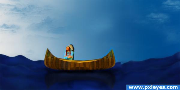
All sources used from the given contest photo only
SBS added (5 years and 4003 days ago)
very excellent work on this .. he kinda needs a paddle.. but that's a personal choice.. he doesn't seem to be INSIDE the canoe.. Kinda behind it... but it could be me... some of the others may be able to help you  .. good luck..and very good work.. your SBS is awesome
EDIT: Solid Improvement.. well done, really looks like a painting 
just lower the indian to the front edge of the canoe (step 12 of sbs)
Ugh...water not look too much like water, kemosabe. (Clouds are too repetitive).
cool it fits well! perfecto!!!!!!!


 high marks!
really nice!! 
its a grt idea.......but sry it still looks behind.............
i'm getting seasick
Howdie stranger!
If you want to rate this picture or participate in this contest, just:
LOGIN HERE or REGISTER FOR FREE
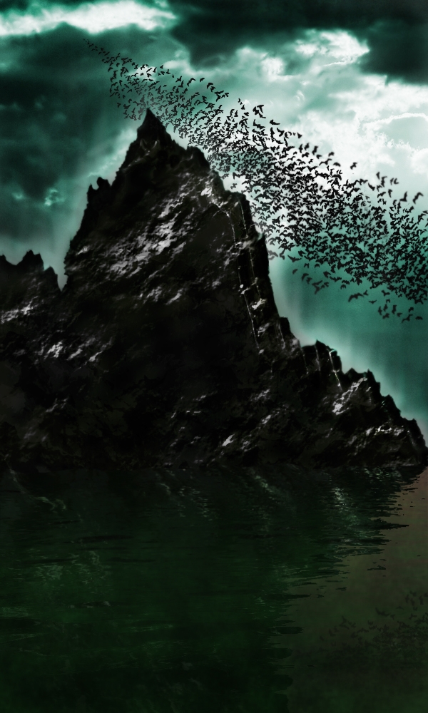
See the step-by-step! :) (5 years and 4008 days ago)
Very batty  ...nicely done indeed...good luck.
whoah cool
Great atmosphere nice work!
Thanks a lot CMYK46, Tuckinator & Warlock! 
very nice feel
gud work + imagination.......bt mountain's top area luks bit flat.....
cool
reminds me of the bats movie lol great mood
Thank you. How should i make the mountain look more realistic? (not flat) =)
really nice idea & job author ... GL
hey nice work
cool
Thanks to all of you! 
very nice balance of shape and form author.. the two merging triangles are a risk as they could easily throw you up and out of the picture but the complex base really retrieves you back into the focus of the whole composition.. quite nice.. even though it is very dark.. but that's just me and my eyes  (I'm a tad bit addicted to color
  IMHO
IMHO
take off, or reduce the outer glow on the mountain.. will make it look more realistic, and if your going to put a blur on any of the bats, put it on all of them. it actually doesnt look bad with a minor blur. maybe make a copy of a flattened layer (select the top layer and press command+option+shit+E, this will duplicate all your layers and flatten them into one) after that, do a bit of a diffuse glow (if that helps with the brightness) or add a medium gaussian blur, and set the blending mode to overlay, and bring down the opacity to around 20. this'll help give it a smooth, yet sharp effect.
great feeling! 
Excellent idea.. nice work author ! good luck!!
So unique and creative, realyl nice work!
WoW Thanks everybody. Thanks for all your fantastic comments! ^^
Congratulations for 1st
Congrats! Well done!
Omg.. I won? :O Thanks for everything guys  !
!
Congrats 
Congrats, well done 
Congrats...good job! 
Congrats!
Congrats for 1st 
Congratulations!!!!
Congratulations!!!! 
yesss, you deserve this first, very well work, congrats.
Thanks to all of you!!! 
Howdie stranger!
If you want to rate this picture or participate in this contest, just:
LOGIN HERE or REGISTER FOR FREE
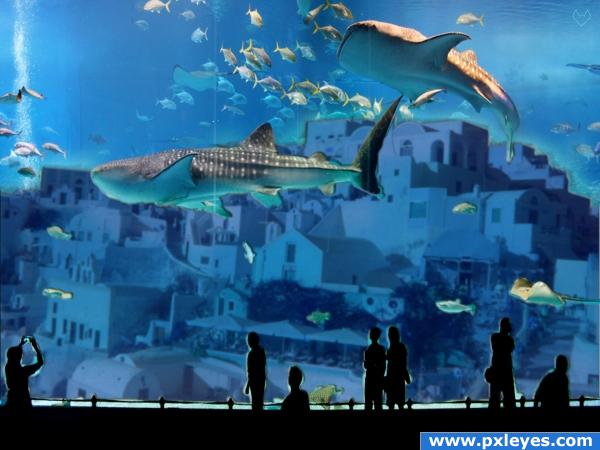
love the flicker photo, nice find looks good author
Great idea, looks really nice, but in my opinion the actual buildings need a little bit of sharpening. Good work and good luck!
Very inventive.........good luck
wicked awesome
wonderful work author
Interesting image.
good job!! good idea!
very nice
The masking around the people could have done with a lot more work.
love the lights on the viewers. but there are two lines on the glass don know if they are meant to be there or was any scrap. good idea.,
cool underwater worl...high res?
Howdie stranger!
If you want to rate this picture or participate in this contest, just:
LOGIN HERE or REGISTER FOR FREE