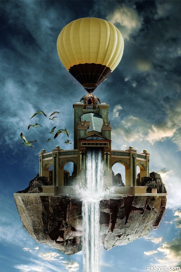
(5 years and 2794 days ago)
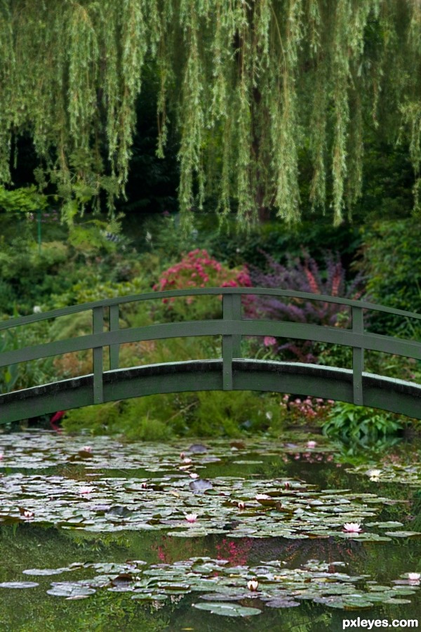
own photos
1. willows over water,
2. bridge
3. water lilies (5 years and 2809 days ago)
Sweet. 
Thank you, it's one of my favourite paintings, so I just had to try.
Very good recreation and lovely photos! I have a little nit pick, the bridge could be a little lighter and more gray like the painting to separate better and the vertical supports on the bridge should be parallel to the vertical plane IMHO.
Thanks, I'll give it a go.
Hope this is better.
Looks great to me! Looks like it could have been the inspiration for the painting!
Thanks
There is no doubt as to which painting this is! Right on theme.
Beautiful work, very believable as the inspiration. 
Howdie stranger!
If you want to rate this picture or participate in this contest, just:
LOGIN HERE or REGISTER FOR FREE
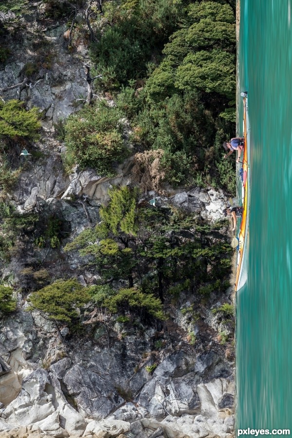
I made this manip. by masking the rock and together and turning them so they where showing up. I did a motion blur on the water to make a feel of motion. (5 years and 2833 days ago)
Also the canoe needs a motion blur, I suppose! IMO
Howdie stranger!
If you want to rate this picture or participate in this contest, just:
LOGIN HERE or REGISTER FOR FREE
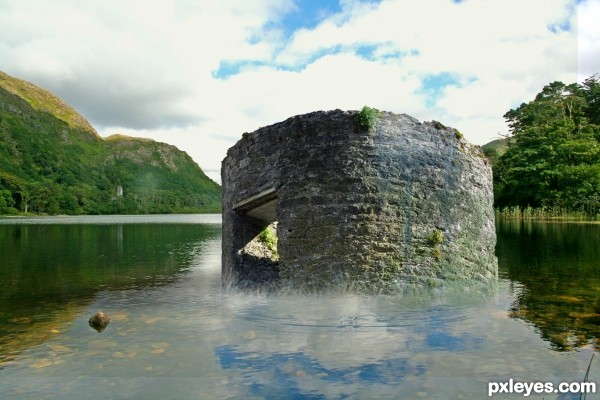
(5 years and 2834 days ago)
Wrong perspective, needs a reflection.
The ruin reflection is needed, not a most saturated sky.
Howdie stranger!
If you want to rate this picture or participate in this contest, just:
LOGIN HERE or REGISTER FOR FREE
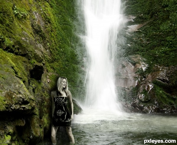
Source image plus my own photo of the waterfall.
Photoshop Elements 6 - used layers to add in the girl, some of the incoming wave and made some level adjustments. Added layers to create shadow, colour matching and blending. (5 years and 2843 days ago)
Light comes from above, so I suppose that the girl's shadow should be less darker, and maybe not above her head! Just a suggestion and my opinion. Good luck author!
I appreciate the suggestions/tips.  Thank you.
The girl is too desaturated for the background, and the drop shadow behind her really makes her look artificially inserted into the image. It does not blend well as a cohesive composition.
I was trying to match the shadowing to the level of harshness on the rocks, but I see your point and thank you for the critique.
Howdie stranger!
If you want to rate this picture or participate in this contest, just:
LOGIN HERE or REGISTER FOR FREE
looks great!
Nice colour and light blending. Good luck author. Fav here...
#WOW! many thanks for all that votes, faves and the sweet comments! only 3 entries and though a great competition! thx mates
Congratulations!
Congrats!!
Congrats very well done
congrats
#thank you for all the congratz!
Howdie stranger!
If you want to rate this picture or participate in this contest, just:
LOGIN HERE or REGISTER FOR FREE