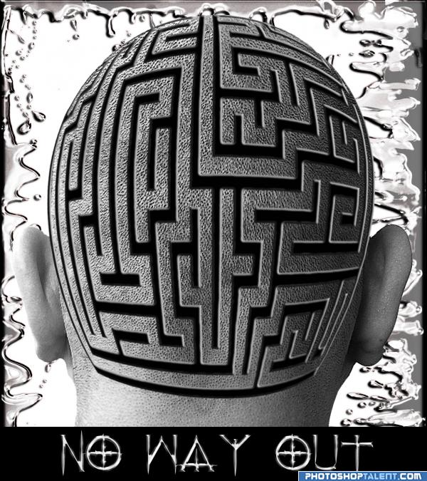
The old one... (5 years and 4022 days ago)
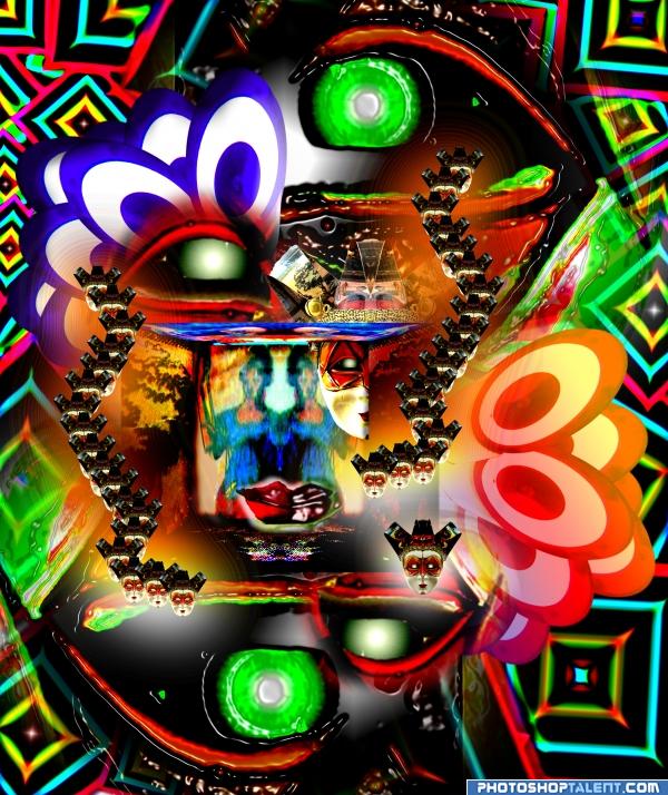
Created while listening to this song
Symmetry by Jane Siberry (Now ISSA)
...or say you're in a room
and there's a beautiful fire
and you're looking out the window
(at the snow and the winter streets below)
but your eyes keep returning to the fire
this is what I'm thinking
the reason your eyes keep returning to the fire
is because it divides your sight
into left and right
and dark and light and dark
like a fine dividing wire
here's another thing
that I noticed last night
when he kissed me over there
he usually kissed me over here, too
I must have known it in my heart
and with my inner sense of art
because when I kiss him over there
I never kiss him over here
it's the way of the world
people do it everywhere
if you're going to do it over here
then usually they do it over there too
symmetry is the way things have to be
symmetry is the way things have to be
or say you're at a table
and you have your forks and knives
do you move them around
'til you get them just right?
(this is while you're talking to someone)
or you work in a nightclub
and you notice that
even though you try to seat everyone on one side of the room
they always spread themselves out evenly from this side to that
like atoms in a model
it's the way of the world...
or say you're in an air show
and you're flying with two other pilots
and you want to do it right
because you like to do it right
and one guy is flying
at the tip of your left wing
and the other guy's off
doing his own thing
would it bother you?
it bothers me
it's the way of the world
(5 years and 4023 days ago)
nice lyric, oops, ah, i mean nice entry, hehe, good job author, very colorful

Edit:Egyptian football

Egyptian football you 
EDIT: Egyptian Petunia you?
Okay I can guess without voting, who the author is 
edit: Bang On Target  Anyways nice picture
Interesting!
Great 

Woah so much is going on here its rather confusing! Totally random and weird, is not a bad thing, I love random! Nice work.
Well Ory, think of it as an entire wall image, it's not so random, I did everything in it in symetry 
things are asymetrical there and make me think of chaos;I imagine one could see this at a disco while being on shrums:P
very nice, good colors, lot of work
very nice 
Very nice entry and colors are too good......G/L Author.
wow
..trippy!! 
great job. like the color 
good.
Howdie stranger!
If you want to rate this picture or participate in this contest, just:
LOGIN HERE or REGISTER FOR FREE
(5 years and 4025 days ago)
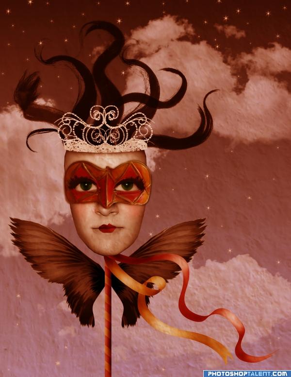
when you added the stars the background went all flat cotton.. if that was your intent.. then kudos.. if now.. you might want to put the clouds back.. I kinda like both versions.. so I'm on the fence.. good luck
i forgot to mention on one of the steps about the texture, it was taken from the wall of the source image. that is what probably makes it flat cotton as golemaura mentioned, so, yes, it was intentional.
Not bad, but the crooked head drives me crazy...
Very nice use of colors and nice composition. 
good work, crown is not in centre.
Very nice...
unique  goodluck!

Nice mood here ilike it good luck!
very nice 
thanks for the comments. fixed the crown.
nice!!
cool 
Wonderful job  Good luck author
looks somewhat surrealistic great imagination
wow.
Just what you need to cheer you up after a bad day! Good work, and high marks from me.
this is so beautiful...
very nice
always good to have a little surrealism in the contests
Howdie stranger!
If you want to rate this picture or participate in this contest, just:
LOGIN HERE or REGISTER FOR FREE
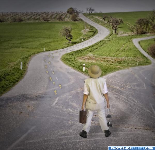
I duplicated the road layer and blended it in to look as though it were coming out of the other road, then, using the pen tool, i extracted the explorer from Deviant Art and placed her in the image. I then used various adjustment layters to blend the lighting, and i also added a shadow. Enjoy! (5 years and 4037 days ago)
very nice work here, you've kept the main source a real key feature of the picture whilest adding a completely unique take on it compared to any others entered sos far... good luck dude 
Good idea! Shadow should be more to the right...look at shadows in the source pic...
I don't know about this one.. well maybe I do.. I'm not really sure.. no wait, I think I got it now.. well maybe you could try.. but I don't think.. heheheheh. JK.. great piece.. very good IDEA
awesome
Idea is nice, but foot print is not necessery(and it's light yellow color - look like someone stepped in paint or something)
if you try to give an expression of wide and much trodded path, you could add even more footprints! good luck!
Useful comments by everyone! Thanks!
nice idea
Howdie stranger!
If you want to rate this picture or participate in this contest, just:
LOGIN HERE or REGISTER FOR FREE
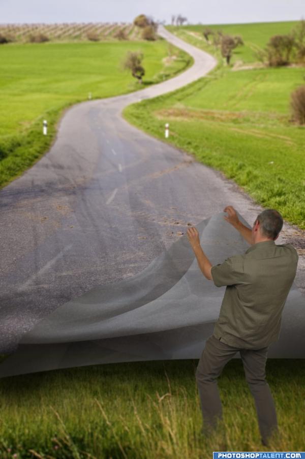
i used some images of fabric, then i cuted using shape masks.
I like this, but was sure I had seen it somewhere before http://alltelleringet.deviantart.com/art/Go-your-own-road-111657665
you´re totally right, i saw that job before...i think the idea was round in my head, and i aplicate thinking that´s my.
i´m so sorry about this..please don´t will vote that, beacouse im an oposite from copies!!! (5 years and 4042 days ago)
Shows imagination 
I like this, but was sure I had seen it somewhere before http://alltelleringet.deviantart.com/art/Go-your-own-road-111657665
Orignal idea nicely done
Well Done!! Best of Luck
@BarkersEgg: Good link, go your own road!!!
Author, your pic may or may not be different enough from the link BarkersEgg supplied. In my opinion it's not. That said, the underside of the road surface he's lifting would be a LOT darker. Think about being more original next time.
@BarkersEgg, thanks for sharing that link, that image is amazing. To author of this image, well done mate...  goodluck.
Great! I like it very much! Great job! 
@ barkersegg: I've seen the image you've linked featured in a magazine this month (photoshop creative mag, i think). That said I think it's a decent effort author. Although I agree with cmyk that the underside of the road should be alot darker.
I don't think there's anything wrong with having an outside inspiration. The real issue is how well that inspiration was implemented here. I don't understand why the background has become blurry or why the lifted-up pavement seems fairly transparent. Also, the perspective of the grass the guy is standing on doesn't match the perspective of the background.
good work
The blend can improve, anyway good work and good luck.
The idea is good execution needs a little work
I don't think grass would grow under pavement! But I like the idea.
i wonder what he's looking for lol, gl nice work
NICE blending
yikes.. I missed this the first time round.. I think you've bent the idea enough .. I like the finished image... the point is well received.. good luck
you did very well
Howdie stranger!
If you want to rate this picture or participate in this contest, just:
LOGIN HERE or REGISTER FOR FREE
Nice blend, i like your idea...
very clever and brilliant idea
very wonderful piece.. you really don't need the text with it already in the title
Nice blend, cool idea. The bottom left and right seem a bit too warped. If you could pull them out to match more of the neck shape...it might help.
i like it sort of
Great idea very nicely executed
thats a cool idea
good work
Good job Author......... G/L.
I'm not too sure about the text in the image.. in my opinion you should just remove that altogether. It's a very nice piece either way, good luck!
Good idea ...... all the best
old but gold . good job. GL.
lol... nice thinking there very original
gl
Usually this must be a congratulation comment. But this time I feel .strange. You deserved the first place.. Your entry was the most original and good idea in this contest, Sorry.
Congratulations for 2nd
Congrats! Well done!
Congrats, great picture
Congrats!
Congratulations!!!!
Congratulations!!!!
Howdie stranger!
If you want to rate this picture or participate in this contest, just:
LOGIN HERE or REGISTER FOR FREE