Credits to:
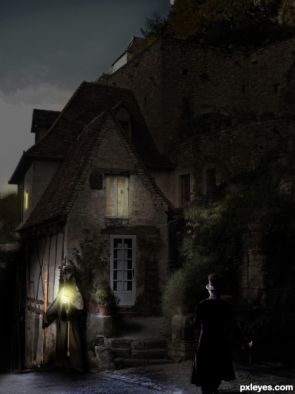
MontvalentStock from DA for old house
Falln-Stock from DA for model
(5 years and 3434 days ago)

(5 years and 3496 days ago)
I like it, not over chopped. Nice result
nice clean chop...gl
CREATIVE!!! 
I was thinking it might make for a lot more literal meaning if you just made the road stop and go strait up in a 45 degree angle. Just a suggestion. GL!
Reply to jawshoewhah: That would indeed also be literal.
However in my eyes:
The original meaning of the trafic sign is telling: You should go straight ahead. (forward)
And in my perfect world the sign would have an elivated road just as in the picture.
So now the sign is telling you have to go Upwards.
Also i like to keep my pictures Semi realistic.
So when u look at them you might at first think it actualy is possible.
Thanks for your comment, however i can not do anything with it.
As you idea is completely differs from mine.
Clever idea, reminds me of my corny jokes in the car when I see a sign for straight ahead haha.
Howdie stranger!
If you want to rate this picture or participate in this contest, just:
LOGIN HERE or REGISTER FOR FREE

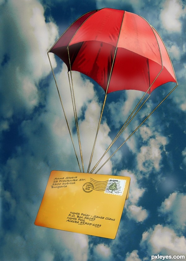
Hope that one day it will reach its destination...
PS: The Sender's a fictional character... the street's name is my idea.
Still the country does exist as well as the town and the postal code! (5 years and 3496 days ago)
Cool idea. You could make that mail being held by to ropes of the parachute, something like this http://www.rosidel.ro/imagini/colet.jpg
Thank you  . I like your suggestion. There are so many ways to bring an idea to life
Very nice idea author...especially in this time of the year...well done
somehow the letter seems too stiff but otherwise nice idea
Gotta love this!!! Nice, clean work and so perfect for the season!
Hehe cute idea, good job, author! 
Lovely idea ! Nice work ! Great job ! 
lovely idea!!! only the way u attached the umbrella to the envelope looks a bit "suspicious"  otherwise I must say again, that i love it!
Howdie stranger!
If you want to rate this picture or participate in this contest, just:
LOGIN HERE or REGISTER FOR FREE

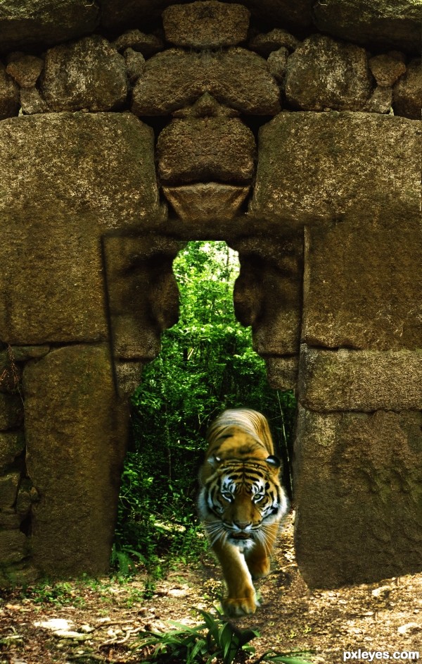
CMYK thanks for your input! I have fed my Tiger!! (5 years and 3516 days ago)
That's one mighty tiny tiger. 
Trust you...! 
... or is it a fantasy realm with really large plant life? 
Tiger fed!
Tip: when a stone doesn't fit in the ground right, cover up with some grass & bushes.
Tip2: when you're not sure of the shadows... cover up with soem grass & bushes.
Nice idea.... good luck.
Howdie stranger!
If you want to rate this picture or participate in this contest, just:
LOGIN HERE or REGISTER FOR FREE

(5 years and 3541 days ago)
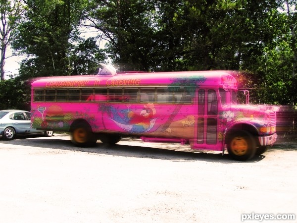
With the motion blur in front of the bus, it looks like it's more on the way to smashing into that car behind it...It's very humorous this way, although it may not be your intention...
Nicely done!
Motion blur wouldn't be in front of the bus.
I think the removal of the car is vital... the bus is parked infront of that car and now the bus is blurred at the begining of it's journey so much that it looks like it's already been moving at a specific speed!
lol ..its easy to guess ..that the bus is going to hit the car.
HEY! I went to Cheeseburger in Paradise in Caseville this year! Believe it or not, even though our family had a cottage there all my life, it was my first time going this year. MMMM, the burgers are awesome!
lol...never tested that
Howdie stranger!
If you want to rate this picture or participate in this contest, just:
LOGIN HERE or REGISTER FOR FREE
The lighting on the lower RH corner is inconsistent and unrealistic. The figure would be more visible, while the highlight on the hat and face would not be so bright. There would be no glow on the top of the hat, rather there would be a consistent backlight glow around the entire body.
The light from the standing figure does not correspond to the light at his feet, nor especially to the light behind him. It is as if there is a street light mounted on the building behind him, and he's holding a flashlight while standing beneath it.
It's a nice image, but the day to night lighting concept needs much more consideration...
this is very very cool composition author...love the mood and the details...and please don't listen evil tongues...
Thanks eration I felt like I have done a serious crime
Author, you have done a good job..
Really nice! I like the details you've added, but would expect to see a cast shadow on the wall on the left side of the guy. Good luck!
Though it seems more twilight than night, I absolutely love this. Well done and good luck.
hehe.. reminds me of an old cartoon.. where this guy is walking home and there's this huge hideous monster waiting for him on the path and a thought bubble saying "Oh no, not this guy again LOL".. great image
love this, good luck!
Fascinating image ... if I were the guy in the Top hat I would turn and walk the other way. There must be a different route home!!!! Great composition and love the story it tells!
Lovely mood, well done author
Howdie stranger!
If you want to rate this picture or participate in this contest, just:
LOGIN HERE or REGISTER FOR FREE