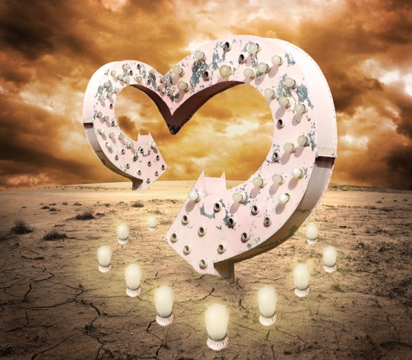
thanks for stock images (5 years and 3698 days ago)
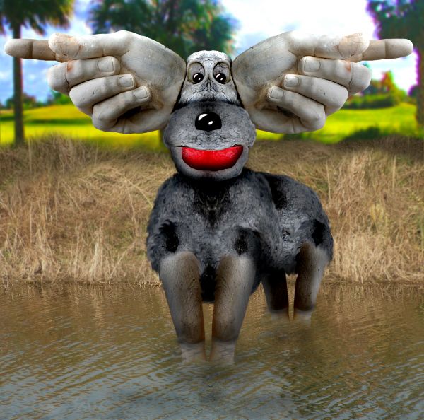
Source and My Pictures (5 years and 3755 days ago)
this is very cute
Try to burn out the light sources on the hands. There's no light source on any of the moose. Why not use a real moose, rather than (whatever you used) and put different legs on it but then again, the stone hands don't really match either...
Well Jaw... as soon as a moose wanders over here to Florida, I'll be sure to use one.. or if they get one at the zoo.. I very seldom ever use sources, except for the one I'm provided with... as for the burning... I reversed with the dodge tool and brightened the TOP of the piece to match Florida Sunlight.. but thanks for the suggestion (the body was made entirely from the wrist of the hand statue)
Howdie stranger!
If you want to rate this picture or participate in this contest, just:
LOGIN HERE or REGISTER FOR FREE
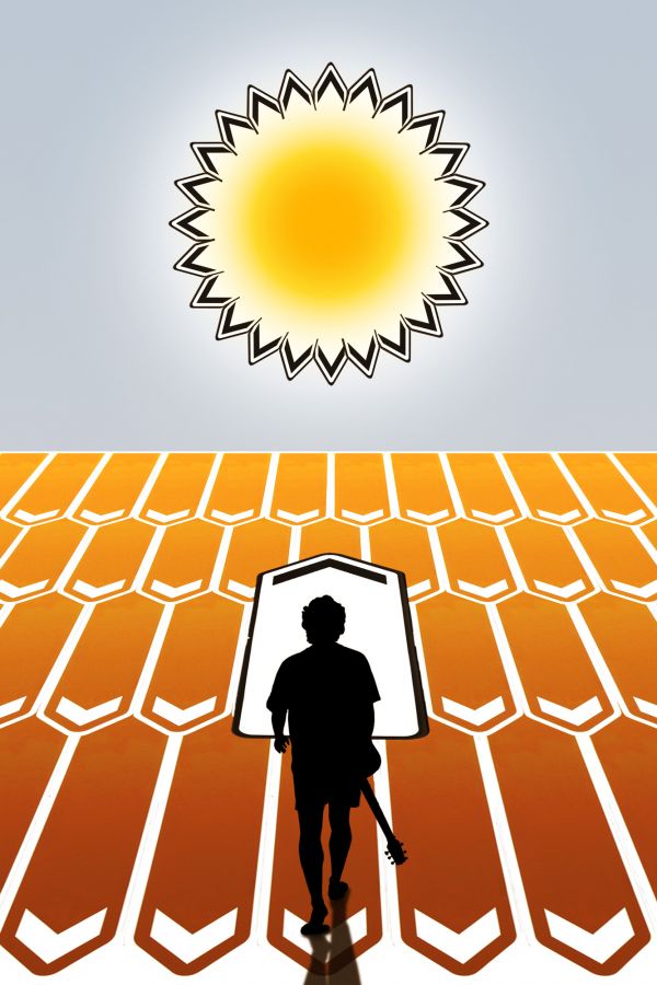
(5 years and 3756 days ago)
Wow! Very creative author! I like how you made your light source come from the image source. My only nitpick would be to maybe balance the edges of the white sign on the middle that you turned into a door (looks like door) Still very creative and unique use of the source. Good luck to you! 
Thank you jawshoewhah! A door? No, the white sign i supposed to be just a different arrow, pointing to a different way, the one the guy is following. But your suggestion gave me ideas 
every single part makes sence nice
nice
Nice image, but fix the shadow...
Thank you guys! I guess the shadow should be longer CMYK?
Shadow's lookin' good now. 

Whoa! Nice one, really. Very creative.
Cool looking image imaginative use of source
Nice work, I really think you had an inspiration when you created this.
Thanks a lot guys! Dollmommy, I think inspiration came from my crazy, rebel 70's 
Well done! What a message!
Congrats for your third place, Divair!
Congrats 
Howdie stranger!
If you want to rate this picture or participate in this contest, just:
LOGIN HERE or REGISTER FOR FREE
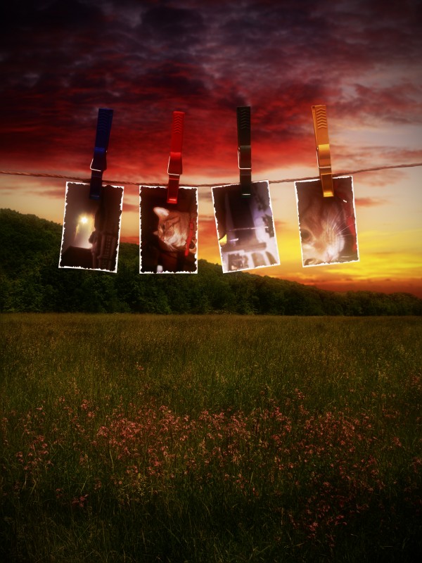
A traditional photographer left them up to dry (5 years and 3778 days ago)
Wow! i like this image very much, good luck.
Just my own opinion, but I think a background of a traditional black room would have been a better fit.
Good work 
Howdie stranger!
If you want to rate this picture or participate in this contest, just:
LOGIN HERE or REGISTER FOR FREE

drawn with mouse (5 years and 3779 days ago)
Howdie stranger!
If you want to rate this picture or participate in this contest, just:
LOGIN HERE or REGISTER FOR FREE
Whoa very nice!! Yes, I agree with nator, otherwise, awesome!
did it. thx
I think you should remove the pieces of cable. They don't have a reason to be there Otherwise very nice image
  GL
GL
I agree with Clinge, now they're only bothering the image. Good luck!
Nice work...good luck
Nice!
Good work, but the bulb sockets should have small rim shadows at the base to make it look like they're actually on the ground...
that's cool idea good luck
Bulbs could've been cut out a little better..but other than that great job..wonderful idea
great image! w/ all those light on the ground shouldn't there be less shadow underneath the big arrow? great entry! good luck!
nIcE IdEa....
Sureal sign...love it!
Nice composition ........G/L Author.
Howdie stranger!
If you want to rate this picture or participate in this contest, just:
LOGIN HERE or REGISTER FOR FREE