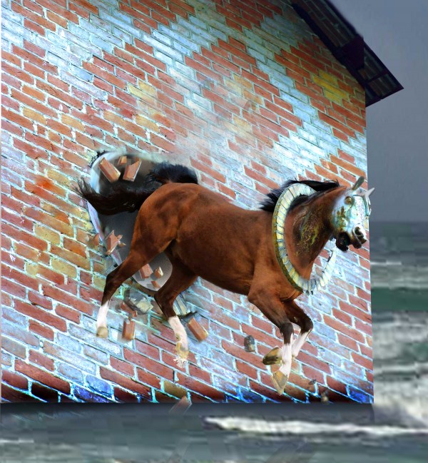
I used one external source of Horse
Thanks to http://www.sxc.hu/photo/1213061
Author: tayohorse3
(5 years and 3790 days ago)
- 1: horse
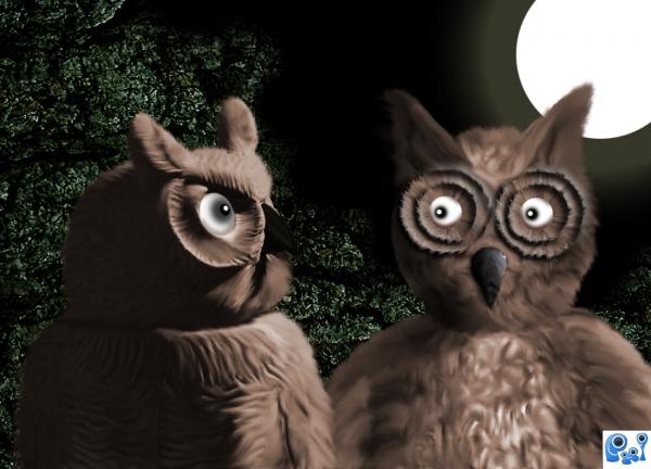
Under the full moon things happen, even in the wild life. some say that a full moon change their lives, some become different. Desires are in the air, and crime increases. (5 years and 3805 days ago)
Hahaha.. good job!
 ))))))) Good Title!Haha...good comment as well!The Moon is powerful...it's strange!I love it!
 Hilarious!!!
Fix the beak on the owl on right...it's flat and the beveling looks weird...
EDIT: Beak is lookin' good now! 
Thank you for comments... (really appreciated). CMYK, I will fix the beak....thanks for observation, I did not like it either.
Update: New beak added.... 
good humour author. GL
Howdie stranger!
If you want to rate this picture or participate in this contest, just:
LOGIN HERE or REGISTER FOR FREE
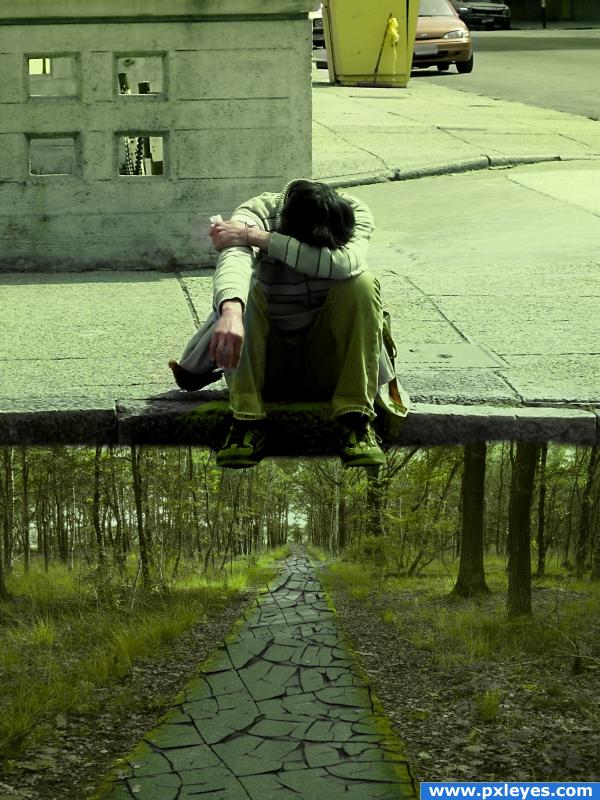
this is just an idea got from a cartoon series in television..here i placed two pictures and and just add gradient to the new layer and blend them linear light and hue..then i erased some of the area to show the skins real (5 years and 3820 days ago)
Nice idea, what does it represent?
Good image! The greenish cast kinda detracts from the source pics, IMHO...
I love the idea. IMO, though, his feet need to either dangle, or have something to rest on--they appear to be floating.
very good
Awesome!
ooh
I like this. It is thought provoking. Down and out in the city , longing to be in the country to gain peace and harmony within the person. I like the feet hanging. connects the soul ( the sole) to the country. only my interp of this image. i could be way off base ...
Poor guy... and the way is cracked!
very nice 
Howdie stranger!
If you want to rate this picture or participate in this contest, just:
LOGIN HERE or REGISTER FOR FREE
(5 years and 3849 days ago)
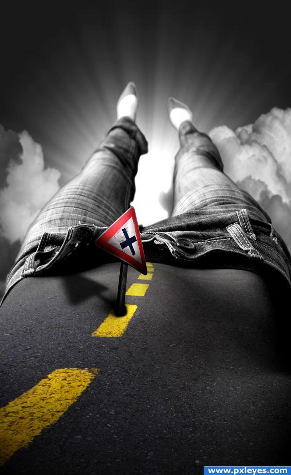
Although I think the blending is really cool and abstract...it doesn't really represent 'gravity off' imho...nice job on the image though!
the blending is pretty good, nice idea, but "gravity off"? i dunno
matter of opinion as far as gravity off. Nice blend though.
the shadow from the street sign is wrong direction unless this is from another planet with 2 suns
nice job 
Wow! different
Howdie stranger!
If you want to rate this picture or participate in this contest, just:
LOGIN HERE or REGISTER FOR FREE
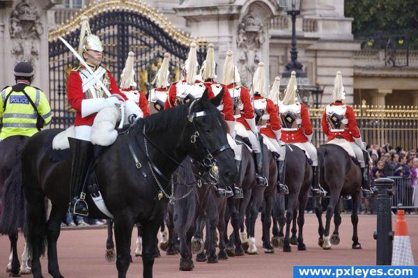
Source from Flickr : Uploaded
by Kol Tregaskes
Main works: mask / proportion / color match(management of color)
(5 years and 3855 days ago)
Just a suggesting, I would adjust the brightness/contrast a litle bit more to make it look less layered but kudos to the idea.
you found a great source, my suggestion is to try to make the horses all the same color, so slightly more brown with less contrast might make him fit in very well.
simple...and looks nice
ponti55: why the horses all the same color? Due prejudice the black horse went to the wrong way!!!!!!!!


very nice idea 
Congrats for another first place!
Congrats, well done 
Congrat Having Fun... 
congrats!
Congrats!!
Congratulations for 1st
Howdie stranger!
If you want to rate this picture or participate in this contest, just:
LOGIN HERE or REGISTER FOR FREE
very good
I have no clue why you put that background in. Doesn't make any sense to me. And the back of the horse I think should be still inside the wall. Like this it just doesn't show your intention which is actually great.
very nice use of source
great concept; background choice not so good though and it doesn't blend in with the brick wall
wow, I love your image.... good jov author. gl
the wall is magically floating over the sea - wierd. Good job attaching the body to the head, but the mane needs work too
Howdie stranger!
If you want to rate this picture or participate in this contest, just:
LOGIN HERE or REGISTER FOR FREE