Please SBS before vote please. (5 years and 1547 days ago)
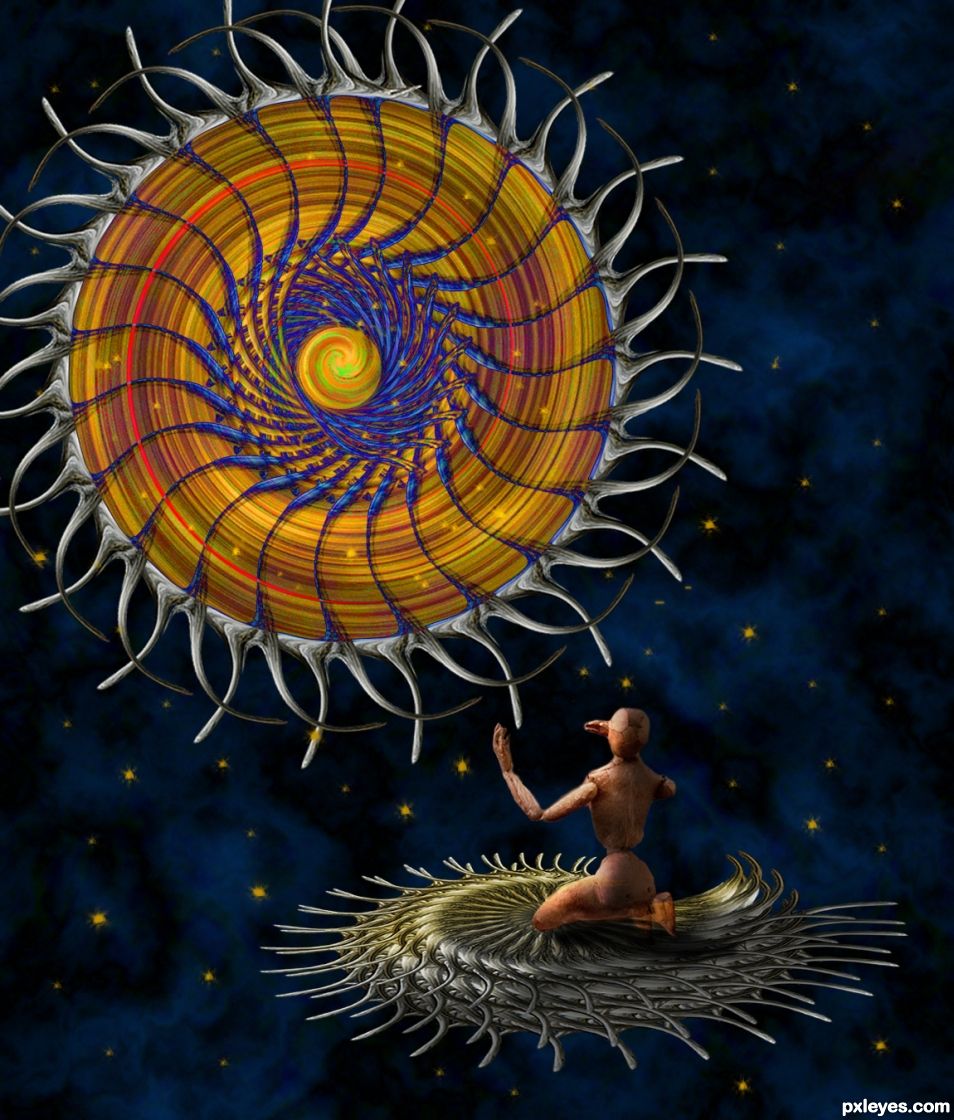
- 1: Wodden Puppet
- 2: Tree trunk

(5 years and 3080 days ago)
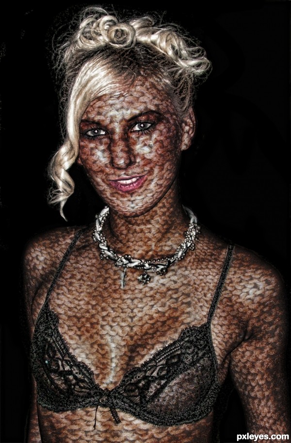
Nice blending on the torso. It's very annoyance to me proves you did a good job. 
caustic yet polite.. kudo's to you  (much appreciated
  )
)
I am lucky I am not her! Nicely done author 
Howdie stranger!
If you want to rate this picture or participate in this contest, just:
LOGIN HERE or REGISTER FOR FREE

(5 years and 3157 days ago)
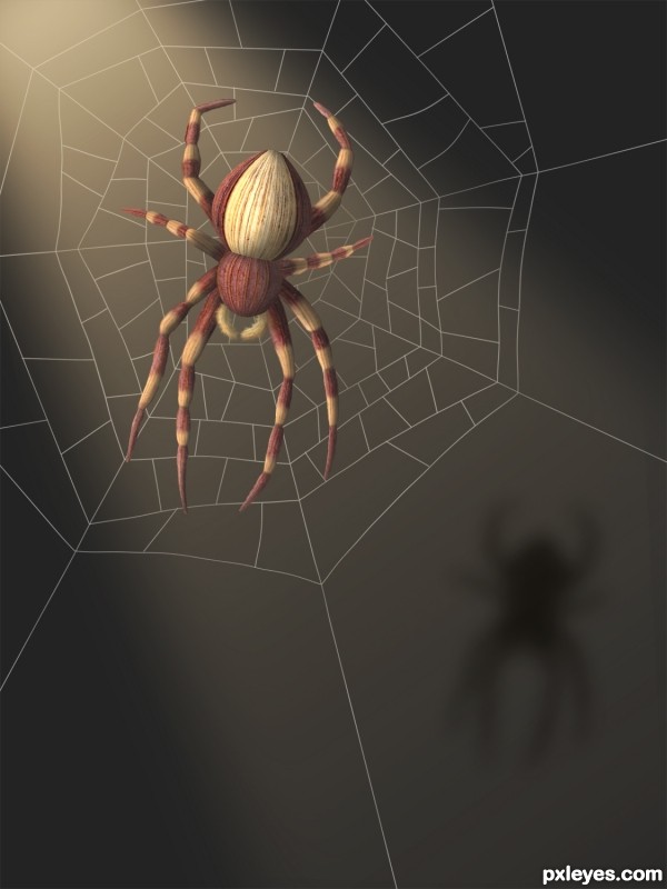
nice build of the spider and lighting -- just wondering if the web would not have just a hint of shadow seeing as the spider has one
Woo HOO and a Ham sandwich 
Very clean work and quite imaginative!
Good lookin' spider! Might have been better to use a real web as reference, though.
Good looking spider....and a good job! Good luck author.
horizontal pair of legs seem too short
suggest:
1) add abit more shading to the spider
2) add little suggestion of web on the shadow as well (no need to have full web, just a bit here n there)
3) saturate the whole image (personal perference) 
superb entry
really like the spider, great work
wish you had put a little more effort in making the web and background as amazing as the spider
really like the spider, great work
wish you had put a little more effort in making the web and background as amazing as the spider
still... my vote with you
Awesome entry
great work, very creative and well done. The net is a bit small for a spider this size, but I love this, nevertheless. 
very beautiful... this deserves a place...
nice work
Even thought I am not to die for spiders I must say this is an amazing work of art!!! Best of luck author, very well done!
@ Aheman: maybe you should spend a little time looking at the source pics before commenting.
And thank you again! Wow. Thanks! 
Beautiful work....congratulations for 2nd!!!!
Howdie stranger!
If you want to rate this picture or participate in this contest, just:
LOGIN HERE or REGISTER FOR FREE

Thanks goes to catalin82 for the image. (5 years and 3567 days ago)
nicely blended
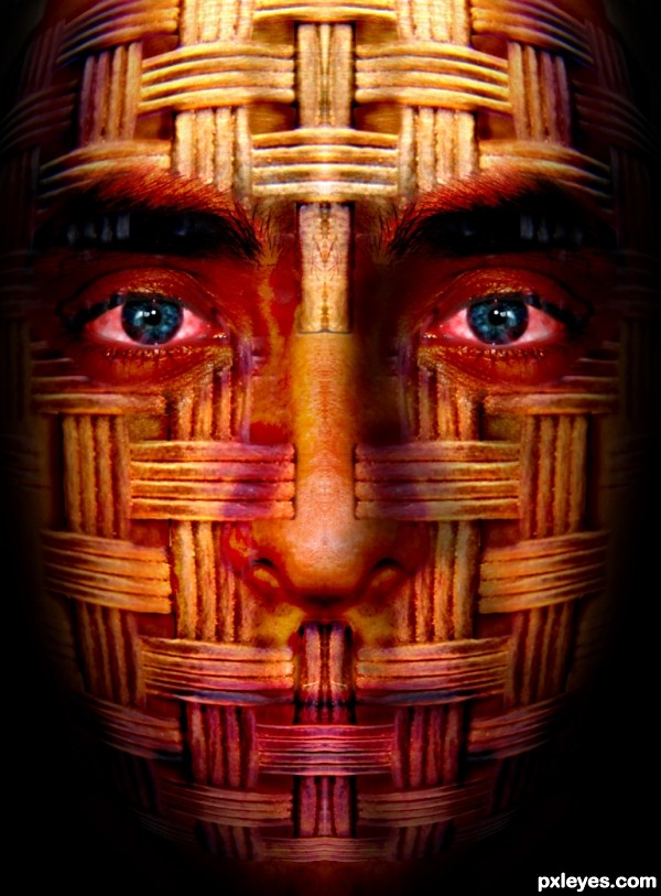
Not bad. You could work a little bit more with the eyebrows. I'm not sure if you left the mouth sealed on purpose, would be maybe cool to show a little bit of teeth or lips also? I like the coloring, if you could only make those eyes a little bit more sharp and focused.
Thanks for your comments. @Widiar: darkened the eyebrows & sharpened the eyes slightly but I want to keep the mouth the way it is, thanks for your suggestions.
Interesting idea. Using a displacement map would make it even better. So would adding a SBS.
Howdie stranger!
If you want to rate this picture or participate in this contest, just:
LOGIN HERE or REGISTER FOR FREE
Nice triangle balance for me. (My eyes not the chop). very lovely color in the background. Good work!
Thanks, comment appreciated.
suggest a "vortex" feel from the centre of the "ring".
dramatise with intense "saturation" may make it better.
good composition and idea!
Thanks for your comment, I added a kind of vortex and increased the color and saturation. Added some starts too.
You added a swirly whirly thing a ma bob, cool
Beautiful work, Author, love the idea
Thanks my friend.
Congrats on 4th
4ths are fun to win too.... thanks my friend.
Congrats, George! Love this wooden guy and the sun like dream catcher
Thanks my friend...
Howdie stranger!
If you want to rate this picture or participate in this contest, just:
LOGIN HERE or REGISTER FOR FREE