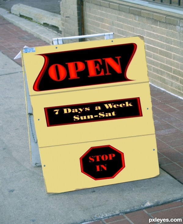
(5 years and 3418 days ago)
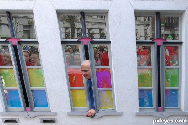
headmaster watching the parade. Thanks to CorneliaMladenova for the image of the children.
SBS coming as soon as I can. (5 years and 3440 days ago)
The two windows on the left are leaning, while the one on the right is correctly perpendicular...
Also, if he is looking down on the children, the reflections in the windows would not show the faces from a "straight on" view, they would be angled down, showing more of the tops of their heads due to perspective. For them to "reflect as they are, you would have to see the children in front of the windows.
Interesting idea, but the execution needs more work.
unfortunatly IM too late to get the rest of this sbs up online but if you go to .my albums there is one created specially for this competition . When you look at something the nearest part appears bigger than the bit further away. I in looking down at the figures was
1- higher and thee fore closer to the top of the window and
2- because its a reflection I was also looking down on the parade correct.
However the childrens heads would not have been much lower than the windowledge and therefore the angle would not have been very perceptible especialy as some of the heads are tilted anyway. Note the angle of the mans head in the original picture by CorneliaMladenova. That head was only flipped sideways no other angle was changed..
Maybe I should have called it  BIRDS EYE VIEW
very neat work...best of luck author
you do get the urge to see the parade (PAN DOWN.. PAN DOWN) hehehe.. good luck author
Ugh... I hate agreeing with Mossy....
Howdie stranger!
If you want to rate this picture or participate in this contest, just:
LOGIN HERE or REGISTER FOR FREE
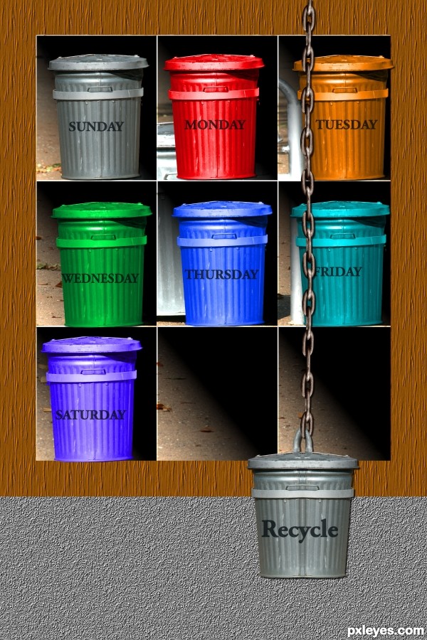
(5 years and 3580 days ago)
good
This one is cool!
Howdie stranger!
If you want to rate this picture or participate in this contest, just:
LOGIN HERE or REGISTER FOR FREE
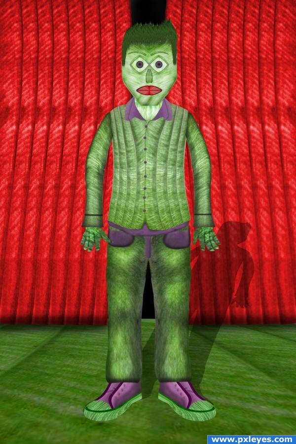
only source,sbs in progress. i am waiting your suggestions. (5 years and 3905 days ago)
lol... Good use of source!
I WANNA BE A REAL BOY!!!! hehehe.. good luck author 
so cool
Very good! Great constitution.
very nice 
Howdie stranger!
If you want to rate this picture or participate in this contest, just:
LOGIN HERE or REGISTER FOR FREE
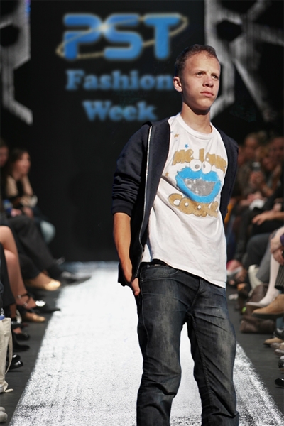
thx to Max Chernitsov at the source 1 (5 years and 4054 days ago)
Very funny idea good luck!
without his feet he's kinda bow legged LOL.. fleeing from lodd LOL welcome back
nice
He's a super model now!
nice idea.....but a persepective problem b/w both images...
good luck
Another image back from the dead - good luck..
lol good idea 
hardly the height of fashion... 
Work it Loddie! LoL
nice idea
good
good job and good luck
veyr believable lol
is that a PXL member?  ) in the spotlight, love it!
Howdie stranger!
If you want to rate this picture or participate in this contest, just:
LOGIN HERE or REGISTER FOR FREE
The idea is good but the perspective is not correct. It would have been better if you created your sign in a normal rectangle and then as a whole transformed it onto the board. To do this you could use the transform/perspective or transform/distort.
Edit: Perspective is much better now.
Thanks solkee I redid any better?
nice work author...u should work a bit more on a perspective of stop sign...everything else is cool...gl
Thanks erathion Here's a redo
Sorry I'm a nitpick on grammar....It's 7 days not 7 day's
Christy Thank You Much I took care of it
Your idea is good... I wish you could have done much better with the source, not only changing text...but transforming the image into something nice and beautiful....check the entry with the yellow flowers..... Good luck!
Thanks Yes its nice I may have never thought of that in that direction Thats why each time I do an entry I learn from others who may have gone and taken art classes or learned from other members who give comments to help inprove my skills Thanks
Howdie stranger!
If you want to rate this picture or participate in this contest, just:
LOGIN HERE or REGISTER FOR FREE