(5 years and 3661 days ago)
- 1: source1
(5 years and 3685 days ago)
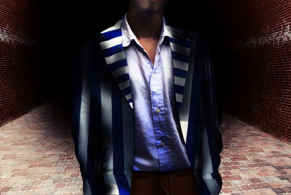
Haha...cool!
idea is very good but it looks incomplete.... need more depth, use the brushes and burn tool at the edges ... good luck!
I wouldn't say wierd... I'd say "clowny"? Hahaha! 
try dodge n burn to make it more realistic..............GL
nice work! the polo shirt is becoming more stained w/ blue though
its too much dark...
Howdie stranger!
If you want to rate this picture or participate in this contest, just:
LOGIN HERE or REGISTER FOR FREE
(5 years and 3779 days ago)
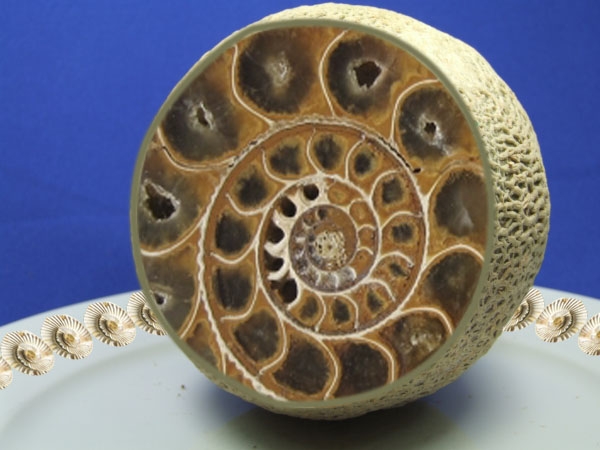
check the perspective between the melon and the fossil --appears to be a bit off
It seems to lack depth.
good idea but the perspective is off
Howdie stranger!
If you want to rate this picture or participate in this contest, just:
LOGIN HERE or REGISTER FOR FREE
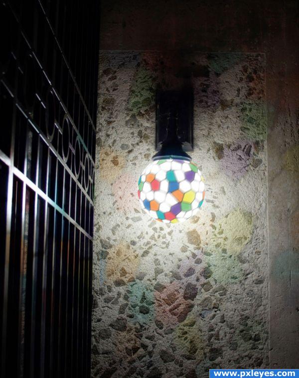
Created a white/black stained glass square, coloured various parts and then spherized and overlaid onto the lamp. Took the square, and stretched to cover the grill / wall, then applied Soft Light , altered opacity and added layer masks to achieve this result. (5 years and 3829 days ago)
that's pretty neat!
Thanks Sean - I try! One day I will be a master!
The actual light is a wee bit blurry but the colors and shadows were placed very well. Good luck to you.
Thanks - the light was supposed to look a little blurry, but I think I overdid it (perhaps I shouldn't have blurred it at all). Unfortunately, I didn't use a smart filter otherwise I would undo it and resubmit. 
Howdie stranger!
If you want to rate this picture or participate in this contest, just:
LOGIN HERE or REGISTER FOR FREE
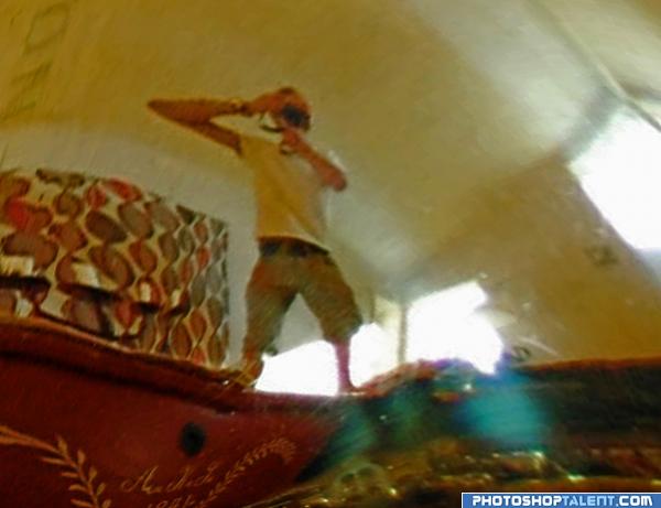
No artistic filters used - interesting pattern is from tuba. (5 years and 3955 days ago)
nice idea good luck!
creative idea!
very blurry, good luck
Not really anything special done to the source, only suggestion from me is to the one who took the photo: GET SOME NEW WALLPAPER! Those are very 70's LOL
SUPER HIGH MARKS!!!!!.. OMG.. this is just FANTASTIC... brilliantly done.. I'm very very very very very impressed.. GREAT CATCH AUTHOR
and carpet is from '60 
Ummm...you just cropped out a piece of the source pic...?
that's not wallpaper rob  it's a fabric bought 2008
  and that part of the house where this photo is shooted is also builded 2008
  *insert phaild tone here*
i believe that i used majority of tools in procedure, like are used at others pictures - i don't know, how to get that result with only crop. but nice to see you, CMYK46! cheers!
Hahaha - good eye.. I am still laughing at the SBS.. where you cat.. Hahaha.. 
A bit too blurry :P gl!
Too blurry
This isnt the source, its your own picture :-P
Good eye for detail  . Good luck!
cool...
I was confused till I looked at the SBS then my jaw dropped. I can’t believe I got so fixated on the tubes, levers, and overall shape that the refection didn’t even register with me.
tick tock - click clunk.. plop (cogs turning and penny dropping) took me a while to realise what youd done. Nice one.. GL
good job and good luck
interesting!!!!
Howdie stranger!
If you want to rate this picture or participate in this contest, just:
LOGIN HERE or REGISTER FOR FREE
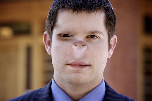
Uh...looks so...disturbing - but good idea and nice done.
Needs a shadow under the nose...
You didnt completely remove the eyebrow, there is a smudge, try use the patch tool to remove it.
thanks for the comments looks better now ?
Shadow that was under nose is still there. No shadow under nose.
Strange...
Don't forget the sharp line by the lowest lip!! ; )
mmmm... good job..
When you flipped the nose, you put the highlight underneath. Now it needs a shadow instead. Always think of light & shadow.
Howdie stranger!
If you want to rate this picture or participate in this contest, just:
LOGIN HERE or REGISTER FOR FREE