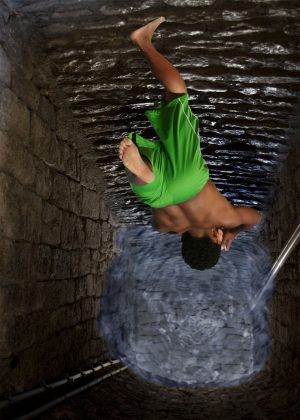
its simple used pic for passage and added water effect to it masked the source and now he is jumping in (5 years and 3711 days ago)
- 1: source1
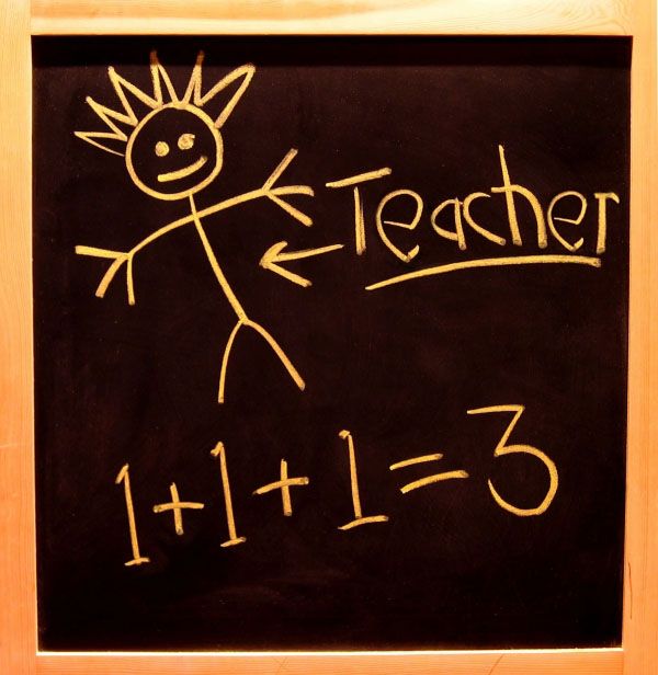
clone tool used (5 years and 3726 days ago)
Seem a lot like the first entry but even simpler.
EDIT: I had to look at the source because it looks almost like it. 
Howdie stranger!
If you want to rate this picture or participate in this contest, just:
LOGIN HERE or REGISTER FOR FREE
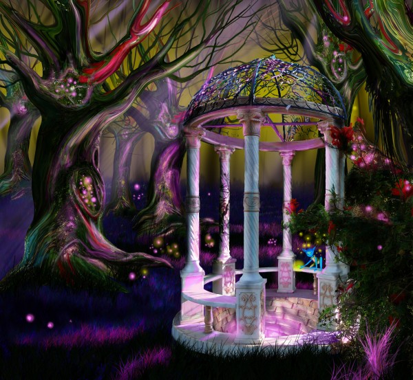
Elves have their own wishing wells too.
No other source used. (5 years and 3763 days ago)
wow this is so beautiful
beautiful,very good
Beautiful mood and lovely image, especially the trees are awesome but the perspective of the far wall of the well doesn't look right.
Thanks Feodora for your comment, but I don't think I have the time now to fix it.
i agree the trees in this image are just fantastic,
Nice work with trees 

grrrrreaaat image!
Exceptionally good !!! Great detail.
Great work and the colors are stunning! 
Exciting to look at...nicely done
Eye catching Entry.........Good Luck Author.
Amazing work author.I love the colors.
very creative !!!. nice ! g/l
This...is.... wow.
Congrats for your third place, Marina!
Congratulations! 
Congrats! for 3rd place
congrats
Congrats!!
Thank you all!
Howdie stranger!
If you want to rate this picture or participate in this contest, just:
LOGIN HERE or REGISTER FOR FREE
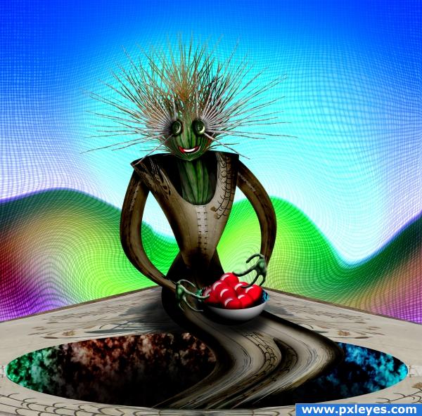
source with gradients and a sphere (5 years and 3856 days ago)
wow!amazing trandformation and gr8 job!
very cool
Nice!i love the way you created the hole!
Wonderful
this is really neat in a weird way 
great 
Cool.
good job! cool I must add!
Howdie stranger!
If you want to rate this picture or participate in this contest, just:
LOGIN HERE or REGISTER FOR FREE
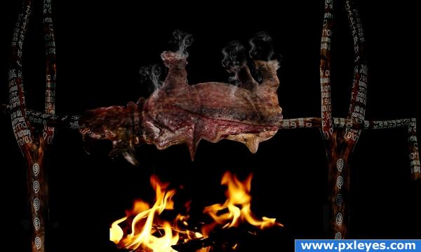
Credits to Stelthman on DA for fire stock (5 years and 3866 days ago)
edges need a slight burn blur (they are really sharp) but the roasted meat texture is very awesome and well done.. good luck author
Haha, nice idea xD
Hahah!Awesome idea!
Howdie stranger!
If you want to rate this picture or participate in this contest, just:
LOGIN HERE or REGISTER FOR FREE
cool idea and good job too
The water looks really fake but it's a really good idea You should put it more transparent.
the water, as well as looking fake, is also too light for the depth it is at!
You could have selected a better source picture for the background.. a picture of a well or something. I like the idea, but a lot of more work needed.
great,gl
Well nice idea and nice use of the source but the water beneath if would have been made sort of a twister then it would have been the best....a superman tag on the fellow would also have added some funny part i guess....
Not bad, blur the wter edges a bit, and use the smudge brush to make them, look like they are actully touching the walls...also try making the water a bit darker and his shadow a tad smaller..GL
so what about it now hope to be good than the first one
yes thats better ..good job
Howdie stranger!
If you want to rate this picture or participate in this contest, just:
LOGIN HERE or REGISTER FOR FREE