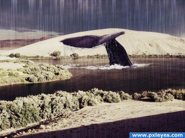
used some adjustment layers to get the effect. Rendered fibres and used motion blur to get the scratches, set the blending option to screen. Hope you guys like it! Comments are very welcome! (5 years and 3893 days ago)
- 1: Whale tail

used some adjustment layers to get the effect. Rendered fibres and used motion blur to get the scratches, set the blending option to screen. Hope you guys like it! Comments are very welcome! (5 years and 3893 days ago)
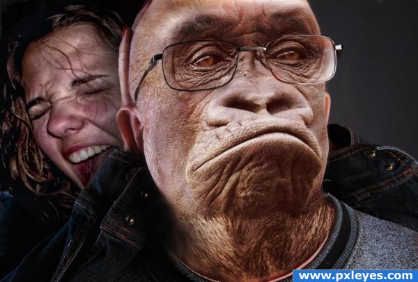
I thought he looked a bit like John Howard now! (5 years and 3902 days ago)
bwa ha ha ha 
mmm outside source ????
funny!  but do post sources
LOL Another theory of evolution applied backwards! Nice work!
LOL so cool
super cool!!!
Lookin' good...nice color work! 
This is so real looking! I love it. 
nice
Lovely chop - great job author, good luck!
great.gl
Sorry,but i had to change the lady in the background because it was non derivative and i didnt realize that.
HEEEEE ROFLMFAO...... can tell your an AUSSIE author. the worst thing is your so right .. ummm arrrr!
Hahaha. This is well done  And it does look a bit like Johnny
Congrats, this really is well done  and so funny
Onya Cobba.. congrats on first place
Congratulations for 1st
Congrats
congrats on first place
Congrats for your first place, Freejay!
Thanx all for the great comments
congrats
congrat to you 
Congrats 
Nice job, freejay
Congrats
Howdie stranger!
If you want to rate this picture or participate in this contest, just:
LOGIN HERE or REGISTER FOR FREE
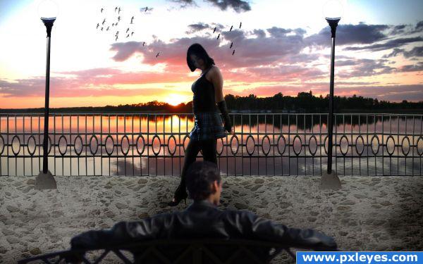
What a beautiful sunset... hope she hurries out of the way and stops obscuring the view...
Thanks:
http://www.sxc.hu/photo/1215010
sunset at the lake
degioalber
http://satin-bunny.deviantart.com/art/Walking-116379898
walking
satin-bunny
http://m47r1x.deviantart.com/art/Outside-13-17374890
M45R1X
Outside 13
http://www.brusheezy.com/brush/1296-Birds-of-a-Feather
Birds of a Feather
by midnightstouch (5 years and 3919 days ago)
good work, looks great, it takes a sec to find the light though... but hey, it's still excellent.
Nice deviation from the source.
Except for maybe the man in front does not match the rest of the resolution, this is pretty unique.
nice take on the source .. GL 
nice use of the source image.gl
Howdie stranger!
If you want to rate this picture or participate in this contest, just:
LOGIN HERE or REGISTER FOR FREE
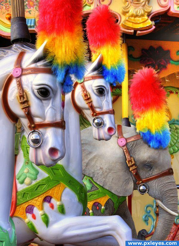
High Resolution is a must view. (5 years and 3934 days ago)
GREAT JOB!
very very good! one thing though (only visible in high res) either blur the elephant a tiny bit or sharpen that colorful thing on his head. 
Excellent! I love it.
Sweet. 

Great concept
very nice
Thanks to gotmeamuse, mairissa and nishagandhi for adding the image to your favorites. 
Just as great and funny as before!  Looks really convincing. Good luck again!
congrats Solkee!!! 
Congratulations for your first place, Solkee! 
Congrats Killer 
Congratulations for 1st
Congratulations, well done.
congrats
Congrats, good job 
Congrats!, very nice blending 
congrats
Congrats!!
congrats 
Howdie stranger!
If you want to rate this picture or participate in this contest, just:
LOGIN HERE or REGISTER FOR FREE
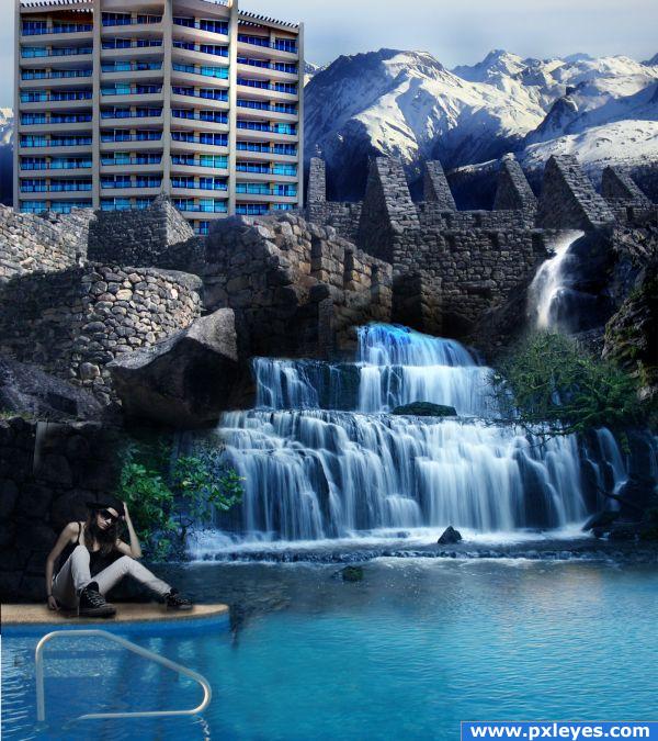
Thanks to Bina Sveda from boston for the use of her image in source 1 (5 years and 3945 days ago)
This image is fantastic: however, the lightsource hits the lower stones differently from how it hits the hotel, which makes it look off. Also you should make the concrete in the hotel slightly darker and more blue to match the stone in the masonry below it.
i think you did a greaqt job.. i have a few suggestions. Try to match the water from the pool and the waterfall a little better, it goes from bright to dark very quickly. I persoanlly think this is a good enough image and doesn;t need the model in the picture, and i would also suggest that you remove the metal handle. Great job though, a very nice image 
Thanks for the comments! my initial thought witht the water is that there is a cliff there and it would be casting a shadow on that area so it would be a hard light. I guess the way that i cropped it you really cant tell that 
Please post source links. The perspective on the masonry right above the falls is off, but it's an interesting image. I agree with Ponti that the metal railing looks out of place now...
It seems like the perspective is off, but it isn't all the stone buildings are 1 image.
Author, I see that now in your SBS...
The color matches much better now. Awesome job!
That is one LARGE small woman. Scale of woman seems off to me, but I like the composition a lot.
I based the persons scale of of the bar in the water
Congrats!
Congrats for your third place!
Howdie stranger!
If you want to rate this picture or participate in this contest, just:
LOGIN HERE or REGISTER FOR FREE
The whale looks huge! but nice water blending. I would get rid of the fibers overlay, but it's your image, good luck!
the whale's too big
like it.
Unique idea and great blending gd luck!
bug fricken whale... nice.
great work...
thanx for the comments guys! In fact i ment it to be very big, so...
Great image and idea,try to fix little bit rain.Its to flat in upperr part....
very nice
Lose the rain & shrink the whale and you'll have a better image...
your all wrong... ITS NOT A WHALE!!! ITS A PICTURE OF A WHALE!!! gosh! your house would have exploded by now if it was really a whale. gosh!
I thought it was cool you made the whale tail really big, like it didn't belong but that's what you were going for and uunderstand that. The rain just dosn't fit.
very nice
Howdie stranger!
If you want to rate this picture or participate in this contest, just:
LOGIN HERE or REGISTER FOR FREE