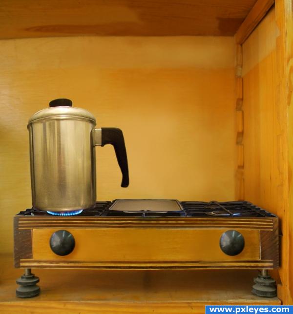
first i cloned out the scales and used the smudge tool..and placed the sources i wanted.....have replaced the pot by another one... thanx to rafragoso for the pot...http://www.sxc.hu/photo/387392 (5 years and 4014 days ago)
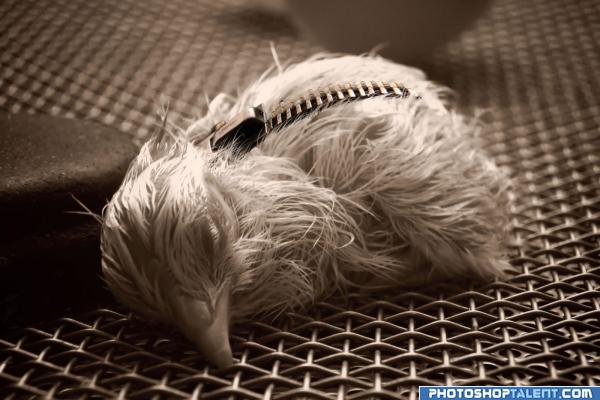
i used an image of zipper for a faster way :P
thx â–º http://www.sxc.hu/photo/406263 (5 years and 4019 days ago)
nice one
PETA would go berserk over this one!  nice
nice
zip not fixed properly
cool
add straps you you will have a gucci purse LMAO
Wow, you can see that a lot of hard work went into this one. Awesome job!
ahahah, stuffing that chick will be a lot easier now  Brilliant work, but an opened zipper would have been funnier. High vote for this one, anyway.
good
very nice 
someone lost a wallet? maybe is ID card inside? 
nice entry
Howdie stranger!
If you want to rate this picture or participate in this contest, just:
LOGIN HERE or REGISTER FOR FREE
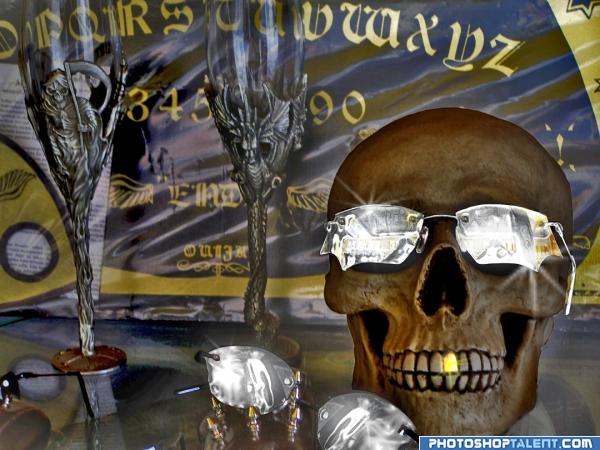
Chrome effect created using a mixture of several layers of different blend modes opacity layers, plastic wrap filter, adjustments to the levels. (5 years and 4019 days ago)
This is INCREDIBLE... very strong entry... love the tooth  .. good luck author
cooool
nice entry
gl
nice work
greatastic image i really love this one!
Howdie stranger!
If you want to rate this picture or participate in this contest, just:
LOGIN HERE or REGISTER FOR FREE
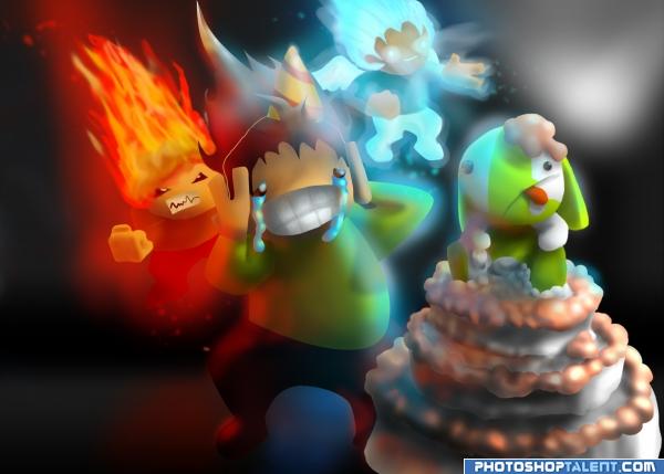
Thanks for any and all comments, no outside sources. Original used purely for reference and inspiriation.
Please check High res. (5 years and 4023 days ago)
this is fantastic. And your step by step guide is really impressive! Good work, you should be proud.
great!!
fantastic.....great expressions............
This is very amazing.. the Chaos of the whole piece is fantatstic.. GOOD LUCK!!! (love all the hand drawn work.. if it didn't have the Happy Birthday sign this would be a wonderful gallery piece.. right now it would be a fantastic Greeting Card.. GOOD LUCK!!!!
gr8 imagination author......but i think character in back has less detailing as compared to character in front.....also agree with golem....about happy birthday sign....GL
lol, thanks for the suggestions on that part, I see what you mean about the "it is your birthday." sign, I'll remove it. If you are talking about the characters on the left, lky, they are like that to keep you from noticing them first. IF you are talking about the good side, i also see what you men, I'll see what i can do.
I'm wondering if i should remove the entire left half of the image, any thoughts on the matter?
You could remove that side, but I think it would be better to make them a bit sharper, just so you have an idea of what they're supposed to be. Now it's just a blurry "mess", excuse my choice of words... I love the image though, very creative... good luck!
cool characters
Good work. In high res view some sharp edges are visible
nice entry
Fixed a bunch, thanks, i decided to plain old remove the left side. It was a bit distracting.
luking much better now
very nice 
Good Luck 
Howdie stranger!
If you want to rate this picture or participate in this contest, just:
LOGIN HERE or REGISTER FOR FREE
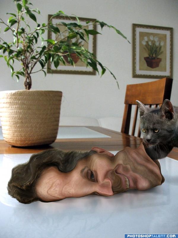
Another Oldie ... :) (5 years and 4029 days ago)
WEEEEEEEEEEEEEEEEEEEEEEEEEEEEEEEEEEE
(can't wait til the kitty smells the inside.. RANK..LOL)
welldone
Great, looks like a real mask  well done.
the curiosity killedthe man...xexexe..GL
very good
Not bad! Not bad at all! Poor cat...who's gonna feed it now....?????! Best of luck!
i love this!
Kind of disturbing...love it!
Very well done author, lovely
Congratulations for 2nd too
Congrats! Very well done.
congrats!!
Congrats!!! 
Congratulations.
Congrats!
Howdie stranger!
If you want to rate this picture or participate in this contest, just:
LOGIN HERE or REGISTER FOR FREE
BHAAA HAA HAA... A WOODEN STOVE?!?!?!?!.. way to think outside the box author.. I would have never thought of that.. GOOD LUCK (though the coffee pot could be a bit larger to match the scale of the whole image but that would make you have to modify the burners as well. good luck
EDIT: Much better pot.. good job author
Very nice idea!The perpective on the stove itslef is very nice, but i'd watch out on the kettle or whatever that is, we shouldn;t be able to see the coffee inside (or whatever it is xD) Good luck!
Edit: Nice one, perpective matches now. Good job and good luck!
Nice idea using the image in this way. I like the concept a lot, but I agree with the other two. I would find a new image for the coffee pot one that is taken more on the side and I would have it so the scale is larger than the one you have used, its just too small
cool
i have replaced the pot by another one..hope its ok now

thanx ponti55
great idea!
Didn't see the first one, but this one looks great!

Edit: On high res, it looks like the bottom outside edges sag down a bit. If they could be warped up slightly so the bottom of the pot has a slight smooth curve, the perspective should be perfect.
nice work author love the outcoming, very creative and outstanding. High vote.
nice job author and good idea also nice blending for the stove .. GL
very believable , good job on this one
amazing final result!! GL
wow! superb entry
good idea and good job
Very nice work
nice idea!! G/L
very good blending, wonderful job, good luck author
Very good
wow
heheheheee i hope you have your fire extinguisher somewhere close...

Thanks to all for the nice comments...LOL Fille
Alot of imagination in here. Looks soooo real :P like a photograph, well done.
The most clean and original image in this contest, IMO. Congratulations.
Howdie stranger!
If you want to rate this picture or participate in this contest, just:
LOGIN HERE or REGISTER FOR FREE