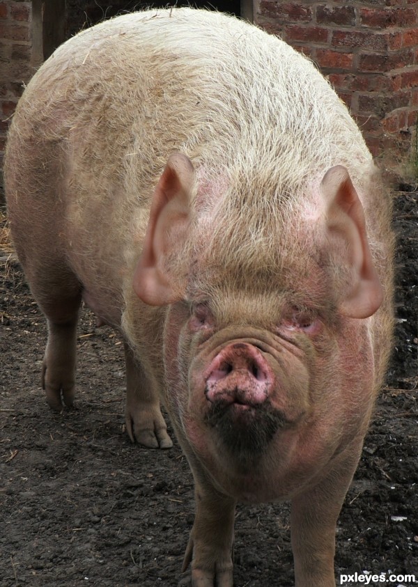
(5 years and 3154 days ago)
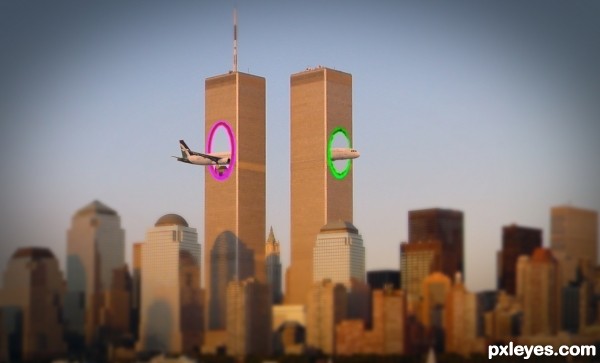
I changed the colors of the portals, i hope now i'm legal, and not break any copyright laws... (5 years and 3164 days ago)
LOLOL! Great image!
Have you seen the new movie short that came out?
http://www.youtube.com/watch?v=4drucg1A6Xk
Thank you MossyB !
Yes, i've seen it. From that came inspiration 
I LOVE THAT VIDEO!! 
Plane parts are at the wrong angle. They don't match up. Plane should be the same gray as the source pic, and not same hues as the buildings, to create contrast.
I love the idea, lol!
Nice 
CMYK46, i agree with you for the wrong angle of the plane, but only on the back of the plane...i simply can't do the right perspective  I'm not good enough, i'm a begginer, and i want to learn as much as possible, but i can't do it right, i tried a lot...
I think the colors are good... why the plane should be the same gray as the source pic, if it match the city photo.. ?
For contrast! And all you had to do to match the angle on the plane parts was draw a line down the axis of the tail section (on a separate layer) and match up the nose section according to that line and it would be visually correct.
I'm not sure about blurring the foreground either, but I still like the idea of your image, and hope my comments have helped you. 
I see now what you meant with the angle... I first thinked about the perspective of the back.
You are right, the plane seems a little broken...and i verified now, the front was JUST a litle rotated and smaller, i alligned them perfectly now, and i will upload the result... not much difference. Probably this is the way that portals works 
Lol, like it. Not sure about your angle discussion here. If there's anything wrong here, it would be that the wings would still crash in that building.
Yes you're right...
nice..
Thank you !
what exactly is this supposed to represent ?? is it from a movie or what ?? that was a terrible tragedy that day.
Good Idea..lol!!
How I wish this had happen! Wonderful work author!
Howdie stranger!
If you want to rate this picture or participate in this contest, just:
LOGIN HERE or REGISTER FOR FREE

Thanks to Cloaks, Koko-Stock, Night-Fate-Stock and freestockswirls from DeviantArt (5 years and 3169 days ago)
The dark area on the right does not match in tone to the rest of the image, it looks too blue and does not add anything to the mood or composition. You'd be better off cropping the sides and reducing the fireworks' bokeh effect to squeeze it back into the image.
There's a shadow on the legs where there should be a highlight, since they're lit by the bulb.
Howdie stranger!
If you want to rate this picture or participate in this contest, just:
LOGIN HERE or REGISTER FOR FREE
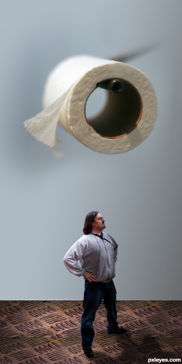
(5 years and 3176 days ago)
The focus of the various elements is not consistent, and the floor is at a different perspective angle to the man standing on it. This just looks hurried and thrown together.

Light source on paper is from top left, on the man from upper right.
While the concept is very funny, for a higher score you may want to run a very soft blur brush over the edges of the man, his will make him blend better (he's very roughed edge and the top of his head has the white edging (IMHO)
Select the FLOOR LAYER and use PERSPECTIVE on it, and you will find that it will blend better as well.. (took me some time to learn how to do that and I still have trouble) but you have enough pattern in the floor so it should be quite easy...
Gray Gaussian disks placed beneath his feet (at the floor perspective) will help ground him as well.. Good luck author (The humorous concept of this piece is very adorable)
EDIT: 100% Improvement author.. good luck


thanks everybody for the tips
Howdie stranger!
If you want to rate this picture or participate in this contest, just:
LOGIN HERE or REGISTER FOR FREE
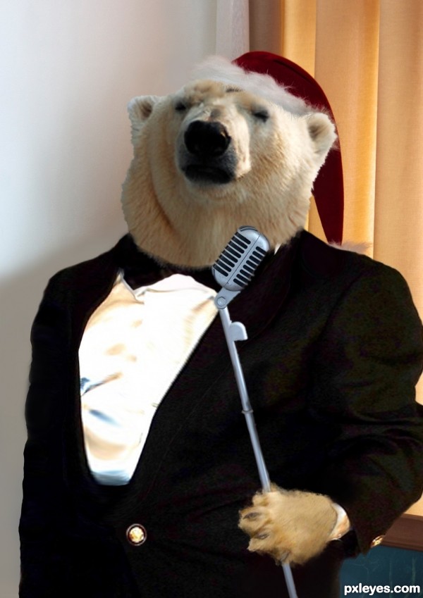
Images, layers, magic wand, erase tool, eyedropper, adjusts (5 years and 3180 days ago)
The shirt is a bit too high contrast compared to the rest of the image. It is almost glowing, it is so bright.
Thanks for the advice, friend
Nicely done! Best of luck!
Thank you, JoeCacia !
Howdie stranger!
If you want to rate this picture or participate in this contest, just:
LOGIN HERE or REGISTER FOR FREE
Great blending. Good job!
Many thanks, MossyB
LOL!!!
fun chop! just a suggestion... if you doubled the ear layers, they may sit better into the sides of the head.. IMHO of course.. great chop all round
(doubling the ear layers will thicken the erase area and make the ears more clear)
Howdie stranger!
If you want to rate this picture or participate in this contest, just:
LOGIN HERE or REGISTER FOR FREE