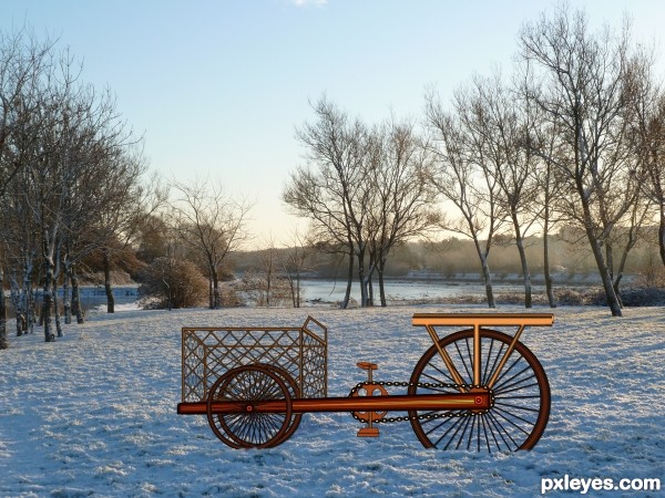
Spec Thanks to CorneliaMladenova for use of this picture found in member stock on PXLEyes.com & in cork& country album (5 years and 3300 days ago)
- 1: source1
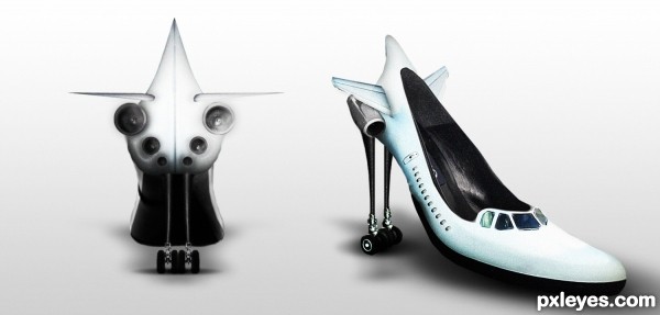
"You put and fly"
lol
(5 years and 3315 days ago)
amazingly creative!! good luck
Lady Gaga would wear these. haha, Great Idea author!
very very cool work author...best of luck
Perfect!!!!
You should be a shoe designer ... these remind me of those roller skate running shoes that kids wear... only for adults ... I have this vision of a lady leaning back on her heels and wheeling down the street ... weeeeeeeeee! Great!
super!
Thx guys for crtitcs!!!
OMG, this is amazingly clever!!! Great job, author.
For when you need to 'jet around town'! 
That is good way to walk faster. Good luck author..
Fantastic those look like a pair "MY " woman would like. Way cool shoes.
Congrats  fabulous shoes
Congratulations! 
Congratulations! See ... you should send the design into Jimmy Choo or Loius Vuitton ... you never know ... you could become famous!
Congrats!!
congratulation...
Howdie stranger!
If you want to rate this picture or participate in this contest, just:
LOGIN HERE or REGISTER FOR FREE
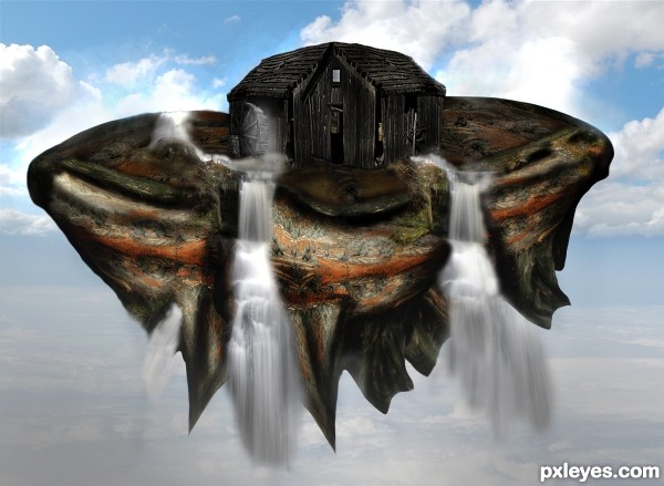
Thanks to wjs7652 for the use of the waterwheel
The floating land I used the given source photo land in the back and applied many layers together to make the floating land for the old wheelhouse to sit on. (5 years and 3424 days ago)
I like the floating island with the old shed in the middle.... the waterfalls look cool too....good luck....
Howdie stranger!
If you want to rate this picture or participate in this contest, just:
LOGIN HERE or REGISTER FOR FREE
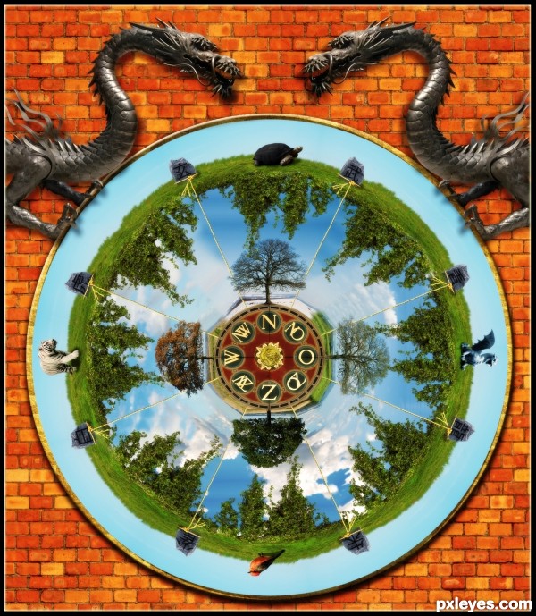
I started without really knowing, what I wanted to do, untill I found the compass image. So I started searching at Wikipedia, if there is something I could do with the cardinal directions and I found something. What I made is an image based on the Chinese symbols:
http://en.wikipedia.org/wiki/Four_Symbols_%28Chinese_constellation%29
The different symbols are:
-Azure Dragon of the East / Spring
-Vermillion Bird of the South / Summer
-White Tiger of the West / Autumn
-Black Tortoise of the North / Winter
I arranged the animals in this order and added the Chinese name on the two stones directly next to each animal. For each animal was furthermore the fitting tree for that season added.
The other directions, such as North-East are a combination of both images from the North and the East, because they belong together.
I didn't use a single colour scheme for every symbol (they all have their own colours) but added these colours in the whole image.
The centre has the colour yellow, that's why all the ropes are yellow, which lead to the yellow dragon.
I know it's not the typical mandala, but I wanted to make something different :)
---
Extra sources:
http://www.flickr.com/photos/glenscott/127082936/
Dragon - Thanks to Hey Mr Glen
http://www.flickr.com/photos/janmichaelihl/1545036983/
Stone - Thanks to Jan Michael IhI
http://www.flickr.com/photos/limonada/214375219/
Rope - Thanks to Limonada
http://www.cgtextures.com/texview.php?id=22601
Gold texture - Thanks to CG-Textures
http://www.cgtextures.com/texview.php?id=30042
Brick wall - Thanks to CG-Textures
http://www.flickr.com/photos/sushifactory/3050109122/
Dragon head - Thanks to Sushifactory
http://www.flickr.com/photos/sushifactory/3050109444/in/photostream/
Dragon body - Thanks to Sushifactory (5 years and 3435 days ago)
Fantastically created! Excellently thought out!
Good concept. If you make this symmetrical it will be a mandala.
True mandalas (of the Buddhist type) are not symmetrical, per se, although they are balanced...
http://www.exoticindiaart.com/mandala.htm
This is a very thoughtful and creative effort. It shows true consideration of the topic, and is quite lovely.
Looks like you put a lot of thought in to your mandala, well done.
Great job ! Very well done 
Nice image, my only nit pick or hmm.... so to speak is why have the white tiger which is known for being in an arctic climate on the fall piece of the pie, and the turtle for winter? Also why not spring for the bird and summer for the dragon? I was just wondering the logic behind the animal placement, on what seems to be a very well thought out piece.
Thanks a lot for all your nice comments 
@Bob: Like MossyB wrote, a lot of the old mandalas are not symmetrical, but balanced and that's what I tried to achieve with the ivy, stones, the ropes, the animals and the spaces between the animals, the trees and the skies between the trees. I tried my best to make it look balanced, because I didn't want the completely symmetrical look.
@VitalExpressions: The placement of the animals wasn't my choice  If you read the link to the Wiki page I provided, you can see, that each animal (which are actually mythological creatures in the Chinese constellations) stands for one season.
-Azure Dragon of the East: Spring
-Vermilion Bird of the South: Summer
-White Tiger of the West: Autumn/Fall
-Black Tortoise of the North: Winter
Very nice work.
wow! Amazing! THis has so much to look at. 
Extra points for the dragon and frame hardware, nice one
This one really drew me in!! I had to look at it over and over....Fantastic job and Best of Luck 
This is quite beautiful, you did some good research. You achieved 'different' quite well, author. Good find on that compass, too! 
very very cool work author...nice to see u participate in the contest's again...best of luck
Thanks again for all the lovely comments 
Congrats on second place!
Congrats lelaina!
congrats 
Congrats 
Congrats!!
Congrats!! Lovely, just lovely!
congrats Elke!!!! 
Congrats Lelaina on great work these week,please keep going...
Congrats for second place !
Congrats Elke, I missed this contest. You did such a wonderful job, rich in details, and you should get more points for the thought you put in and the research on mandala  .
.
Howdie stranger!
If you want to rate this picture or participate in this contest, just:
LOGIN HERE or REGISTER FOR FREE
(5 years and 3435 days ago)
Howdie stranger!
If you want to rate this picture or participate in this contest, just:
LOGIN HERE or REGISTER FOR FREE
Interesting work...IMHO would be better with some other background..maybe a bit more dynamic instead of this one...GL author
Hey Thanks erathion Here's a different backround Any better?

Edit.......... pixelkid Thanks I did a remake couldn't get it in I darken it like you said looked better but I was to late
You did really nice work on the bike...using the source the way that you did...seems that it was very time consuming. However it looks slightly out of place on that background. It kind of looks like an illustration on an actual photo. Perhaps if you darken the entire bike and have the shadow follow the shadows on the trees...this might help. Nice work nonetheless!
Interesting idea and many thanks for choosing my stock
Howdie stranger!
If you want to rate this picture or participate in this contest, just:
LOGIN HERE or REGISTER FOR FREE