All from source image (5 years and 3836 days ago)

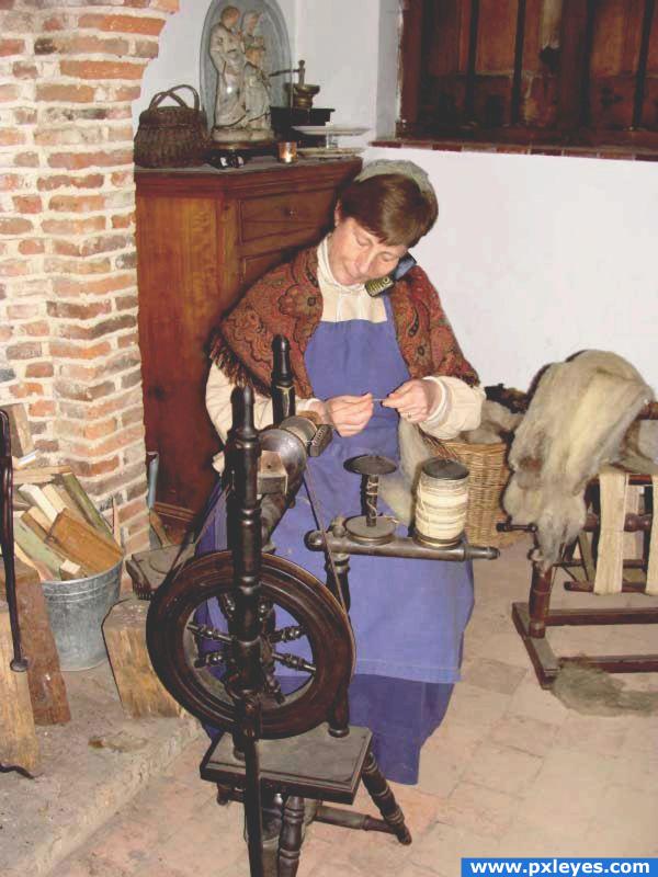
"Uh-huh..she only spins alpaca wool..."
(5 years and 3838 days ago)
Hmm the phone is about to fall you maybe want to make the space betwee her ehad and the shoulder smaller, try to cut her off from the background and use liquify :P
Thanks for the tip Akassa. Took care of it the best I could...
lighten the image, lower the contrast or saturation or whatever you overdid there  i think it should look more like the original, adds to realism.
Thanks for your keen observation elficho. Edit: reduction of saturation.
Funny!
Howdie stranger!
If you want to rate this picture or participate in this contest, just:
LOGIN HERE or REGISTER FOR FREE

I have been wanting to try something like this for a while.
Any comments and helpful tips welcome .
All outside sources used from stock.xchng.com (5 years and 3850 days ago)
very welldone
wow so cool,nicely done author
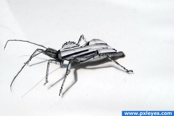
Great built! The legs are so cute ^.^
Good job...could be larger & centered, with a better high res, but still a nice job. 
Beautious!!
getting alot of inspiration from this place propper mental stuff on this site
Great job! The legs look so great! Just as the things, that come out of the head (I don't know the english word for it) Good luck!
Great job!
good job! 
Congrats XWD for your 5th place, you did a good job.....!!!!
Howdie stranger!
If you want to rate this picture or participate in this contest, just:
LOGIN HERE or REGISTER FOR FREE

(5 years and 3900 days ago)
Simple but well done...

This is a really striking entry, it's simple, but there's so much life and so much energy in there.. you can't seem to take your eye off it! Good job!!
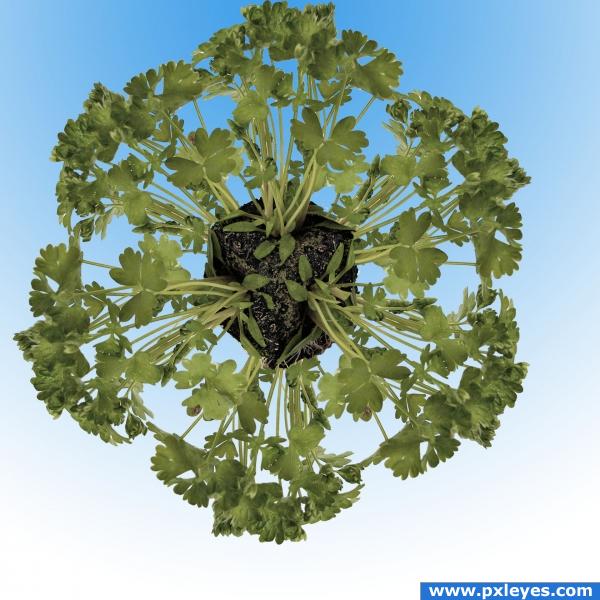
This reminds me of a mandala somehow  Looks good and works really well with the background. The only thing I'd suggest is to place it more in the middle. Good luck
pretty cool, BUT put the leaves of the one growing from the back left side of the cube behind the one on top 
simple and creative
really cool
ponti55 said it all! Good Job, Love it!
hmm, interesting. just a thougt now, .. if you change the colours to white it could also look like a snowflake 
very nice 
Howdie stranger!
If you want to rate this picture or participate in this contest, just:
LOGIN HERE or REGISTER FOR FREE
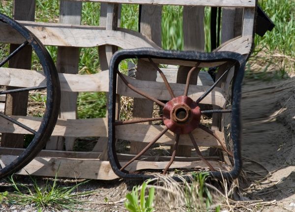
Nice idea... you should cut out the wheel...clone stamp the boards back in...then liquify the wheel and distort to the square... everything distorted is too obvious and distracting... g/l and keep on chopping!
I love the idea author but woodztockr is correct.. if you kept the back ground normal and only squared the wheel separately, you will have a much more powerful piece.. good luck
done using the liquify tool
I agree completely with what woodztockr and Golem say. Would be way way more effective if the background is "normal" (with the round wheel removed, of course). Good luck!
Make a dup. of the first then do your liquify on the second. The add layer mask and go around the saved area with it. I will help
Howdie stranger!
If you want to rate this picture or participate in this contest, just:
LOGIN HERE or REGISTER FOR FREE