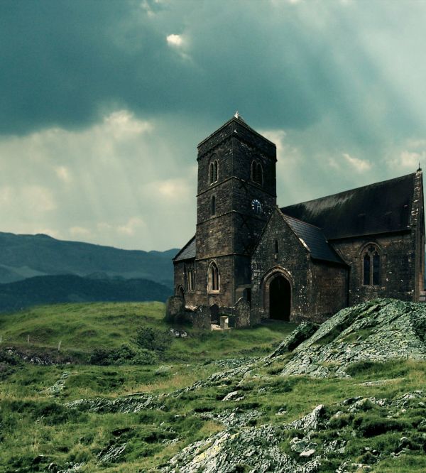
thanks to RibbonRose,brasswatch and costi for the nice stocks (5 years and 3670 days ago)
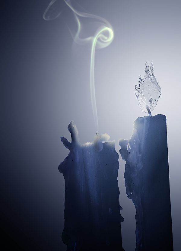
Edited: I thought on adding a flame, but finally I decided to add the smoke, I think is better to show the final of the fight.
Thanks for suggestions guys. (5 years and 3728 days ago)
nice
that's when you know it's too cold :P good job
not an original idea, but well done
A nice idea but IMHO not really on theme. You are supposed to show how fire and water are fighting each other for dominance.
Maybe if you put a fire flame on the other candle??
I agree with Jawshoewhah and i think Raytedwell's suggestion of adding a flame would really change this image for me. I'll hold my vote for now.
Ok, thanks for comments and suggestions, I´ll try to add the flame 
Enhorabuena amigo 
Congrats for your second place, DML!
Thanks friends!! 
Congrats 
Howdie stranger!
If you want to rate this picture or participate in this contest, just:
LOGIN HERE or REGISTER FOR FREE

This was mostly blending. I tried to make the legs look tucked under. The source was choped at the legs. (5 years and 3805 days ago)
Making the legs look tucked under is a good idea, but they're a bit too blurry...
hee hee. what a happy looking pig. I immediately interpreted the legs as being tucked under, which is a great detail.
Awesome!
Howdie stranger!
If you want to rate this picture or participate in this contest, just:
LOGIN HERE or REGISTER FOR FREE
(5 years and 3822 days ago)
What's the blob in the middle?
Mother and child.
I think you should delete the mother and child--it would be a better looking picture without it.
Please provide source link for mother & child...
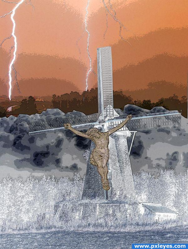
I changed this image. I took the picture of Christ at St. Ann's in Wadena, Minnesota.
Thanks for your feedback guys. It looks a lot better since I changed it. Thanks again!
What a sacrilege 
I'm a bit offended by the content but getting past that, the foreground reminds me of infrared techniques.
I guess you wanted to make a monumental scene with the lightning that illuminates the ground, and you inserted the Christ to underline the fatalism ( if i can say so) of the momment. Suggestions for the future: target your theme and exploit it at the max. In this case the lighning. You should place just a big powerfull one instead of many, and put it in contrast with the rest of the scene. Also , you should avoid using religious symbols in a way that might offend folks, cause you're entry can get removed, instead of getting appreciated.
Howdie stranger!
If you want to rate this picture or participate in this contest, just:
LOGIN HERE or REGISTER FOR FREE
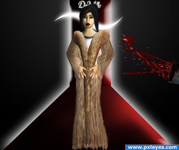
The girl is drawn by me (except for the hands... I was too lazy lol :D ).
Paint splash brushes thanks to domino-88 : http://domino-88.deviantart.com/art/10-splash-brushes-66966282
(5 years and 3853 days ago)
I really like this.... funny and well put together.
nice idea! good luck
Howdie stranger!
If you want to rate this picture or participate in this contest, just:
LOGIN HERE or REGISTER FOR FREE
Very natural looking.
thanks CMYK46
You turned it in a nice landscape!
I have to agree with CMYK46 ...good job author!
loving the color
Nice work...gl author
Very good blend, very convincing! GL!
nice job on making it look as though the church was always there... something that throws it off for me though is the fence that is in the field pic. the distance appears to be the same as the church in the pic, yet the fence is tiny by comparison in size... the church then looks as though it is a giant's castle. Great work though and good luck!
congrats on 3
Nice job congrats on 3rd
Howdie stranger!
If you want to rate this picture or participate in this contest, just:
LOGIN HERE or REGISTER FOR FREE