Credits and thanks to:
- faestock (http://faestock.deviantart.com).
- Zela (5 years and 3981 days ago)
(5 years and 3998 days ago)
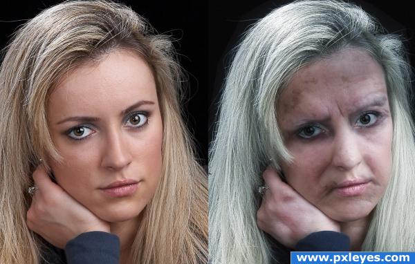
good work... still her expression lines miss match a little
She doesn't look that old to me, she looks more like she's drugged/drunk >.
very nice 
her forehead is too dark
she looks like she suffered some spousal abuse;i'd remove those dark spots so it would look like a nice old lady
Howdie stranger!
If you want to rate this picture or participate in this contest, just:
LOGIN HERE or REGISTER FOR FREE
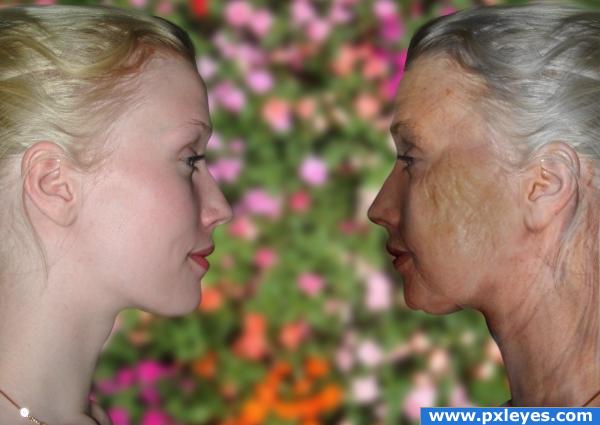
This is a friend of mine, her uncut photo is in the SBS. (5 years and 3999 days ago)
Very nicely done, you have aged her beautifully 
This looks great!! Really well done, that chin is super realistic!!
great match.. GOOD LUCK
great job!!!!!!
I think that looking at yourself (or rather your friend looking at herself) is an excellent take on this!
nice job making them face each other; and she looks pretty even at 84
I think you should change the background. Nice aging effect.
very nice 
Congratulations for 3rd
Congrats for your third place!
Congrats!!
© registered at http://myfreecopyright.com/registered_mcn/C6EE5_5E759_0C4F5
congrats!!
Congrats!
Congrats, very well done!
 congrats
Congrats!
Howdie stranger!
If you want to rate this picture or participate in this contest, just:
LOGIN HERE or REGISTER FOR FREE
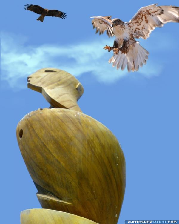
Look, Hank! That's the biggest freakin' gopher I've EVER seen!
Just for fun. Hope it made you laugh. ;O) (5 years and 4034 days ago)
GOPHER!?!?!?!?!?!? BWHAAA HAAA HAA HAA HAA.. OMG.. I didn't get it at first until I read the description.. this is a weird case when I think if you put a cartoon talk bubble into the piece it might actually carry the message faster.. HEHEHEHE. but thanks for the laugh, very clever and very cute (If you do add a talk bubble, PLEASE make it clean and accurate.. I'd hate to see you ruin this very adorable image)
EDIT: Oh never mind, you never do anything that is not clean and accurate.. (Now I need glasses.. hehehehe)
lol Thanks, Golem. I was just feeling goofy and decided to put this together. No room for a talk bubble unless I screw up the compo. Besides, its more fun to puzzle over it first and then read the caption. lol
Oh I puzzled over it .. it was like WTF.. Of course now I will never be able to look at that sculpture without thinking GOPHER.. hehehe
real cool

nice
good job author, good luck
Howdie stranger!
If you want to rate this picture or participate in this contest, just:
LOGIN HERE or REGISTER FOR FREE
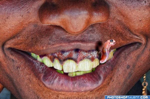
That was really ugly! Hope you don't get nausea while looking at this picture, cuase I almost got while browsing through worms pics on Flickr
Comments are appreciated!
I made this entry using some hue/saturation/brightness, contrast fibers, plastic wrap filters and burn tool as well. Sorry no sbs (too lazy today) I'll improve in my next entry.
Special thanks to the guys from Flickr:
Ferdinand Reus (women photo),
Ben McLeod (ugly worms photo),
Hamed Saber (rabbit smile photo). (5 years and 4047 days ago)
ophh yea ...very good
nice idea good luck!
URP 
This is just plain sick...
OMG....scary
ewwwwwwwww
No way Nator! Wormy iss the best thing I ever had on my entries! I think it is ugly cute!)))
Yuck, he needs a one year threatment at the dentist >.
damn thats ugly
damn thats ugly
love the worm
Howdie stranger!
If you want to rate this picture or participate in this contest, just:
LOGIN HERE or REGISTER FOR FREE
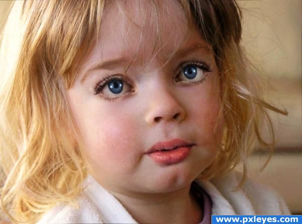
great blending! i don't know why, but she looks kinda weird.. maybe it's the eyes.. but nevermind, great image!!
Thanks... she looks a bit strange because of the eyelashes i guess, they're not really of a child's. I already removed most of the make up and arranjed up, dunno if i can do more >.
all you have to do is lighten the base lashes... children's bottom eyelashes are usually not dark in slovak/caucasions (I have over 20 nephews and nieces) the darkness of the bottom lashes causes the ADULT eye effect (sorta like how they dress all the teen age girls on the Disney Channel to look like sluts.. they just darken the base eyelashes and put them in tight crappy clothes) lighten ONLY the lashes, or she may end up with eye bags (you could also remove them completely, like the original photo, keep the top ones so it still looks like a transformed adult.. beautiful image
EDIT: MUCH BETTER.. the lighter lashes make her more sweet.. good luck and very good work author
My understanding is thast you ars supposed to use an image of an adult and make them young again. What you have here is a image of a child already.
i agree with JustinCase in contest goal says "grab any image of an adult"...but this image is quiet nice but out of theme, good luck
This is cute though--it reminds me of one of those porcelain dolls that look so real. I did this project before I realized it was for a higher level---I put the results in my album (or in ART)
how is this off theme? "revert them back to early childhood, in other words, turn them into babies!" i think the author did a pretty good job doing that!
excellent blending, her bottom lip could do with a bit of adjustment, it looks lik she's pulling it to the righ (screen right)
Well this is supposed to be the model's from faestock, baby's version for that i needed a child's stock ~~
Edit: Made the eye lashes lighter; fixed the lips; added more shadows/lights to the eyes.
Woah.. quick change.. looks a lot better in my opinion now, good luck!
personaly i think the child you submitted looks older than the original ( more defined ) i thought you were suppost to take an older person and make them young, not take a young person, and make them look like a different young person ?
very good blending on this image, good job!
I think the problem i sthe left eye, it's a little bit to big,needs to be rotated a bit and maybe add some perspective to it. All just some minor adjustments

Great work BTW and on-theme if you ask me
The two images are too similar in age to make this much of a transformation....
Well i'm sorry if this is not really in theme i guess i didn't understand well what's the goal of this contest o.o
to take a old person and show what they looked like young. don't get me wrong this is a very nice image, just a tad off theme.
awwwww! so cute
How is this off theme? Other people are doing the same, working on a child's stock using adult's parts on it T.T
I would like to see the "older" version in your SBS. The mouth needs to be shifted screen right a bit and if you use the transform feature I'm sure you could get it more into perspective. All in all I like it...off theme or not!!!
The older version is the girl in source 2 by faestock.
Congrats for your second place, Akassa!
Congrats!
congrats
Congratulations for 2nd
Congrats!
Howdie stranger!
If you want to rate this picture or participate in this contest, just:
LOGIN HERE or REGISTER FOR FREE