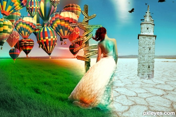
credits and thanks:
http://fairiegoodmother.deviantart.com
http://faestock.deviantart.com
http://emelody.deviantart.com (5 years and 3045 days ago)
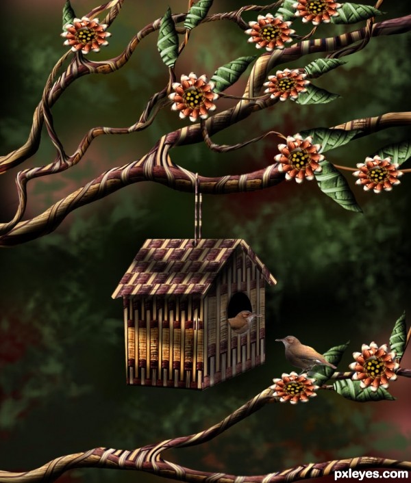
Thanks to alvimann from morguefile, for the pic of the little bird. (5 years and 3140 days ago)
Very decorative and original!
Thank you Mossy.
suggest to saturate the birds alittle and add shading (dodge n burn) too
cool image 
Beautiful work author...little birds fits perfectly with the rest of the image...best of luck author...
beautiful work author.. love the depth and details on this one good luck and high marks..... and a definite fave... 
Thanks for comments.... and good wishes.
Aheman: birds saturated and shaded, just a little.
ohi, that's a fine house, that is! 
Nice work!! 
Very lovely... SO out of the box... Great! GL...
Very lovely... SO out of the box... Great! GL...
Great job,I simply love it ! 
Cute chop, love the branches! 
nice work!!
How lovely, it looks like a painting! Truly beautiful!
Congrats, George!
I appreciate all your favorites on this entry..... Thanks for support.
Howdie stranger!
If you want to rate this picture or participate in this contest, just:
LOGIN HERE or REGISTER FOR FREE
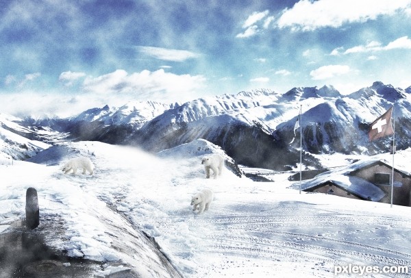
http://en.wikipedia.org/wiki/File:Polar_bears_near_north_pole.jpg
Thank you US Sailors and all others that serve their country and people.
(5 years and 3141 days ago)
The source photo is too blue and cool in tone, while the bears are too yellowed and warm in tone. Maybe apply a cooling filter to the bears and desaturate the blues of the contest source so everything is a bit more consistent.
Thank you so much... I will try and fix it... thanxs MossyB for the help! ;O) always appreciated!
@MossyB I tried to blend the colors better! I really hope it is better... lol... if not hit me, kick me, and tell me... lol... I can take it  truly love all comments!
@MossyB thank you so much! :o) love the help... thank you!  lol.. not like you are thinking... :o) take care me friend
Mucho gooder! Everything looks like one image, now. Nice fix!
Excellent concept, good work to blend these, author. 
Howdie stranger!
If you want to rate this picture or participate in this contest, just:
LOGIN HERE or REGISTER FOR FREE
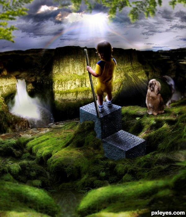
Stock author on DA is notified via "note". Thanks DanielaOwergoor for the link. (5 years and 3169 days ago)
Brilliant!
The angle of the top is off for the baby standing on it, it's too high in front, the kid would be falling backwards...
The dog is too hard edged, looking very "cut and paste," and the lighting on it does not fit with the rest of the image, since it is in shadow, yet is fully illuminated and casting a shadow in a different direction from the kid...
The waterfall is likewise lit from an entirely different direction than your light source in the sky.
Plus, your rainbow is distorted into an ellipse...
Good concept, but very rough in execution, with little attention to details and consistency.
Change the perspective on the cubes and you'll have a better entry.
1) perspective of the cube should be downwards (towards the front)
2) the boy should not have such a strong light cast, as the light ray is too far away
and the rays are on the mountains already

Thanks for all the nitpickings and suggestions, it helps me a lot in doing refinement to my entry. 
Nice refinements!!! much more grounded  GOOD LUCK!!!
congrats
Howdie stranger!
If you want to rate this picture or participate in this contest, just:
LOGIN HERE or REGISTER FOR FREE
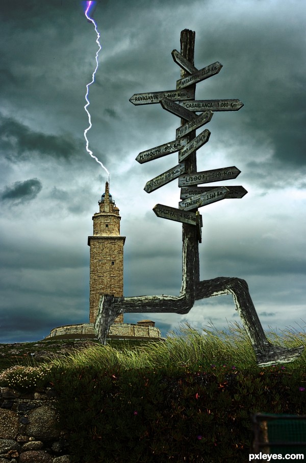
(5 years and 3212 days ago)
hahahahahahahaha...great humor...gl author
cute thought................
Thanx.....
Howdie stranger!
If you want to rate this picture or participate in this contest, just:
LOGIN HERE or REGISTER FOR FREE
Tower needs a shadow. Maybe you should add about a hundred more balloons...
Howdie stranger!
If you want to rate this picture or participate in this contest, just:
LOGIN HERE or REGISTER FOR FREE