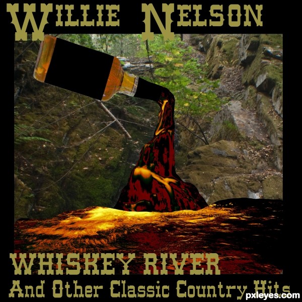
My mother is a big Willie fan so it was a easy choice.
(5 years and 3218 days ago)
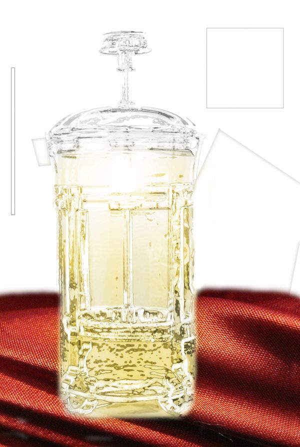
i thank sherrie for uploading this image under creative common (5 years and 3724 days ago)
Has to be a little darker....
Not bad, yes agree has to b darker, also the edges are too feathered,,,GL
I liked the idea, and the treatment on the press itself is interesting. Althought it appears to be floating on the red backdrop. The shapes in the background detract from the focus of the image.
Howdie stranger!
If you want to rate this picture or participate in this contest, just:
LOGIN HERE or REGISTER FOR FREE
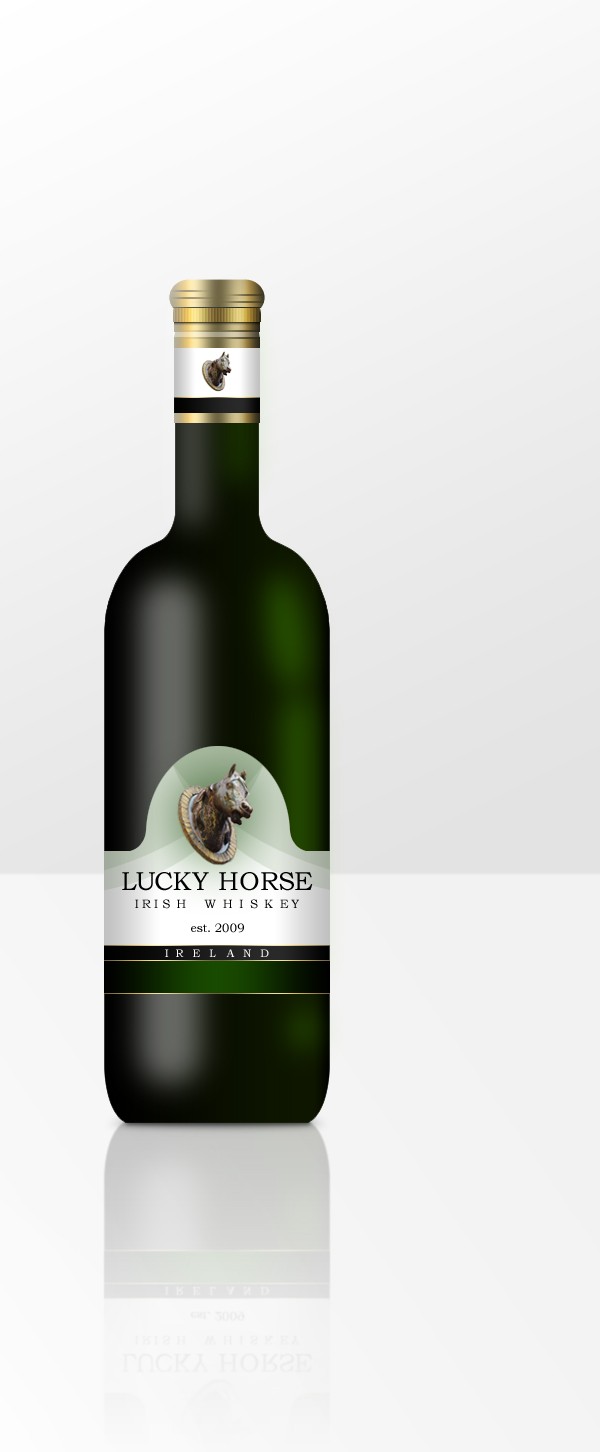
I learned to illustrate a wine bottle in photoshop using this tutorial.
http://psdfan.com/tutorials/drawing/create-a-realistic-wine-bottle-illustration-from-scratch/ (5 years and 3780 days ago)
Nice job, author. I think if you could isolate the 'LU' of lucky and the 'SE' of horse and scale the width a bit (pulling one side closer to the rest of the word) it'll help look as if it's wrapped around the cylinder. Just a thought...
I took your advice pixelkid and messed with the spacing between each letter. It looks much more realistic now, Thank you so much!
Nice job with the bottle illustration render. Good work.
Love the look of the bottle... well done author...gl
Cool! 
Congratulations for 3rd
Congrats for your third place, Tnaylor!
congrats!
Congrats
Thanks to all for the great comments!
Howdie stranger!
If you want to rate this picture or participate in this contest, just:
LOGIN HERE or REGISTER FOR FREE
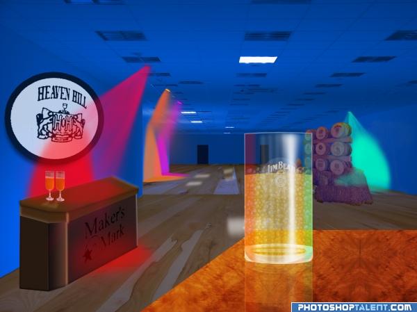
Added lighting to room and made bar ad closest glass used bubbles by hawksmont and water by obsidian dawn (5 years and 3948 days ago)
Check perspective...
the perspective is a little off, especially on the 'Maker's Mark' table. Good luck!
LOVE the color pallete.. good luck on this author
Soory tried to fix perspective but turn out worse than the original ..leaving it the way it is...
surely u can do better than this, non a les a gud job...
good colors, perspective issues are there(eg: tables).
ummmmmmm... good
nice 
persepective problem.....
The cup looks awkward, can't tell what the problem is though >_
Howdie stranger!
If you want to rate this picture or participate in this contest, just:
LOGIN HERE or REGISTER FOR FREE
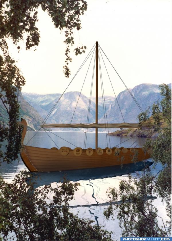
Ship made entirely from source image. (5 years and 3948 days ago)
OH MAN..this is WONDERFUL... I LOVE VIKINGS and the way you used the source..excellent... and cropping the foliage was NO PICNIC i'm sure..hehehehehehe.. great job.. .high High HIGH MARKs
Time for looting and uhh... I will leave rest to your imagination... Nice boat ya got there... Everything is good... But might as blur the foliage in the front as it can be a lil distracting... LAND HO... lol 
edit: couldn't resist... This boat is pure  lol
lol 
Ship is well done, reflection needs work. It should be slightly bluer than the ship, not red, and the spar is too distinct & too far left.
Edit: Much improved now...good luck.
Water reflection looks awkward but good job on the ship 
Very Creative use of the source!! Good Luck
Nice work but water reflection need to be fixed.
Maybe try and match some water ripples like at the front of the boat? Just space them wider as they get closer..
nice work bt if u create the small shadow around the beer trunks to make it real..non a les a gr job done nice thought...hey r u smugling these beer trunks hey hahaha........jusk kiding
great image
nice entry
You're missing a sbs
Annabat, no I'm not. I have used an external source, so an SBS is not required.
wow very nice work, well done with this one 
ship looks so real
Howdie stranger!
If you want to rate this picture or participate in this contest, just:
LOGIN HERE or REGISTER FOR FREE
Great concept and better thatn the origional cover which you incorporated on the bottle
Thank you for you comment. I sent a copy to my mother and she made it her wallpaper. She showed it to all her friends at the seniors lunch house.
Howdie stranger!
If you want to rate this picture or participate in this contest, just:
LOGIN HERE or REGISTER FOR FREE