(5 years and 2817 days ago)
1 Source:
- 1: source1
Photography and photoshop contests
We are a community of people with
a passion for photography, graphics and art in general.
Every day new photoshop
and photography contests are posted to compete in. We also have one weekly drawing contest
and one weekly 3D contest!
Participation is 100% free!
Just
register and get
started!
Good luck!
© 2015 Pxleyes.com. All rights reserved.

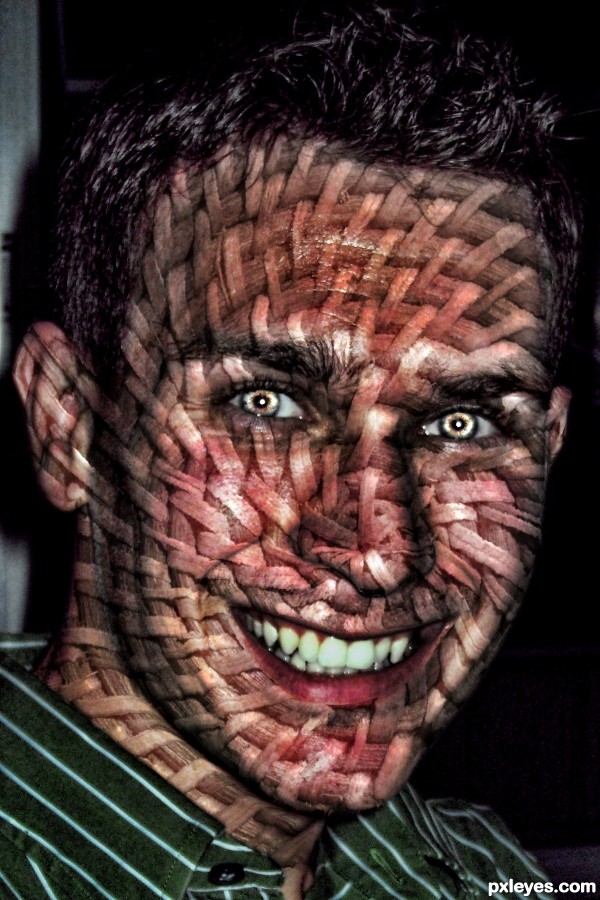
Nice idea. It would look much better if you used a displacement map on the face so that the wicker would follow the curves and crevices.
great suggestion! Thanks!!!
yep, displacement map helped a lot (I'm usually used to using it for letters all the time) THANKS
Yes, big improvement.
in my modest opinion, I would have kept the level of the basket lighter, but maybe you're right, I would not look like it had measles!. beautiful work
OMG, that's creepy-great!
Howdie stranger!
If you want to rate this picture or participate in this contest, just:
LOGIN HERE or REGISTER FOR FREE