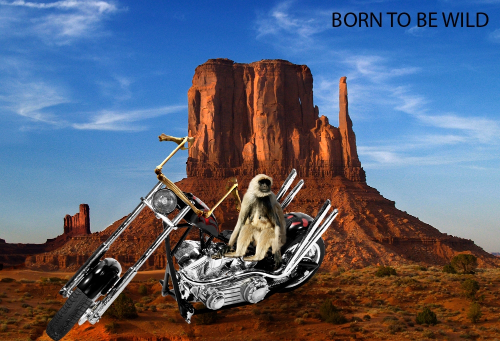
Sources from CG Textures and sxc.hu - did a bit of a change on the bike and added some bones in for handles (5 years and 3987 days ago)
5 Sources:
(5 years and 3996 days ago)
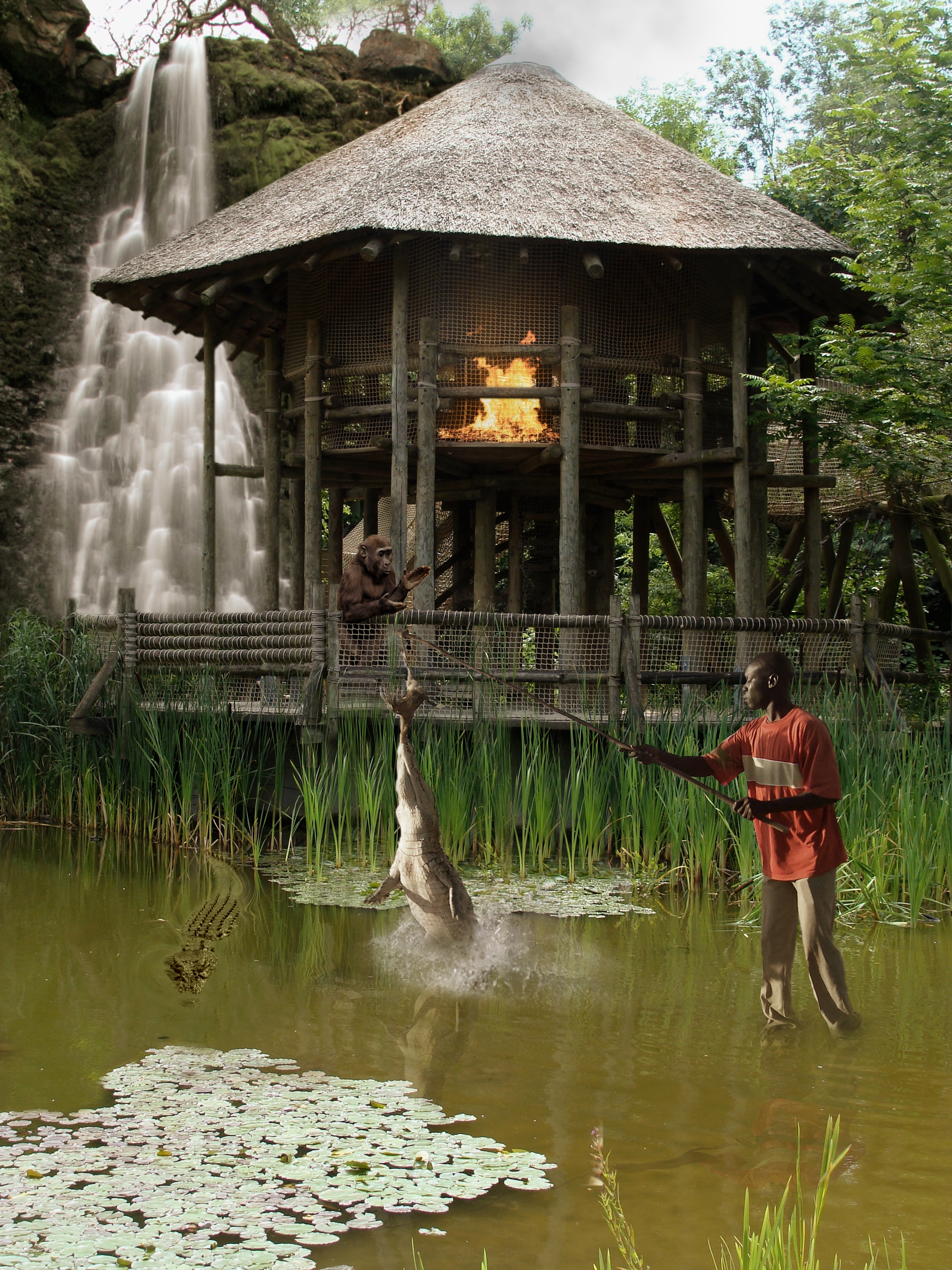
very good! the gorilla's a nice touch! but the reflections aren't good at all. compare them to the reflection of the grass 
Fantastic! You thought of every little feature! Good job!
where's the kitchen sink? hehehe.. good luck author
This is one fearless guy... does he notice the alligator or crocodile approaching him behind the one he's trying to feed? lol... I love the fire plus smoke coming out at the top and the waterfall... it all looks great... great blend... I do agree about the reflections, it might help to just use a slight wave filter or try one of the other distortion filters, doesn't need a lot IMO... Good luck.
the waterfall is a nice touch. good combination of pictures. GL
hhahahahahahah all of the images fit very nicely!
Where's the fire department? A fire in a wooden hut?
Really awesome image, a lot of work Maybe the guy on the right needs softer shadows but really cool work
A magical stick he's working with, it doesnt bend at all...
Congrats for your third place!
Congratulations for 3rd
Congrats!
Congrats!!
Howdie stranger!
If you want to rate this picture or participate in this contest, just:
LOGIN HERE or REGISTER FOR FREE
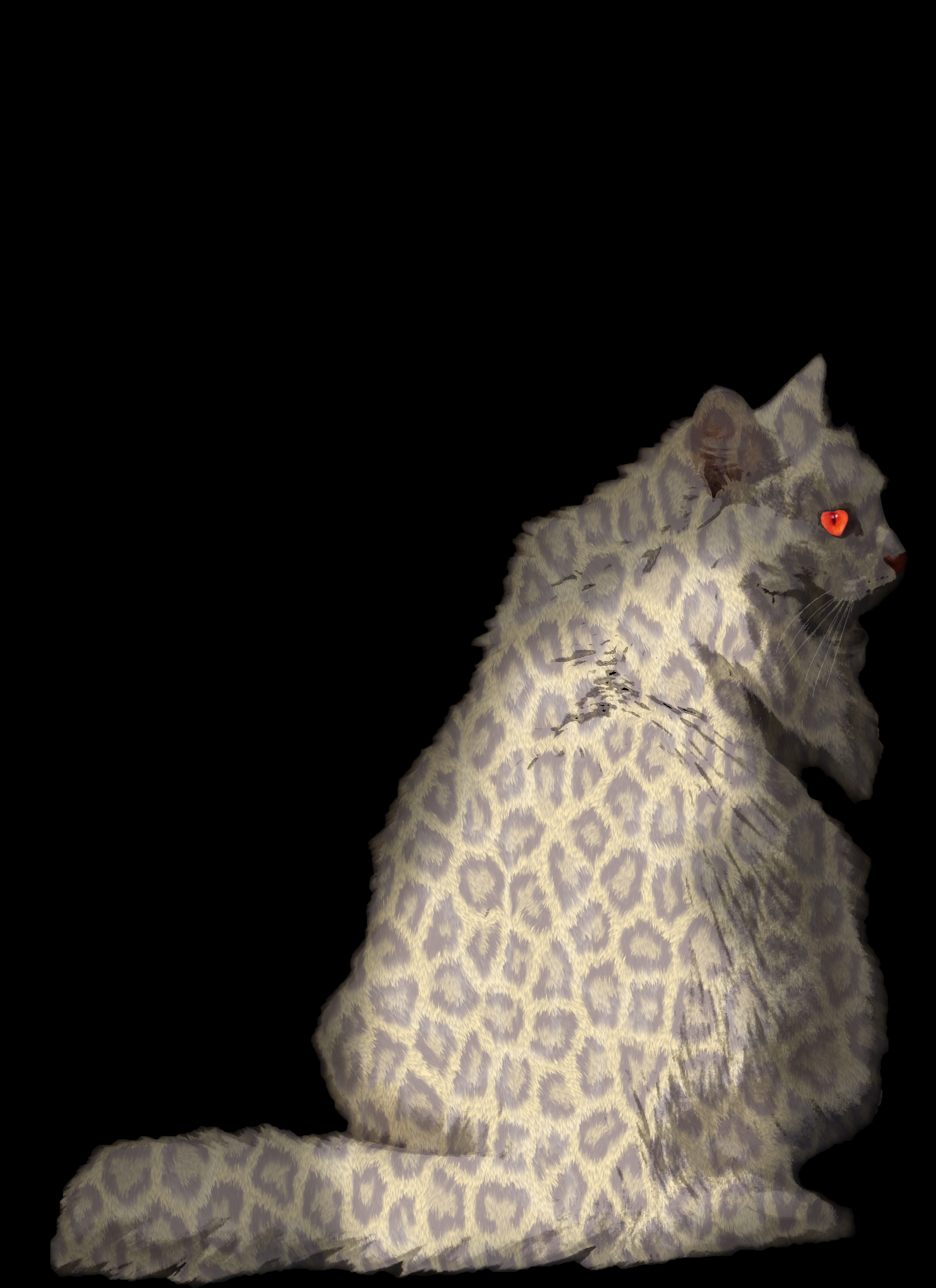
simple displacement map, but with a lot of work (5 years and 4005 days ago)
great image but you need to clean up around the edges of the fur or youll be gettin some bad votes but not from me!!
thanks Tuckinator
Nice idea shading still needs a little work tho bit patchy & transparent in places
good work!
Try working on the fir, especially around the edges. Also the color of the pattern, maybe if it were a little more vibrant and the blending mode that you used you might want to reconsider. Good idea, but maybe work on it a bit.
predator... mouses be aware...
love the eyes!
Howdie stranger!
If you want to rate this picture or participate in this contest, just:
LOGIN HERE or REGISTER FOR FREE
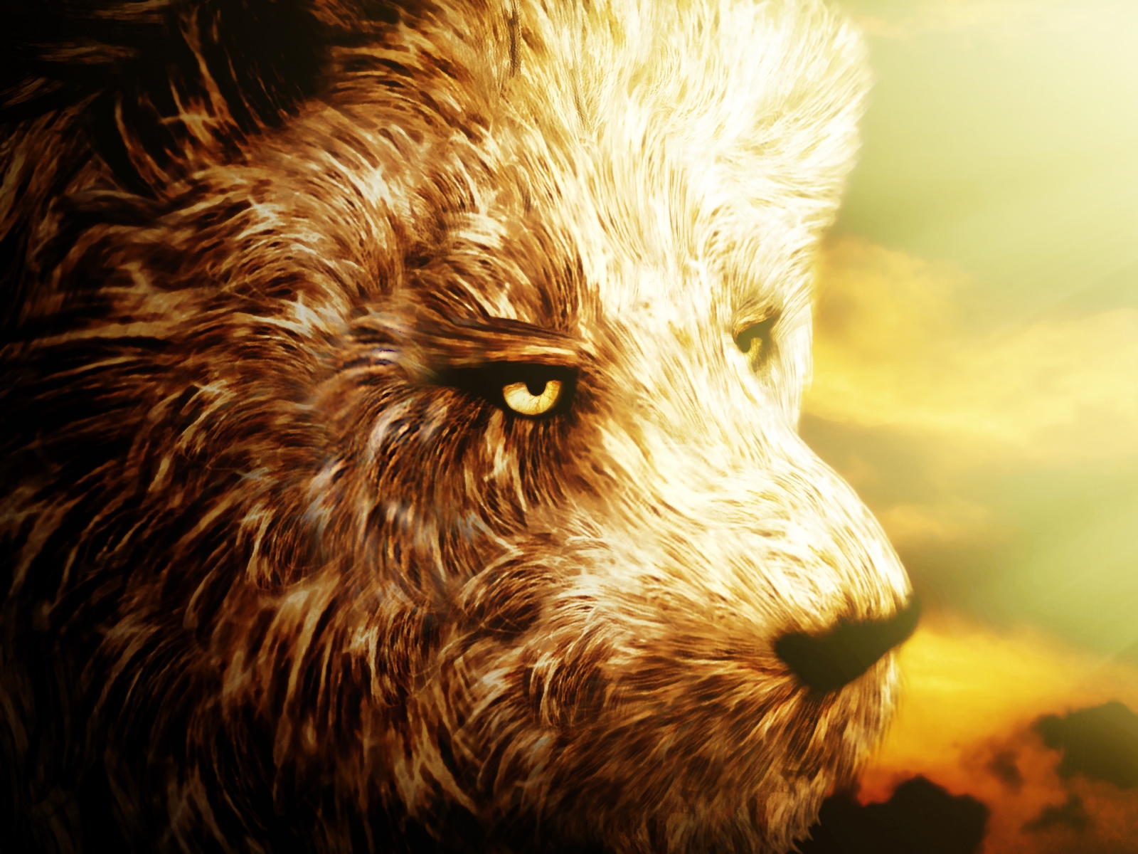
As the source image is not very clear, I focused on one portion of the chicken that looked bit better to me and selected it.
From that selection only I have created different shapes for my lion's hair. I used a lot of warping, resizing, flipping, rotating, masking in order to create diversity and blend them as good as possible.
I added sky backround, light beams, flattened image and added a lot of adjustment layers: gradients, brightness/contrast and two types of filters that I have never used before but which proved themselves to be very efficient for the overall effect I was looking for: under Artistic/ Sponge and Watercolor.
Hope you like it!
SBS on the way for more details! (5 years and 4024 days ago)
awesome image looks a bit like a bear because lions have much shorter hair on their faces but that doesnt make a difference. i love the mood. very high marks good luck
great job!!
Wowee!! The mood on this is excellent, and the detail in the fur.. WOW! High res is a MUST SEE! Great work, super high marks from me!
some light on nose and eyes may work great
just WONDERFULLY done.. he is more bear then Lion. just because of the tones and the fluffy fluffiness. hehehe.. Even though it has heavy brown tones and is very dense.. because of the light work.. you could poke him with a pin and he'd blow up like a balloon. JUST AMAZING!!!
perfect
nice work
Looks more like a bear/dog than a lion, and the light side is a bit too dodged...
You just put together a new type of wild animal... Wonderful work... I agree with CMYK though that it's a bit to light on that one side... good luck.
Very clever use of the source & very nicely executed....but would have to agree the lighting could do with being toned down a bit
good work
good work
awesome
Excellent idea.. nice work author ! good luck!!
growing up, yeah?  cooool!
nicely done..... good luck author
congrats!!
Congrats! Well done!
Congratulations for 2nd
Congrats Nellista!
Congratulations!!!!
Congraaaats
Thank you very much guys....! I'm soooooooo thrilled!
congrats
Howdie stranger!
If you want to rate this picture or participate in this contest, just:
LOGIN HERE or REGISTER FOR FREE
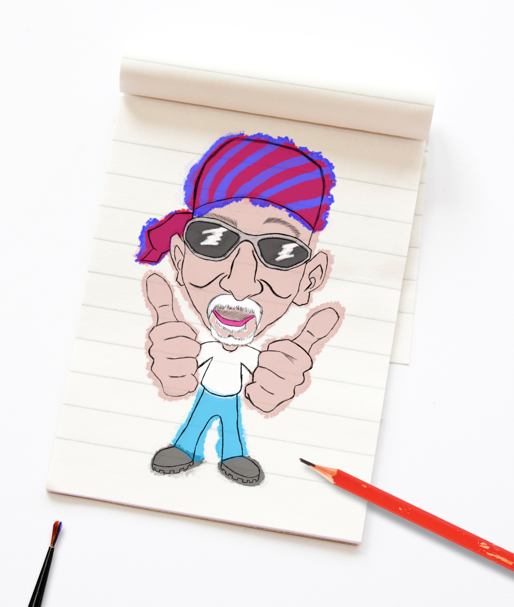
Made with a rough sketch and then painted it rough to give a watercolor look( thanks to someone suggestion :))
Used some outer source to give a different look... Hope the subject will like this one...
Also I did obtained permission for it... (5 years and 4024 days ago)
right on theme... out of the park actually.. dead on
woah... thats real fast commenting lol...
Edit: Thanks waz... I will try a little more shading, but not too much... Don't want to ruin it by going overboard...
nice work
Nice result and very recognizable caricature! Coloring is nice too. See that little bit of darker blue in the jeans just above lchappel's right shoe? That kinda shading makes the watercolour and whole drawing more lively. In case you'd like to experiment with that (ie for shading the hands or face/cheeks), would be very cool! But that's up to you, so far the result is pleasant already. Good luck!
EDIT: you're very right, author. Try to add a bit of shading like what I pointed with the trousers, certainly NOT overdo it. Most important is that it has to look spontaneous
nice work....a bit more detailing in coloring would make it great.....GL
yeah the coolest granpda here
Yeah I like it thanks for making me look younger, and the new Doo-Rag looks great 
Very cool.....great work!
You don't mess with the stars and bars where this man comes from. Better duck, author!
cool job!!!!!!
very nice!
haha...cool !!!
i like it!
hahaha.... very nice
Good effort........... nice result.....G/L Author.
i totally agree with lchappell wonderful image!!:;0
Very nice, good work, you need to fix the tip of the pencil though Idont know why it is stretched like that.
I don't think the pencil is streched... The only odd thing I find is it to be sharpened by a knife and not a sharpener... Still I will check it out once more...
very nice
YEAH! An actual caricature! nicely done!
superb work
cool
very nice
Congrats on a top 7! good job
Congratulations!!!!
Howdie stranger!
If you want to rate this picture or participate in this contest, just:
LOGIN HERE or REGISTER FOR FREE
Photography and photoshop contests
We are a community of people with
a passion for photography, graphics and art in general.
Every day new photoshop
and photography contests are posted to compete in. We also have one weekly drawing contest
and one weekly 3D contest!
Participation is 100% free!
Just
register and get
started!
Good luck!
© 2015 Pxleyes.com. All rights reserved.


The change you made on the bike looks great, but i think the monkey could use better masking around the fur, it looks like quite a harsh selection. Maybe also try masking his right leg (screen left) so it looks like he's actually sitting on the chair. And who knows, maybe give it a background if you want! Good luck!
i like this image!
Howdie stranger!
If you want to rate this picture or participate in this contest, just:
LOGIN HERE or REGISTER FOR FREE