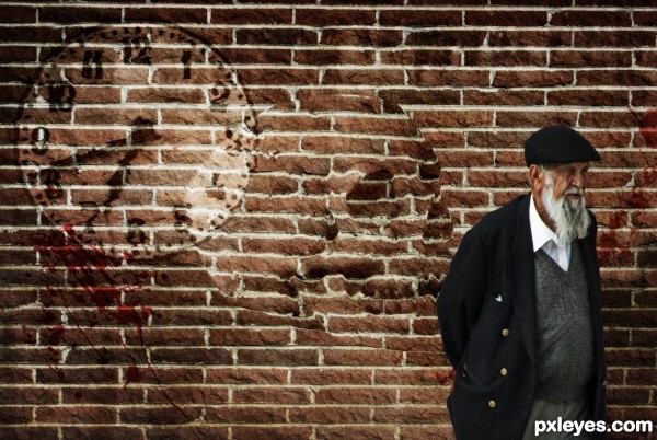
Two displacement maps were used in this project. (5 years and 2634 days ago)
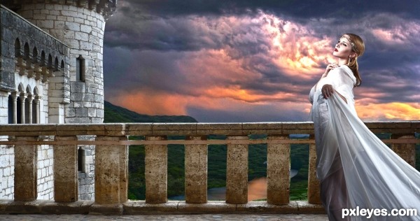
Thanks to Cat-in-the-Stock
Antithisis-Stock,Reine-Haru (5 years and 2708 days ago)
It's really dark!
it is very dark, maybe you could add a hi res to it, that might help me see it. is there someone/something in the foreground enjoying the view? i can't tell, but do not readily see anything there.
Pretty good masking, but the top of the tower is cut off.
does have the epic feel  Reminds me of Anne Boleyn
Pretty image, I love the settings and colors. Good luck! I think, it is one of your best entries... good luck!
thank you so much
Howdie stranger!
If you want to rate this picture or participate in this contest, just:
LOGIN HERE or REGISTER FOR FREE
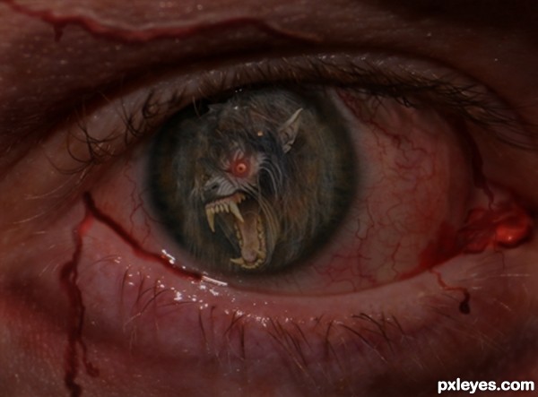
Thanks to kadath from flickr, for the pic of the werewolf, and to slworking2 also from flickr, for the pic of the eye. (5 years and 2723 days ago)
Very cool idea
Thanks....Kiricom
Nice veins and blood! well done author
Howdie stranger!
If you want to rate this picture or participate in this contest, just:
LOGIN HERE or REGISTER FOR FREE
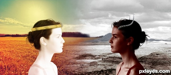
I know it's not the usual way of heaven and hell, but this is what I feel.
You see, to me heaven would be a place full of the colors I like: orange, yellow red... And hell of course is a place without color, bleached out!
Thanks to Kxhara http://kxhara.deviantart.com/ for her lovely stock. (5 years and 2731 days ago)
Original take on the idea. Nice blending of the two.
Thanks for your comment!! 
Howdie stranger!
If you want to rate this picture or participate in this contest, just:
LOGIN HERE or REGISTER FOR FREE
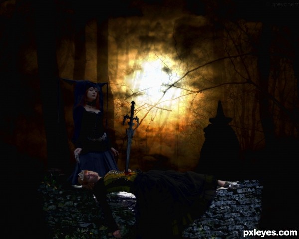
thanks to Sammykaye1sStamps
Eirian-stock,greychemistry
MADmoiselleMeliStock
HumbleBeez,Melyssah6-Stock
kuschelirmel-stock,thy-darkest-hour (5 years and 2744 days ago)
I'm sorry this entry came in so late; with a little tweak of lighting it might have been even better than it is. Your model choices are great (love the expression on the standing model) and the background is nicely colored. However, your characters do not have any of that beautiful light on them. The table/slab is bright, but the dead princess's body doesn't cast a shadow onto it nor do her clothes (nor the standing queen) have any golden highlights from the bright center light. Good luck, author!
Howdie stranger!
If you want to rate this picture or participate in this contest, just:
LOGIN HERE or REGISTER FOR FREE
Howdie stranger!
If you want to rate this picture or participate in this contest, just:
LOGIN HERE or REGISTER FOR FREE