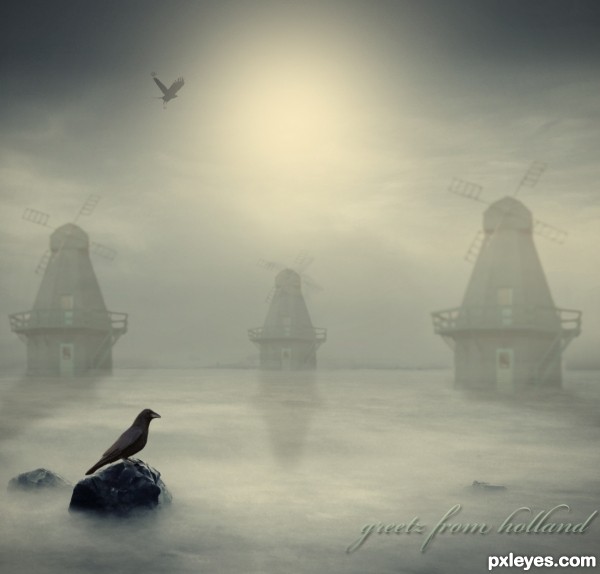
(5 years and 2725 days ago)
- 1: thx to lady-symphonia-stock
- 2: source2
- 3: source3
- 4: source4
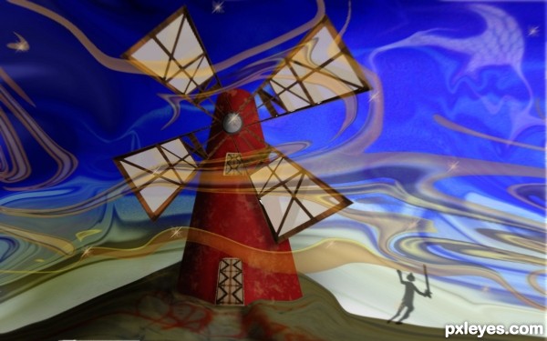
(5 years and 3313 days ago)
Very creative use of the source. Well done!
Has an almost Peter Max sort of look ... almost but not so much that it is not an Original. Very creative and definitely unique! Great work!
very very interesting work...love the childish mood on this one...but if u like more i could say...Sjajan rad, sa fantasticnom atmosverom...Srecno...
thanks erathion i appreciate it ..... ili hvala ti Nebojsa 
Howdie stranger!
If you want to rate this picture or participate in this contest, just:
LOGIN HERE or REGISTER FOR FREE
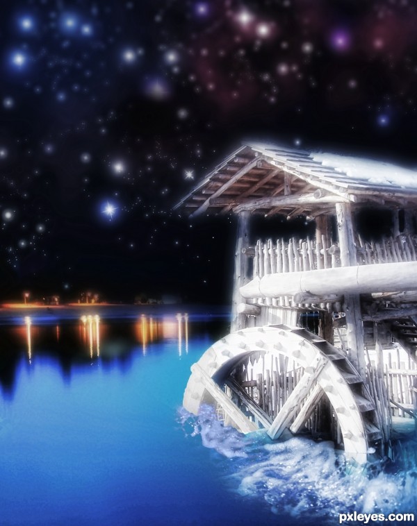
(5 years and 3530 days ago)
wonderful but its little bit blurry and the wheel need put some shadows and mask
it is very very nice work ,good luck
VERY NICE NO 1 WORK ! BEST OF LUCK
agree with silencer
Hmm, the blue part on the wheel is over the limits of the water; that's why silencer said it needs masking.
Thanks everyone. Have tweaked it but I'm not sure it improved the picture.
I think the blur is suppose to be like a glow since it's fantasy land, that was my first impression. Nice work.
Howdie stranger!
If you want to rate this picture or participate in this contest, just:
LOGIN HERE or REGISTER FOR FREE
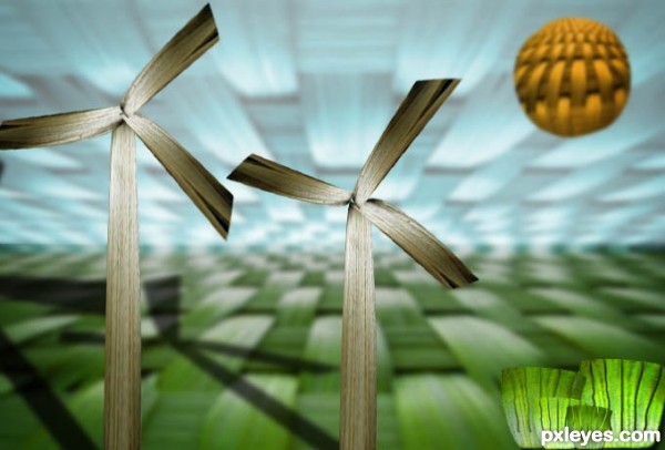
Update:Added some highlights and blurred the Sun.
Made using source image only.
Nothing but a Mill and grass, sky, and fields. (5 years and 3614 days ago)
Good luck 
Sun is too sharp comparing to sky and field. 
@kakarot
Thanks
@erikuri
Yes because I want to show some difference between the Sun and the Sky.
And others are blurred because I want to highlight the wind mills
nice idea
@hereisanoop
Thanks
Nicely done..GL
goodluck
@dollmommy,itsdesign
Thanks you!
Howdie stranger!
If you want to rate this picture or participate in this contest, just:
LOGIN HERE or REGISTER FOR FREE
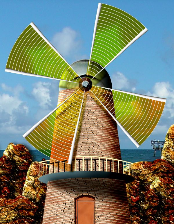
Beach photo I took at Thanksgiving combined with source
Have a friend who collects light houses and they are all over her house, so I'm always looking to buy them for her :)
I used the idea of a light house to design the windmill (5 years and 3666 days ago)
You really used the source in every way.  GL
GL
Nice 1 
Hey, it's very nice... But I don't know what is, I feel something wierd when I look at the door part... the perspective of the bricks, maybe. Looking at upper half, the building roundness is ok, but the lower half... sorry, friend, I really don't know, maybe it's only impression!
erikuri.. it should be leaning forward more.. and its dipping into the waterline (I tried to be sneaky and use the rocks in the back to cover it up..hehehe.. but you caught me .. hehee.. I like it the way it is and really don't care about placing (I modeled it after my friends lighthouse collection).. if I have time I'll try to fix it.., I just liked the way I used the source  THANKS BABE
Very very nice work...good luck author
--to erikuri-- it's because as the level of the brick come closer to, and level with the viewers 'eye-line' the bricks would lose the circular perspective shape... then lower than 'eye-line' the effect would begin again in the opposite direction. NICE WORK though... good idea
lovely one..
good luck author 
Wonderful work....
lot of work... amazing result.. goodluck
nice use of source...goodluck!
Way to use your imagination!! Love this entry, Good Luck!!
Howdie stranger!
If you want to rate this picture or participate in this contest, just:
LOGIN HERE or REGISTER FOR FREE
Beautiful
Congrats!!
Howdie stranger!
If you want to rate this picture or participate in this contest, just:
LOGIN HERE or REGISTER FOR FREE