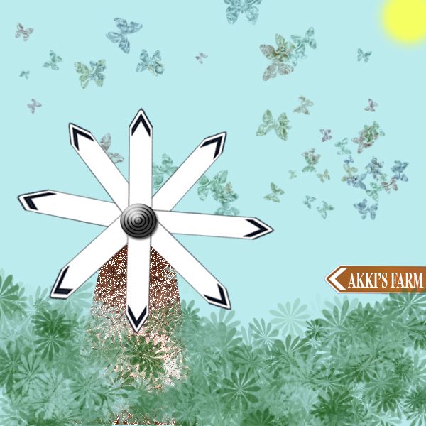
i have taken the image given and from that ive created a windmill surrounded by a farm.
*note-no external source used for this project. (5 years and 3725 days ago)

Only source used. (5 years and 3817 days ago)
nice
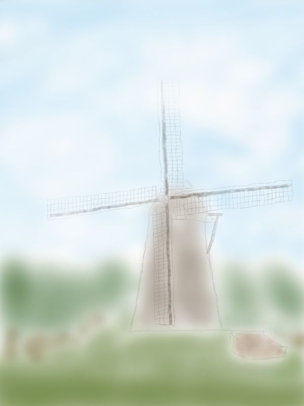
looks like a photoshop filter and that's it... maybe add a SBS to show the work you did?
Originally it was just me doodline and messing about, I just thought I might as well enter it. No filters used, 100% shoddily painted 
so you just drew the image, not actually used the source image itself???
Howdie stranger!
If you want to rate this picture or participate in this contest, just:
LOGIN HERE or REGISTER FOR FREE

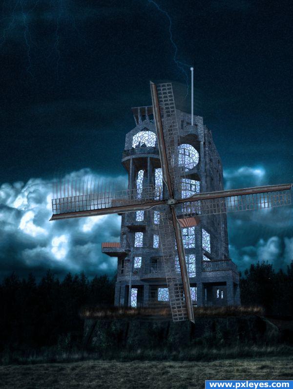
I wanted to try and combine this challenge with the one next to it.
I thought the juxtaposition of modern architecture with the old world windmill would be cool.
I added the lightning rod to further the concept of past meets future
No other photos used (5 years and 3819 days ago)
Cool idea & mood. You might want to shadow the tops of some of the windows if the light is external. If the light is internal, then never mind. 
I like the mood of this...try and put some variation of tone in the windows. I don't think all the windows would have the same brightness...just a suggestion. 
TY both for the advice. I did intend the light to seem internal but perphaps should have used some glow and some burn to emphasize that. My biggest personal complaint after looking at it again is that I would have transformed the propeller to the appropriate angle! oh well hindsight is 20/20
Wow! Different...Good idea
Howdie stranger!
If you want to rate this picture or participate in this contest, just:
LOGIN HERE or REGISTER FOR FREE

source and ps (5 years and 3900 days ago)
very nice
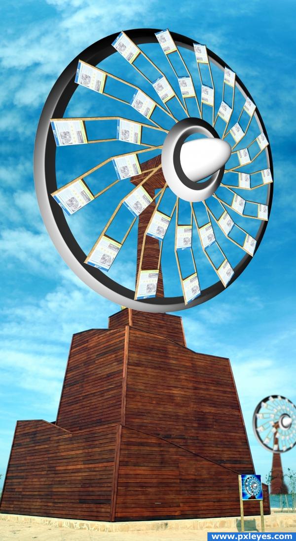
Fantastic idea, i like the addition of a second on in the background. Very nice presentation, good luck!!!
very nice 
very nice
very cool, i like the one in the background too  however i think the sign is too much, not really necessary imo
Howdie stranger!
If you want to rate this picture or participate in this contest, just:
LOGIN HERE or REGISTER FOR FREE

(5 years and 3917 days ago)
The image is very nice, but the effect spoils it a bit. Good luck!
edit: Good modifications, looks a lot better. Well done!
Cracks are way out of proportion to the structure...
cool
to remove the entry red flag the entry and write the reason
Howdie stranger!
If you want to rate this picture or participate in this contest, just:
LOGIN HERE or REGISTER FOR FREE
You windmill blades are a little off. Try copy and pasting each plade after rotating each 45 degrees.
This is a different way of looking at the source, nice imagination
thnx dollmommy..this is what i really intended to do sumthing different from the sign board
Howdie stranger!
If you want to rate this picture or participate in this contest, just:
LOGIN HERE or REGISTER FOR FREE