Windblows for your windows (shades) Just put them on and tell windblows where you want to go or what you want to do.
(5 years and 3863 days ago)

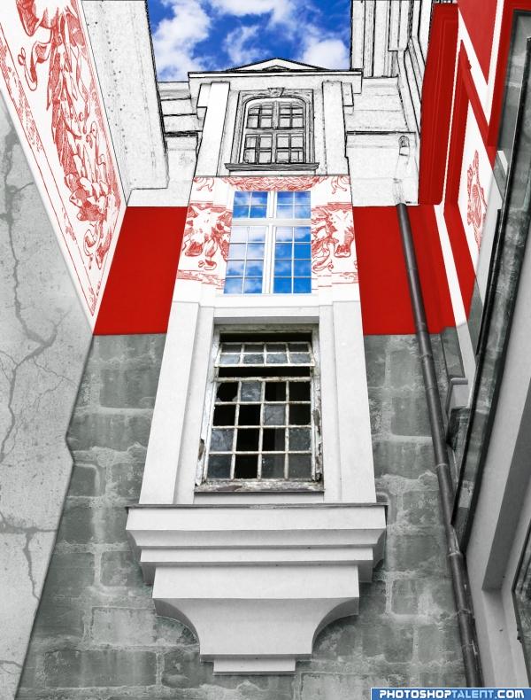
The Past is gone, we like it no more;
The Present shines with all the britest colors;
The Future, it is canvased from us all
Into the shapes and lines, and gathered into figures... (5 years and 3940 days ago)
Nice layering into time.. love the perspective.. GOOD LUCK!!!
GolemAura, thank you for the comment.The image is not perfect but, hopefully, the idea is visible 
The past and future is ok, but present.............need to improve
nice!
good one
Nice description, I like it, Good Luck 
Ory, thank you. Took me a while to create. I hope it will be useful for someone as well.
I like the idea of the future being not painted yet
nice work
Interesting idea, but image is not understandable without the theme and your description. I don't get what about the middle segment conveys the present beyond the reflected sky. The future window seems incredibly classical to me with the side columns and pediment. (A future level that looked like a blueprint might help convey the notion of prospectiveness better.)
interesting perspective;what a great idea would have been to do this building different styles of architecture
DanLundberg, I really liked your idea about the blueprint, and even wanted to try and put it into live in this contest. Unfortunately, for the past couple of days I wasn't able to get back to my work, so don't think it's wise to change anything right now.
akasha, didn't think about that, but like the idea.
you did very well
Howdie stranger!
If you want to rate this picture or participate in this contest, just:
LOGIN HERE or REGISTER FOR FREE
Hey... Now that's cool... There maybe some quirks here... But doesn't matter to me... Again nice pics...
Edit: Scratch that thought... I think I saw something else lol...
Awesome concept and probably in the works... nicely done!
The concept is fantastic but if this is an advertisement you should photoshop out the blemishes in the face.
isnt windows copyrighted?
Great job
Its a good concept author. Just one nit-pick with the image; shouldn't the images inside the glasses be flipped around so that the man can see the screen properly from the other side? Otherwise, very good!!!
well you can always call it windblows XD
supercool!
I book one!!
nice idea!
Now that you took the blenishes out it looks much better. Great job!
cool, really like this one.
I'd love to have this Windblows! Including that cool glasses of course Good luck!
Congratulations!
Congrats for your second place!
Congratulations for 2nd
Congrats!
hey congrats for the second place..
Congrats!!!!!!! well done!!
Congrats!
Howdie stranger!
If you want to rate this picture or participate in this contest, just:
LOGIN HERE or REGISTER FOR FREE