(5 years and 3014 days ago)

(5 years and 3120 days ago)
Wonderful Use of your own photography.. GOOD LUCK author 
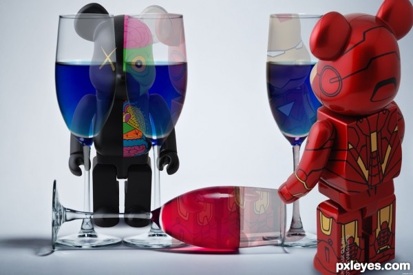
Great concept, but there are a couple technicals hurting the execution. The tilted mouse on the right is off-kilter to the rest of the image, looking like it should be falling over at that angle, and the mouse behind the glasses should be showing some distortion from the curvature of the glass - it would not be so perfectly aligned, because the glasses are curved front and back, not flat like a pane of glass.
Your shadows of the added elements also need work to match the contest source.
Howdie stranger!
If you want to rate this picture or participate in this contest, just:
LOGIN HERE or REGISTER FOR FREE

(5 years and 3157 days ago)
Nice background choice!
Howdie stranger!
If you want to rate this picture or participate in this contest, just:
LOGIN HERE or REGISTER FOR FREE

Made completely with CS5 (5 years and 3177 days ago)
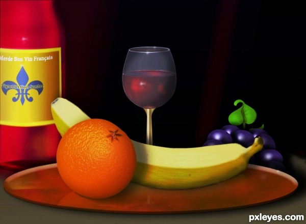
Great job on this, wine glass, orange and banana especially. 
The wine in the glass does not look like a clear liquid, so much as paint inside the glass, because of the bluish/gray lighting on the bottom, while the inside of the glass shows a darker red with no gray tones. Likewise, the light grayish coloring above the wine and even lighter along the top far edge of the glass looks out of place for something transparent.
MossyB your observations (duly noted), seem to be based on your belief that my glass was intended to be totally transparent. It was never meant to be. From my point of view, I wanted it to be a translucent blue-gray color. As for the wine looking like paint...well you are entitled to your opinion. I however seem to think it is somewhat clear or liquid looking, seeing how dark the back ground is. I did however make a change to attempt making the wine a little more see through if you will.
This is fantastic work author...every single element is made very neat and final product is perfect...best of luck
Great work!

Howdie stranger!
If you want to rate this picture or participate in this contest, just:
LOGIN HERE or REGISTER FOR FREE

Impact Font for Label (5 years and 3258 days ago)
LOL, appropriate name!
Howdie stranger!
If you want to rate this picture or participate in this contest, just:
LOGIN HERE or REGISTER FOR FREE
very well done, the olive color palette is quite neat.. good luck
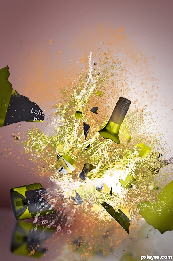
very nice entry, the only thing i would change somewhat is the angle of the glass pieces. I would try to emboss it a little bit to give it a little bit more debt and variation of the arround flying pieces.. the neck of the bottle looks great done but the other pieces still look somewhat flat. This image is however a great idea and the fluids youdone well too.
I really like this entry! it has a very "artsy" look to it. I'd hang this on my wall!
awsmm wrk Author!!
I can almost hear the glass breaking (I love that sound)!! Good work author!
Thanks for the words peeps.
Too much debris from just one bottle, but otherwise nicely done.
Actually I only used cut outs from theo original bottle.... no more no less. Any less and I would have half a bottle.
Howdie stranger!
If you want to rate this picture or participate in this contest, just:
LOGIN HERE or REGISTER FOR FREE