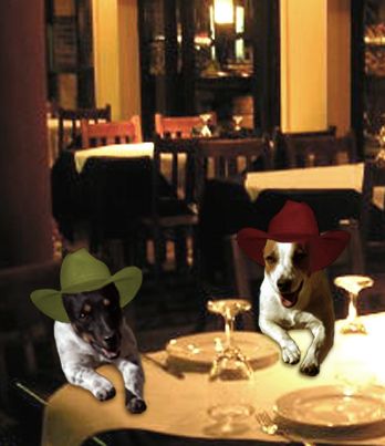
Cheers! (5 years and 3504 days ago)
- 1: Pub
- 2: Cowboy hat
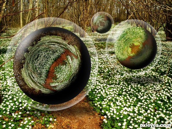
source and bubble brushes (5 years and 3544 days ago)
The bubbles are cool (although might not the clear portions distort the background somewhat?) and the title is fun, but I admit I don't see the relationship between them.
Tiny bubbles? Looks more like 5 foot wide plate-like things. 
now that's pretty cool lookin!! 
maybe "tiny bubbles in the wind?" the letters are close on the keyboard. 
It's a old love song sung by Don Ho. Famous Hawaiian entertainer, the song was running through my mind when I was making the piece so I just kept it as the title
good
Howdie stranger!
If you want to rate this picture or participate in this contest, just:
LOGIN HERE or REGISTER FOR FREE
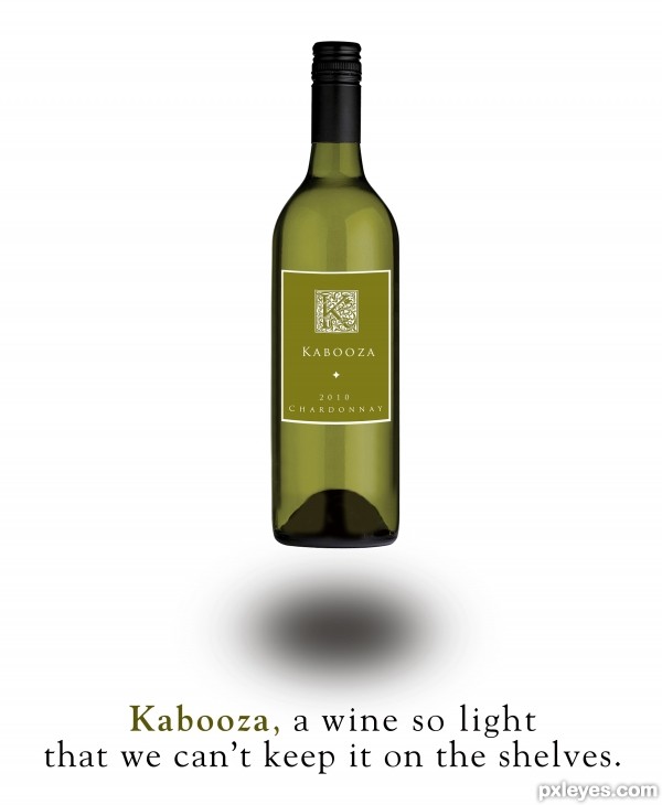
Fonts:
"K" Goudy Initial
"Label" Trajan Pro
"Headline" Goudy Old Style (5 years and 3578 days ago)
NICE ad. Love it
Because everyboody would have drunk it all! 
Nice and clean! 
Crisp and clean. The image portrays the abstract notion of 'light,' but then your text introduces the concrete notion of a table that is nowhere to be seen. A simpler message along the lines of "Kabooza, the truly light wine" might work better. [An aside: Why is a 'light' wine a good thing? Is it especially appropriate for particular occasions or with particular foods?] The label is classy and sophisticated, but while its border matches the curve of the bottle exterior, the illuminated-K logo and text do not.
Bottle design is very good. shadow you should compress vertically at-least 50%.
Well, you just changed a table for a shelf, but the message is still the same... 
Light is light, but not in excess!!! 
@Dan: I don't understand about wines - I don't even drink - but I suppose that a difference of a white wine and a red wine is clear, at least for me; I think that the white one is lighter in taste than the red one. Soft and smooth... Am I wrong, author?
Shadow isn't too convincing... gotta agree it needs pulling in vertically... also just a nit pick but the shadow wouldn't be oval either... based on the light hitting the bottle...
oh one more thing... the message might be conveyed better if there was a bottle either side of your 'brand'... just to show the difference visually... ??? just an idea!?!...
I like the concept, and it looks like a real ad, so kudos for that. I will agree on a few minor technicalities: The shadow seems a bit off (perhaps the vertical compression suggestions will work) and if one looks closely, as DanLunberg suggests, the logo and text on the bottle don't match the curvature of the label itself. Perhaps a very slight warp on those elements would resolve. Either way, it's well done, conceptually, as well as execution. Good luck author.
Very nice work author with great slogan...best of luck
Howdie stranger!
If you want to rate this picture or participate in this contest, just:
LOGIN HERE or REGISTER FOR FREE
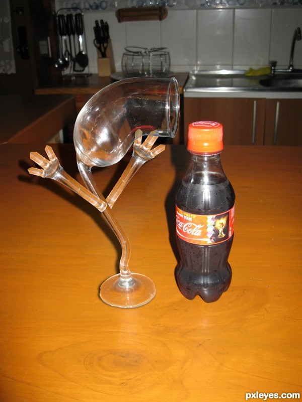
The picture used was taken by me. (5 years and 3582 days ago)
bravo.. well done!!!
Cool!
love the image but one questions... im not that great in photoshop or anything but shouldnt the background in the glass retain its original image? I mean to make it seem more realistic :O..... sorry haha had a moment
but i do like the picture 
IMHO, if you put some curves on arms it will be more personificated. Now it seems a sculpture. But I like the idea. 
nice concept. hand need more transparency.
Nice job. May want to take a soft eraser to the arm attachment area. Seems to be sticking away from the actual glass itself.
Great job removing glass from BG (what version of PS are you using?). I agree that the arms need a bit of work where they connect to the stem, but overall, well done. Good luck.
Hey all,
First of all thanks for your comments, I will try to see how to apply them to the image.
I used the photoshop CS5.
ultra cool...
He doesn´t like coke?  Amusing and well done!
Congrats on third place!
Congrats for your third place!
Congrats!
thanks a lot to everyone
Congrats!!
Congrats 

Congrats
Congrats!!
Howdie stranger!
If you want to rate this picture or participate in this contest, just:
LOGIN HERE or REGISTER FOR FREE
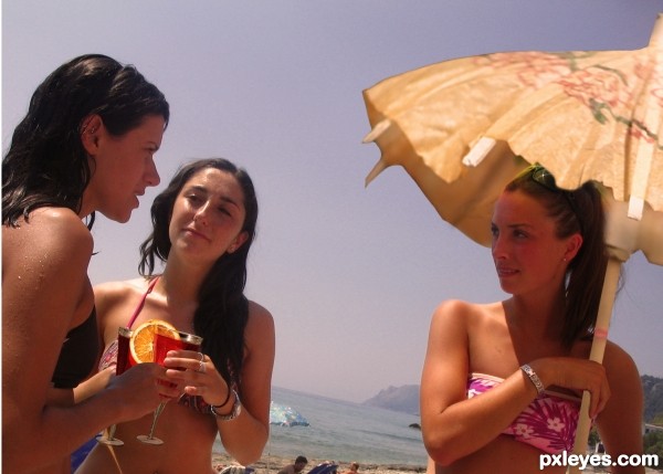
Thanks for the following images: girls on beach by keithusc and wine glasses by Davide Restivo.
(5 years and 3589 days ago)
nice blend author...good luck
Nice work author! I will have to double check your sources... I think I know these girls... I may owe one child support... lol....
Keep up the great work!
awesome
Howdie stranger!
If you want to rate this picture or participate in this contest, just:
LOGIN HERE or REGISTER FOR FREE
made me laugh...good picture, wish you had a hi res
It's so cute except the background is really blurry. :p
Howdie stranger!
If you want to rate this picture or participate in this contest, just:
LOGIN HERE or REGISTER FOR FREE