Photoshop Pictures: Wings (page 6)


results 26 - 30 of 43

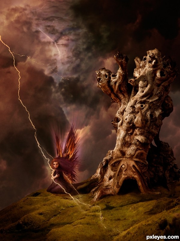
Tazer - created by arca


Tazer
Favs: 10SBS: 25Hi-resRank: 2/16Score: 62.8% (30)16611 views

She is known as Tazer; born from thunder and lighting she is as wild as the wind. But caution is advised, don’t let her pretty wings and dainty looks fool you. If you get too close she will give you quite a shock, knock you out cold and steal your gems, gold or what ever else suites her fancy!

Thank you to the following:
The Fairy: dahl29
The Sky/Lightning: MnMCarta
Dragon mouth, Tree, Wings: mqtrf
Hilltop: Lelaina
Hair and Glow painted by Author

Step 20 in SBS is Animated!

HAPPY NEW YEAR EVERYONE!!!! (5 years and 3249 days ago)

8 Sources:

avatar Geexman
Geexman says:

Magnifique!, great source choices and very well executed.... and I always love your hair
Well done and very best of luck, high hopes for this one

avatar greymval
greymval says:

It looks good, and you made a pretty cool SBS, but one thing I don't agree with is the color of her hair & dress that gets lost in the colors of the sky. I understand that she's a force of nature and therefore there's a reason for the blending, but somehow she should step out more - at least a darker hair and dress .
Happy New Year!

avatar pingenvy
pingenvy says:

Love the picture. My only issue that lightning wouldn't cast a shadow on the ground.

author says:

NOTE: IMAGE HAS BEEN EDITED AS PER SUGGESTIONS ABOVE
@Gino, thank you so much for the lovely comment and fav!
@ pingenvy - I searched for a long time to find out if lightning cast a shadow and could not find an answer. All I know is: Lightning is Plasma (neither a Gas or a Solid) and does have Mass. So I thought that perhaps it would cast a shadow. I prefer the picture without and your comment encouraged me to remove it. Thanks!

@greymval - I darkened her dress and hair and changed the sky's colour a bit. I am out of time to do more but think this helps. Thanks for the suggestion.

avatar Christy
Christy says:

Author I have to agree with Greymval on the hair color...Think any other color would made her stand out a little more....And the lightening issue IMO for this image is a bit out of place along the side of her arm and with that being said, I think causes the "issue" of shadow or no shadow...It's the color of the lightening, it just doesn't fit....Still get high marks from me for fantastic work!! Best of Luck

author says:

@Christy - Thank you for the feedback!

avatar jawshoewhah
jawshoewhah [banned] says:

Nice chop! GL!

avatar MnMCarta
MnMCarta says:

WOW!!!!! You did really awesome on this! Love the blending and colors... just makes me more jealous of ya'll that can work with PS!

avatar CorneliaMladenova

Wow, the sweet little fairy's hair and plumage are on end

no avatar

Very nice execution.....Well done .....G/L Author.

avatar CorneliaMladenova

Congratulations!

avatar jadedink
jadedink says:

Congrats on your 2nd place!

avatar jawshoewhah
jawshoewhah [banned] says:

Congrats!

author says:

Thanks to everyone! Hugs!

no avatar

congrats ... nice imagination....

avatar hereisanoop

Congrats on the second place..

avatar spaceranger

Congrats!!

avatar RichieMB
RichieMB says:

Congratulations for 2nd place, stunning piece.

Howdie stranger!
If you want to rate this picture or participate in this contest, just:

LOGIN HERE or REGISTER FOR FREE


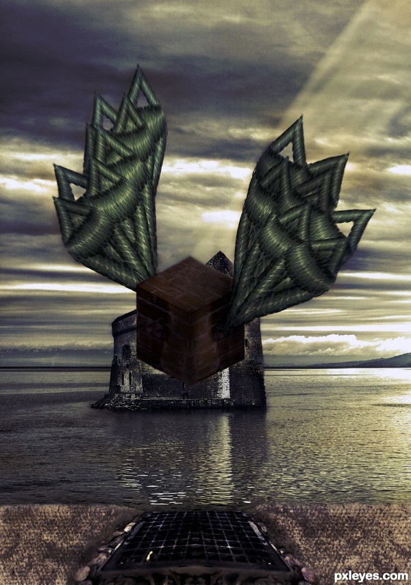
Flying Brick - created by xwd


Flying Brick
Favs: 0SBS: 10Hi-resRank: 9/16Score: 52% (0)10395 views

(5 years and 3280 days ago)

1 Source:

avatar CMYK46
CMYK46 says:

Motion effect should be on the entire object, (wings too) not just one part.. Interesting use of source.

avatar erathion
erathion says:

Very interesting approach...maybe u could use some color adjustment layers to achieve more dramatic result...with colors like this i suggest dark blue overlay layer,dark brown color layer, maybe gold-ish color layer and at the end blue/gray soft light layer...Of course all layers must have adjusted opacity...just an idea author...best of luck ...

Howdie stranger!
If you want to rate this picture or participate in this contest, just:

LOGIN HERE or REGISTER FOR FREE


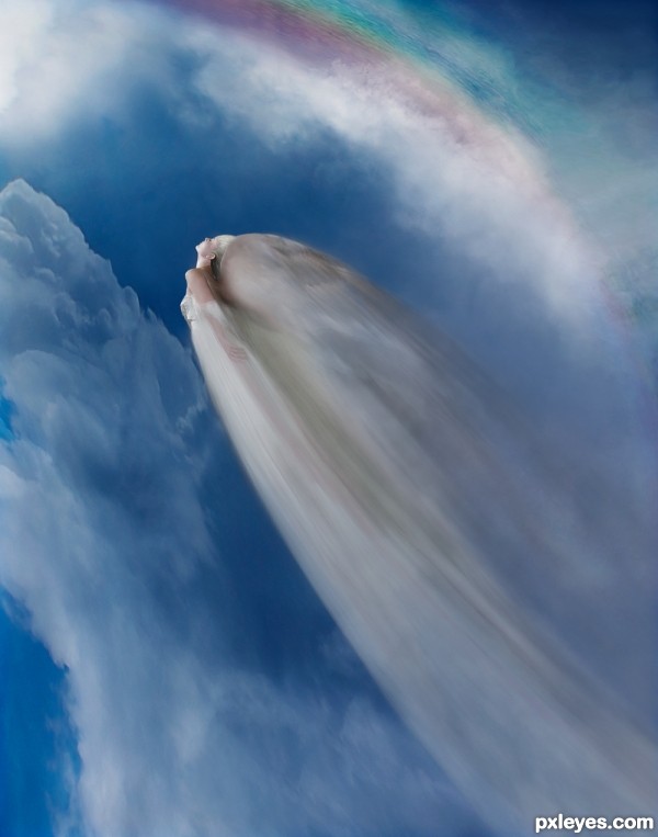
Flying the Rainbow - created by arca


Flying the Rainbow
Favs: 1SBS: 21Hi-resRank: 5/16Score: 56.7% (19)15286 views

She loved the days when the Rainbows came out. Flying through the moisture laden clouds and circling through all the colours. What a joy!

Edit: Redid the sizing and the motion trail. Lost some detail but brought it closer to the theme. Trying to get the blur from the figure flying in one direction and the wings moving in another was a pain!

All images except the model are my own.

Thank you to rammkitty-stock. (5 years and 3307 days ago)

2 Sources:

avatar loopyluv
loopyluv says:

Beautiful...

avatar MossyB
MossyB says:

I can't make out what is flying. It looks like either just a bird wing, or a dead bird. Now that I studied your SBS, I can barely make out the woman, but the wings are too large and overdominate the woman, making the image very hard to "read" without seeing the SBS...
Perhaps you could give her face and hair a bit more contrast.

avatar lolu
lolu says:

Even if i don`t understand what`s happen in this pics it looks beautifull.....

author says:

EDIT DONE ... changed so much that the SBS is not very applicable to this image. Sorry about that, I did not have time to change it. It still shows that I did the work and gives details of my first image.

avatar robvdn
robvdn says:

Author I have to be honest that it took me 5 minutes too to actually see what was flying there (and I watched the SBS a couple of times and wondered how you used the sources). Somehow you have a kind of visual illusion here, either you see it or you don't

Nevertheless I really like this entry, visually it is good, has some mystery in it and makes you want to look again. The motion could be a bit better, looks like she's photographed with a stroboscoop now, if there would be anything you want to improve I'd say have a look at that again

author says:

Okay ... tried some changes. I think it is better but I believe Rob is right. When you look at something a long time you have a vision of what it looks like but it only you can see it. Sometimes it is not a good vision LOL!

Please let me know if you think it is better???

avatar robvdn
robvdn says:

think it is more recognisable now what is flying there

author says:

Hey Rob! Thanks! Just one question, is the motion blur better? I worked on that too!

avatar robvdn
robvdn says:

To be honest If I were you I'd keep the original entry for my personal portfolio (I liked it better) but also think you made the right choice to change it for this contest. Think you have to search for a photo which has got motion blur on it and see how that looks like on a photo, it will give more a blur trail.

avatar MossyB
MossyB says:

Much better! You can clearly make out the woman, and the motion looks more "moving," to fit the statement.
Great improvement!

avatar erikuri
erikuri says:

I could be a "stop-motion" image, or a "slow-motion". Very beautiful, and it makes our imagination fly away...

avatar apicula
apicula says:

oh, very nice one...

avatar erathion
erathion says:

Fantastic entry author...i did not saw the previous version/versions but this one is powerful...well done

author says:

Thanks Nator. I was unsure about the changes so it is really great to get positive feedback now that they are done.

avatar hereisanoop

i should have seen this earlier..., beautiful job

Howdie stranger!
If you want to rate this picture or participate in this contest, just:

LOGIN HERE or REGISTER FOR FREE


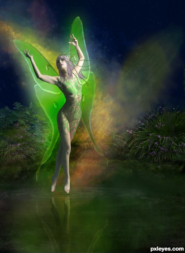
Star Dust Fairy - created by arca


Star Dust Fairy
Favs: 16SBS: 17Hi-resRank: 2/16Score: 62.5% (30)16956 views

Hair, jewels, body swirl design, pool, sky and most of the background were all created by me in PS.

Thanks to Marcus Ranum www.ranum.com. for the model and to zepherofgod for the Luna Moth Wings. (5 years and 3321 days ago)

2 Sources:

avatar CMYK46
CMYK46 says:

Great. Love how you achieve a painterly effect.

avatar hereisanoop

I had a feeling about the author.... And I was right..,
Great Job again

avatar shaadow
shaadow says:

love her wings

no avatar
Keiley22 says:

beautiful work author...... im very impressed with your background its stunning
Would look great on a book cover if you ask me

avatar erikuri
erikuri says:

Simply superb!

avatar swordfish
swordfish says:

fantastic .............

avatar nanaris
nanaris says:

love the mood and shape, good luck!

avatar Siddhartha

wooooooooowwwww...explicit art...very well done ..gud luck

avatar genuine2009

CGR.!!!!

avatar demi
demi says:

Gongrats

avatar Geexman
Geexman says:

congrats acra, beautiful as always

avatar velkanx
velkanx says:

congrats..lovely work

avatar DigitalPro

Congratulations for end place - very nice

avatar mistic
mistic says:

congrats!!

avatar spaceranger

Congrats!!

avatar chakra1985

Congrats!!

Howdie stranger!
If you want to rate this picture or participate in this contest, just:

LOGIN HERE or REGISTER FOR FREE


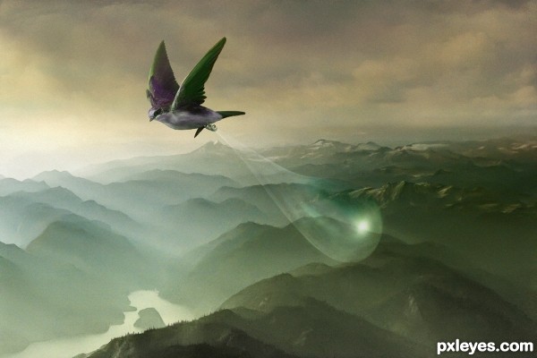
The Burden - created by arca


The Burden
Favs: 9SBS: 15Hi-resRank: 3/16Score: 63.1% (25)18296 views

Created from all my own images and a little bit of in PS painting. See SBS. (5 years and 3333 days ago)

avatar artgirl1935

This is such a beautiful image and makes me feel like I am up there with that bird. Bird could maybe use some motion blur so that it doesn't seem to be motionless. Your SBS is SOOOO outstanding. Would like to know what program you were using. My Adobe 6 doesn't seem to have all the options you described. High score!! GL

avatar mistic
mistic says:

very soothing image................

avatar nanaris
nanaris says:

very sweet work, good luck!

author says:

Artgirl ...I am working in CS5. What options doesn't 6 have? I used to work in PS6 and may be able to suggest alternate ways to do the same thing ... PM me if you want

Re Wing Blur - I know what you mean. I did try that when I was first working on the picture but it never looked quite right. I could perhaps blur the wings a bit? I did have the teardrop hanging more straight down originally but thought that having it flowing backwards helped to give the sense of motion.

avatar hereisanoop

Once again.., beautiful job

avatar cabldawg71

Very nice Author I like this alot

avatar erathion
erathion says:

Fabulous work author...animated part in SBS is nice touch,,,good luck

avatar Akassa
Akassa says:

Simple but amazing! Very good job author, i love the perspective and the colors overall!

avatar erikuri
erikuri says:

I imagine the bird carrying our dreams in that bubble... Very beautiful image, and the colors are so nice!...

avatar pingenvy
pingenvy says:

I was SO looking for a coconut in the bubble. My first thought was, "Is it an African swallow or a European swallow".
Back to the point, its painterly and VERY nice!

avatar shaadow
shaadow says:

animated sbs is very good

avatar lchappell
lchappell says:

very pretty, I like attention to detail on your mountains

author says:

Pingenvy ... I am pretty sure it is a North American Wood Swallow but I changed the colour to match the image better...it was originally; a great iridescent blue on the back and lower part of the wings, white belly and brown/gray everywhere else ... tee hee, sneaky me! Oh and sorrry about the coconut ... I will consider it if I do a revised edition someday

avatar jaskier
jaskier says:

Very nice image.

avatar CorneliaMladenova

Congratulations!

author says:

Thank you all so much for your comments and support ... I am certainly loving my new home! Many hugs to all!

avatar swordfish
swordfish says:

Congrats

avatar hereisanoop

congrats

avatar loopyluv
loopyluv says:

Arca, wonderful work!!! congratulations!!!

avatar spaceranger

Congrats!! Sweet image!

Howdie stranger!
If you want to rate this picture or participate in this contest, just:

LOGIN HERE or REGISTER FOR FREE