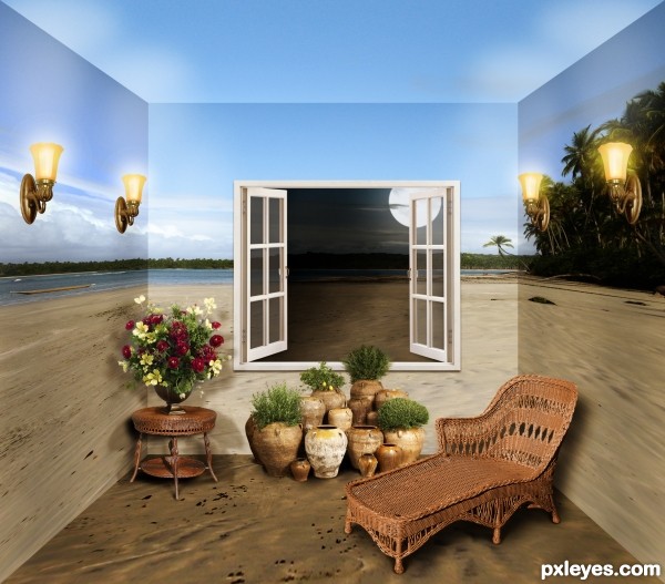
Thanks to Lieven Verbelen for the perfect background.
Special thanks to these photographers for their painstaking work in preparing their stock:
AbsurdWordPreferred for the window, and
JinxMim for the light fixtures, wicker, and garden pieces.
I made the moon by drawing a circle (ellipse tool) filled with white, then using the eraser, set to chalk brush at a low opacity, to create three "craters," varying the brush size each time.
Shadow/color variations for the walls and floor were achieved with Brightness/Contrast adjustment layers. Furniture and object shadows employed some Drop Shadow and mostly black painted layers with low opacity.
Night scene through the window was achieved using a duplicate background layer (using the window as a size guide) set behind the window, applying an Exposure layer mask, and painting selective light back in. Glass panes are white rectangles set to low opacity.
Two color adjustment layers were applied over the entire scene: one with greens made more vibrant, and one with an overall golden brown, set to soft light.
If I missed explaining anything, please just ask. (5 years and 3184 days ago)


Amazing!
I like the shadows, and perfect combination with the background. And i like it the idea for the floor. Well done.
Wow!!!
I'd never want to leave a room like this! Excellent work, and one of the best examples of this concept I have ever seen. Instant Fav!
Very elegant!
This is so much better than the tutorial. But there didn't seem to be any corners showing in the tutorial Guess that doesn't matter. Also, I love the sand on the floor. Tutorial had baseboard around floor which wasn't in very good perspective. Great job!
I'd think the back wall would be darker than the walls lit by the lamps. Otherwise I love this...GL author!
Thank you, all!
I didn't care much for the tutorial either, artgirl1935 - lots of sizzle but no steak (I couldn't tell or couldn't appreciate the difference before and after all those additional adjustment and shading layers, LOL). But it sure is an interesting concept.
CMYK, what you say makes perfect sense logically. However, as I sit here and look at the walls, the one that faces me reflects light more and is brighter than the perpendicular side walls, even though the light is physically on the side wall. Weird. (The immediate area of the light is brighter, otherwise side wall is darker in comparison.)
MossyB, all opinions and critiques are welcome and appreciated, but as the contest proposer, your opinion is very special. I'm glad you like the result!
The night exterior with the day interior is genius. The sconces are a creative way to convey greater solidity to the side walls, but the light they emit is apparently irrelevant to the illumination of the room. (They shine light up while their solid bases would cast shadows down.)
Very good work, GL!
very very nice but i think there are some premade work , thats not allowed , like thr garden set
Pre-made? I don't understand. They are real objects in a layered psd. It's not a photo manipulation. Is that what you mean, andi?
Agree with Dan about the interior and exterior shot lighting difference. I'd never want to leave this room - and the use of wicker is perfect for this relaxing 'atmosphere'! Great job.
congrats! well deserved 1st place!
Congrats Elemare wonderful room, I'd like it at my place
Great work and congrats!
Thanks, everyone!
Howdie stranger!
If you want to rate this picture or participate in this contest, just:
LOGIN HERE or REGISTER FOR FREE