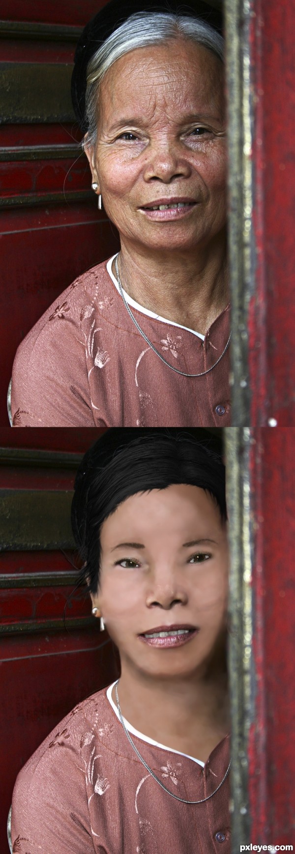
It was interesting.. found the younger you wish to make them you have to lose the porous skin... would make a better pic if you could have borrowed skin,,but that was the challenge... (5 years and 3345 days ago)
(5 years and 3352 days ago)
nice colors! good luck1
Howdie stranger!
If you want to rate this picture or participate in this contest, just:
LOGIN HERE or REGISTER FOR FREE
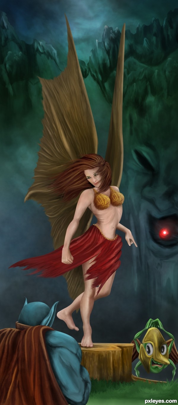
The kingdom of the Bigblues is under attack... Now the only hope for them is the red diamond from the magic mountain. Which belongs to the fairy queen. The warrior from The Bigblues reached the magic mountain and asked the help of Fairy queen. She was so kind to help him.. And also she asked her servant Eyeboe (the little green guy)to assist the warrior in the battles.. But the little Eyeboe is lazy and he is not interested... Still he has to obey his queen...
So the great battle will begin soon.....!!!!!!
No out side source or references used.... (5 years and 3369 days ago)
whoooooaaa......there you go again..... this is really fantastic......!
awesome entry GL 
very nice work!  beautiful colors too!
MARVELOUS!!!
i like your ART WORK
Fantastic ! Beautiful wings she got  Nice work on the background
  and the expresion on the face of Eyeboe is great ... all the best


nice work
I like her movement and wings. Nice work = )
Fantastic! Love the story too!
Made some change in colorbalance... And changed the title....
Fabulous piece of work author...I love whole composition but the details as hair and fabric is master piece...well done
Fantastic work !!
Fantastic drawing work, author! 
Fabulous entry 
Congrats Anoop. Another amazing work.
Congrats!! Very fine creation!
Congrats on a wonderful entry!!!
Congrats Anoop  wonderful work
Congrats, great job 
congratulation!!!
congrats!!!!!! 

congrats 
Nice Job Congrats on first Place
Lovely fantasy land you have created! Great work, once again a top notch image!
Howdie stranger!
If you want to rate this picture or participate in this contest, just:
LOGIN HERE or REGISTER FOR FREE

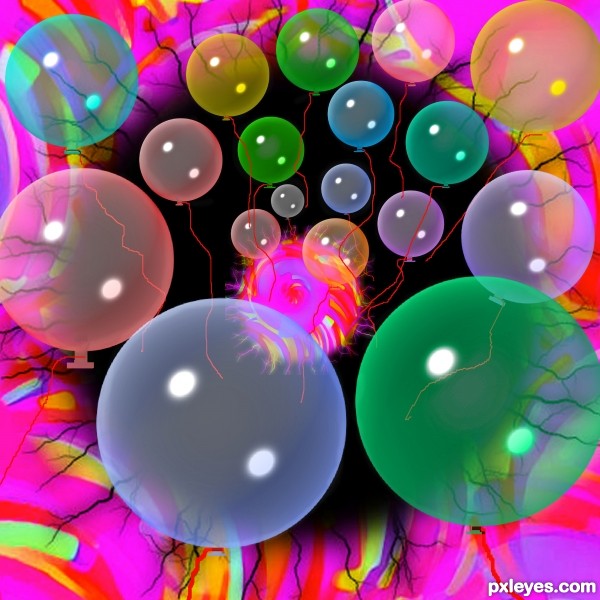
the bubble is the ozone layer here,we use different types of chemicals in our daily life which are destroying the ozone layer (5 years and 3371 days ago)
The light reflection "spot" is misplaced and makes no sense. It should be a reflection of the sun shining on the planet, not an odd, squarish light spot.
There is also no light reflection/refraction from the flame, which is so bright that it would be MUCH lighter along the bubble "edge," not a dull orange that barely shows on the bubble at all.
there are many ways you can suggest someone about their work.people do not come here for getting a rough criticism about their work..most of us come here for have some fun and learn something through competition s.There are many ways you can help someone to improve their works.But hurting their emotions is definitely not the way.It never works.words like"makes no sense" only disappoints a participant nothing more..u may have much knowledge about photos , lighting,and reflections but there are many friendly ways to admit those.I always appreciate your honesty..but always be careful how u admit them.
You are not in training . I received a couple of slaps on all weeks.
ACTUALLY IT'S HARD TO FIND THE BUBBLE ON YOUR PIECE, AND YOU SHOULDN'T BE OFFENDED AS THIS CRITICISM WAS NOT ROUGH AND BESIDES MossyB POINTED TO YOUR MISTAKES. YOU SHOULD HAVE SAID "THANK YOU" AND CORRECT YOUR MISTAKES.
It's an obvious technical flaw, and I pointed it out.
Comments are just that. I commented on what I observed, which is incorrect light reflections on your bubble. Whether or not you choose to agree, or get hurt feelings is YOUR response, which I have no control over.
This is a competition site, and while we all come here to have fun, it's not a day care, and part of submitting your work for public comment means having a thick enough skin to not whinge when your technical mistakes are pointed out. If you cannot endure any criticism, you can always not elect to allow public comments.
I do not need to "be careful" in stating what I see. Perhaps you need to be more careful in what you render.
well Its not about my feelings sure its not because I am with this site about 1.5 year almost.so my skin is thick enough while guys like you around.well its more a COMMUNITY then a competition site IMO, thats what i wanted to say.where competitions are fun ,scoring points are fun also.I have received many criticisms since I am here, I always appreciate those ,but is it sensible in a community to admit your suggestions way like this.?..and @ANDROLA I have said in my previous comment that"I always appreciate your honesty"..so I guess I thanked him/her there,but what I wanted to say I don't really like the "way" he/she suggest, not just mine only.
Author is partially right,Mossy, you always sound way too serious when commenting, that's cause you never use smileys and have no avatar (anti-social written all over  ).
).
Although I honestly dislike when someone points to my mistakes even though they are 100% right (and they even use smileys and avatar), the thing i hate the most is having a low or average score and no one telling me why.
You should be (somehow) glad that Mossy commented and believe that she has no hidden interest in making you feel bad. And she was pretty much right, so..if you have time, you could try to improve your entry.
LOL. I can see the bubble. Yes your work needs a little work author, and Mossy's comments are here to help you. (as are every one elses)
Though she(are you a she Mossy, LOL) tends to sound like a robot, very impersonal, but as greymval said she has no avatar and doesn't use smileys, i would if i knew how
Don't take it to heart.
Keep up the good work, we can only learn from our mistakes and sometimes others guidance.
Members who suggest how your image could be better are doing you a favor. If you choose to be insulted by their comments, you had better be a genius who can afford to ignore them. In this case you are not.
why you guys misunderstanding me ?I didn't feel insulted, I always appreciate those suggestion come to me ,they always help me to improve my my work am grateful to you guys,
But there should be a little respect for the work while you suggesting someone ..thats all what I wanted to say
I am probably one of the most sensitive people around....even I didn't think MossyB's comment was a "rough criticism" EVEN without smileys! Why should people have to put smileys after a sentence? How about people just think about the many ways the sentence can be construed and pick the most favorable one?! People always think the worst first. I think MossyB said things constructively politically correct!
By the way author, I like the whole image except for the fingers. It looks as though the fingers have been burnt. I'm not sure if that is what you were going for, but it just doesn't look right 


"It's up to us as the authors to decide what works best in the end"-spaceranger and I believe in this and feel like this way.
Howdie stranger!
If you want to rate this picture or participate in this contest, just:
LOGIN HERE or REGISTER FOR FREE
(5 years and 3383 days ago)
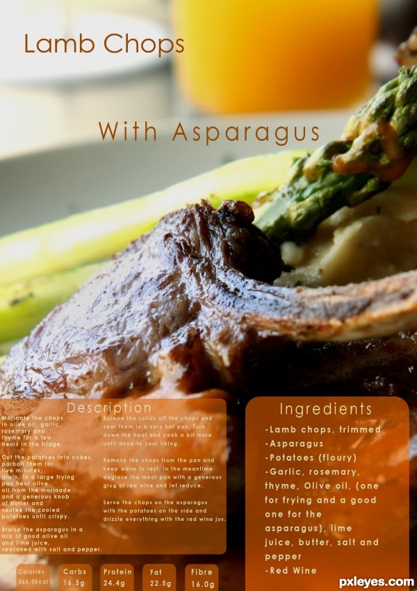
Sounds delicious, but the light reflection off the pork chop is too high contrast, looking more like a glare than a highlight.
You've also misspelled "ingredients."
Ohh thank you i didn't notice.. must have pressed "e" twice by accident...
I'll fix the contrast too 
the text of your description need to be centered to the panel with an equal gap seperating the 2 columns and give more space on the left side text (its a guillotine operators nightmare).......sorry to be picky but I do this for a living 
Sounds good, but the small text is barely readable in high res.
Right on theme with an upscale-magazine layout. Unfortunately, the glare on the pork chop hides the central ingredient. I think making "Lamb Chops" and "With Asparagus" bigger and having the former slightly overlap the latter could be more dramatic. Also, traditionally the ingredients come first (i.e., on the left side here) followed by the instructions (i.e., on the right side here). (I suppose alternatively having the ingredients higher than the instructions might visually convey the traditional ordering arrangement even if the physical arrangement is non-traditional.)
Very nice! GL!
Howdie stranger!
If you want to rate this picture or participate in this contest, just:
LOGIN HERE or REGISTER FOR FREE
Her left eye is slanted at a strange angle, and the forehead coloring looks like she has a large lump near the center of her forehead, but a good effort!
Howdie stranger!
If you want to rate this picture or participate in this contest, just:
LOGIN HERE or REGISTER FOR FREE