
Photograph is my own, thanks to surely for his fish (5 years and 3507 days ago)
- 1: Fish
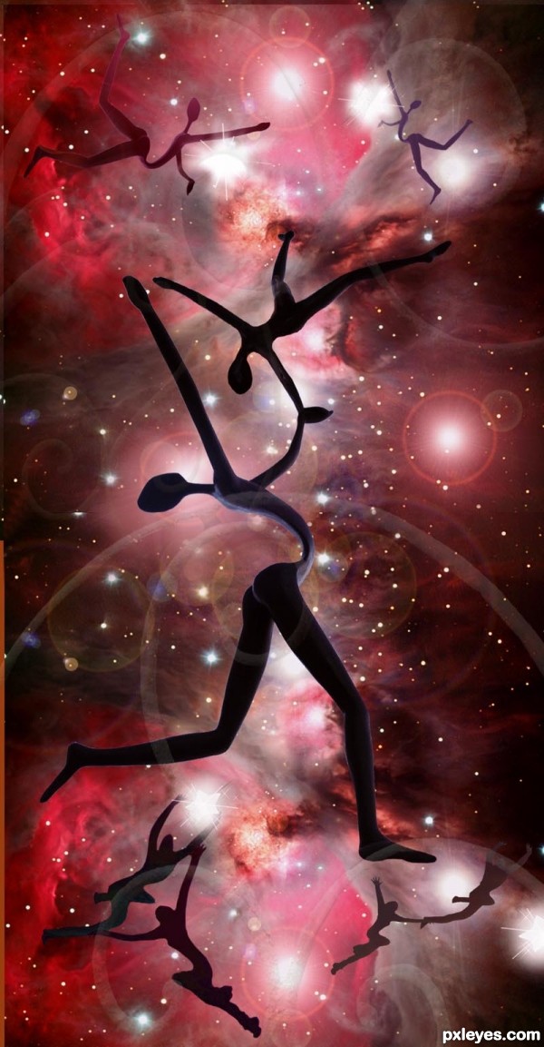
I've wanted to use this wonderful sculpture for a long time in a contest. Thanks for Great Nebula in Orion by mike-in-ny at flckr.com. Also to stuant63 at flckr for Star Jumpers and to brockvicky at flckr for the star source. The sculpture is by veggiegretz at morguefile.com. Thanks so much!! (5 years and 3515 days ago)
Nice image! The sculpture is really interesting, and fits perfectly in this work. Great colors, too. GL!... 
cool!
fine work
very cool work author...well done
nice work .......... 
Best of luck!
Howdie stranger!
If you want to rate this picture or participate in this contest, just:
LOGIN HERE or REGISTER FOR FREE
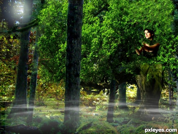
One with Nature and everything around you. (5 years and 3525 days ago)
NIce
Interesting concept 
cool idea
Howdie stranger!
If you want to rate this picture or participate in this contest, just:
LOGIN HERE or REGISTER FOR FREE
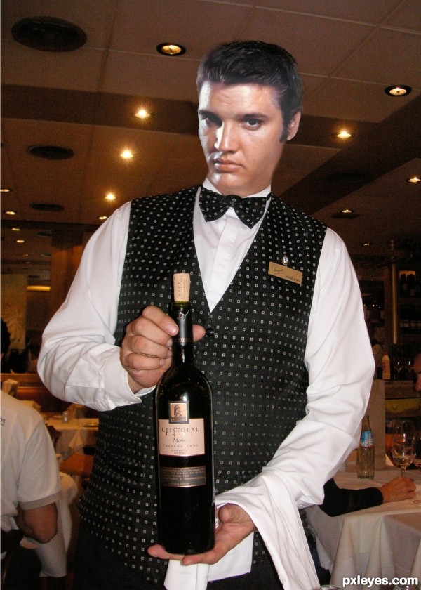
Thanks to :Aine D for Elvis and bmurch for the image of the waiter. (5 years and 3526 days ago)
Try to work on the hair...compare to source. There's something with the face, too...it looks distorted somehow.
Yes I agree with you CMYK46, have fiddled about with it for two days and can't get it any better - will have another go tomorrow. The thing is as well - to me he doesn't look a bit like Elvis. I did find a good lookalike but didn't take details at the time and now can't find him again - he's obviously "left the building"... Thanks for the input - always appreciated.
Author, the face in your source looks pretty good to me!  Give it another shot.
Well CMYK46, have worked for many hours on this one. He still looks a bit strange in the neck region thats because the original waiter had a bit of a double chin (hope he doesn't read this!) and I had to keep the neck since Elvis didn't have much of one and the image was quite small. I'm sure that others could do better, but I'm all Elvised out .........
Thanks for your help though - really appreciate it. It helps me a lot - although you may not believe it looking at the results.....
he is not smiling anymore 
I think he looks better, but get rid of the shadow on his highlight side.
Looks still quite fake...do as CMYK says, and also remove the shadow behind his head and fix the bulging sides of the neck.
Elvis is looking down, so his chin would cover his neck more, I think. If you'd lower the head, it might fit better on the body. Btw I thought there was nothing wrong with the looks of the previous Elvis (before you edited your entry. Good luck!
Well thanks for all your comments! I have tried to make the changes and I think he looks a little more normal now, but as always - you all have the last word. Strange....I used to LOVE Elvis.....
Lookin' great now! 
Thanks for all the help folks!
I know you said you are all Elvised out, but looks like all your extra work was worth it GL = ).
cool entry author
Howdie stranger!
If you want to rate this picture or participate in this contest, just:
LOGIN HERE or REGISTER FOR FREE
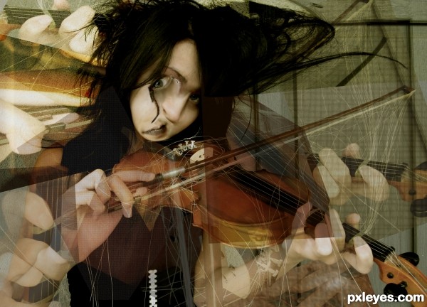
in the true form of the master, picasso, i've rearranged her face,
thanks to shinrajunkie @ dA. (5 years and 3529 days ago)
Real nice work here author.. GREAT job!!!
great work author!
very nice ! g l
very nice work author...i like Psiho effect...best of luck
Picasso would be proud of you, author! Very well executed, GL!... 
"Daliesque". To me at least.
freaky! but in a great way!!
Nice colors and interesting manipulation on her face 
Howdie stranger!
If you want to rate this picture or participate in this contest, just:
LOGIN HERE or REGISTER FOR FREE
nice work...gl
Not bad, but you need to remove the sun glare from the wall.
Yep, I agree with CMYK, sun must be higher for glaring on the wall, as the original source. But colors are very nice.
Thanks for the comments - spotted them too late though.
Congrats
Howdie stranger!
If you want to rate this picture or participate in this contest, just:
LOGIN HERE or REGISTER FOR FREE