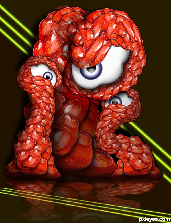
Picture of a cup of Mountain Dew over Ice on the window sill in the sunlight (my Photo) (5 years and 3573 days ago)
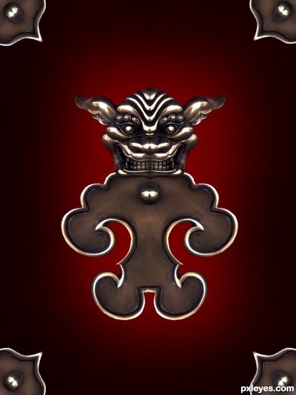
Only source image used. SBS included. (5 years and 3573 days ago)
A grown up version of winnie the pooh 
Howdie stranger!
If you want to rate this picture or participate in this contest, just:
LOGIN HERE or REGISTER FOR FREE
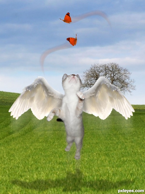
My pic, a source of another contest and some outsource images.
Thanks to:
- jans canon at Flickr;
- 13dede, clemmesen and alitaylor at sxc.hu;
- and Pxleyes.
Edit: I removed some butterflies, but I'll keep my thanks to the authors above! (5 years and 3575 days ago)
Nice image, the only things I would suggest changing are the butterflies (it is too obvious you have cut and paste each one three times, use more different images). I would also remove the blurry train from below the cat and the wings, adding a slight motion blur or manually blurring the ends of the image would make it look more realistic imo.
SOOOOO SWEET!!!... maybe arrange the butterflies in swirl patterns that are playing with the kitty... like that effect you get when you tie a ribbon to the end of a long stick and make it follow a trail pattern.. just an Idea.. the kitty is BEAUTIFUL!!
Just my 2 cents, but if there were only one butterfly (possibly a bit larger), it would give the image more of a focus. Good idea, though!
I COMPLETELY agree with you all! Let me see what I can do... thank you! 
Damn,this kitty cat is very focused...yummy butterfly's...great work author...best of luck
Isn't she so fluffy and cute? 
yes she is fluffy and cute.. just like you.. much improved with the single butterflies!!!
Thanks, Ernie... Fluffy is you, friend of mine... 
Really CUTE! I would shift the bottom butterfly to the right slightly so it's more in the kitty's line of site, and I would drag the shadow layer a little further down so it looks like it under neath the cute flying cat. Motion trails may not be needed, but that's up to you. Such an adorable idea!

congrats girlfriend!!!!
Howdie stranger!
If you want to rate this picture or participate in this contest, just:
LOGIN HERE or REGISTER FOR FREE
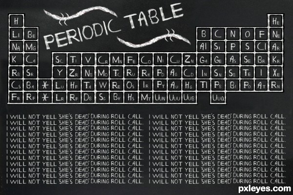
All built with source,
NO FONTS USED
(just wanted to see if I could do it) (5 years and 3586 days ago)
Good idea.. and very tedious work. Good luck and good humour 
Great job author...but u don't have all elements there...so your grade is B-...lol...I am just joking author,very cool work...best of luck
Great job ! 
So shout "now she's a zombie"... 
wow! brings back baaad memories of all the blood sweat and horror in the science class... very well done!
So cool , and so funny =)
very nice entry .............. brigs back the sweat memories ............. thanks author ............. all the best to u ..... 
I like this...and not to add to the tediousness of this, but it looks as though the sentences at the bottom were all copied and pasted from one original line. I think it would have been far better to hand draw each to really give it a look as if it was actually written with all the nuances of writing there.

good work
Congrats Slushy .............. 
Congrats for your third place, Ernest!
Congratulation Erny...well done
Congrats!
Congrats, Ernie! Now she's dead, turned into a zombie and will pull your leg tonight!... 
Congratulations!
congratulations!!! 
Congrats!
Howdie stranger!
If you want to rate this picture or participate in this contest, just:
LOGIN HERE or REGISTER FOR FREE
My Pictures and Source (5 years and 3587 days ago)
Very very nice work ...great job with the eyes author...Best of luck

good job.
nice work .........
Great work, awesome entry. GL
Howdie stranger!
If you want to rate this picture or participate in this contest, just:
LOGIN HERE or REGISTER FOR FREE
Very good entry! Good Luck
Very cool, looks like it took a lot of time to create = )
Ravishing!
AWESOME IMAGE!!
only one thing and not sure if i'm even right, but it is the yellow lines you have in the bg, they appear to be reflected onto the floor, which if this is the case then you would want to remove the part of the lines on top of the monster's reflection and make them appear behind the reflection as they do for the bg of the image... but hey i guess they could be a different set of yellow lines running along the floor...
I see what you mean bjaockx... I flipped the lines so there is no question that it IS a floor design (actually got the idea from a club I used to go to when I was a young'un) they had the neatest lines on the floor that would go up into the walls
Thanks for the help and the fav!
I knew it,,,,,,,,,,great work, very colorful!!gl
Jesus!... It's jelly creepy!!! That's incredible to imagine they come from cups of icy soda...
Very well done
This is so cool author...best of luck
fantastic creation .........
I like the texture you did, very nice work
great effect
Congrats for your first place, Ernest!
I love this creature!
Congrats, that's a creepy critter
Ernie, congratulations for the 1st. place! (They are still looking at me...)
congrats for the first winner,.......
Congrats
Look at you on the front page! Congrats on 1st place!
Howdie stranger!
If you want to rate this picture or participate in this contest, just:
LOGIN HERE or REGISTER FOR FREE