(5 years and 3753 days ago)
My Photos (5 years and 3765 days ago)
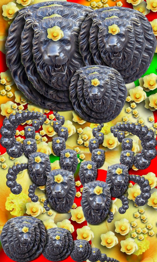
Don't see the Droste effect here...
look harder...it's in the entire piece... I just didn't want it predictible
Sorry, but I agree with CMYK. Even if it IS there, it's extremely hard to see. And I still don't see it.
I think it's stretching the theme, but i believe the droste effect is there.
http://1.bp.blogspot.com/_NpINLHeo8rM/RuaF7vjOUDI/AAAAAAAAGb0/xiwUX-R-RaA/s400/Droste+effect+%2819%29.jpg
http://3.bp.blogspot.com/_fEglkkU__oM/R5z2IZlHTDI/AAAAAAAABWA/VnjHy0yWgKc/s400/Droste.jpg
Even the original Droste took it's liberties (notice the differences in the miniature images and the added on effects)
http://blog.e-lek.nl/wp-content/uploads/2009/09/droste-big.jpg
Taking partial droste effects and then manipulating them into Mobius Strip feels was my goal...
And for those who know my work should understand that the first image I ever made that won a contest was a droste so I HAD to think out of the box... which is where all my work usually resides
I completely agree with you author.. great thinking 
i don't agree at all author... those examples you showed to prove your point actually hurt your point... they all have some type of symmetry to them, yours is more chaotic... part of the infinite nature of the effect is it's symmetry...
I see many strips of lion heads that go on infinitely, but that just isn't a very good representation of the droste to me, whether it's correct or not. Sorry, this is in my honest opinion.
Once again I used a droste Mobius combination (you can see I could have easily made it into typical droste as remenants are every where) but my goal was other than that.. the samples I showed are showing the PARTS of the droste effect I used to make the image. (It's quite obvious that I know what droste is as to convert this into typical droste would take a few minutes) granted its more recursive.. but that was my goal to scatter droste not make on whole picture of droste (as I clearly could have done) just my Idea (this is fun)
I used Droste ideas to create a Car-touche image with floating droste as method (if you cropped the picture down, you'd have droste all over the place)
I don't really see it either.... sorry.....
EDIT: still like ya though 
Not sure if this fits, not sure if i hate it or disgust it. 
Author, if you have to write such a lengthy explanation just to prove people that it's good, then is it really?
Lengthy???.. hehehe.. I once wrote a 20 page term paper on the relative styles of Blake vs. Matisse (spent three whole pages on hands alone.. LOL) and I wasn't trying to PROVE anything.. just explaining my point of view  .. and I never ever said it was good.. art just is (the good part is in the eye of the beholder)
Yes I suppose you are right. I suppose my eye is just not fit, then. XD
Nice work...gl
Howdie stranger!
If you want to rate this picture or participate in this contest, just:
LOGIN HERE or REGISTER FOR FREE
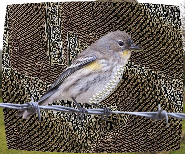
the kind of weird background was made with the roof of the building (5 years and 3765 days ago)
?
??
???
Well, I am sorry but I don´t see that pattern on the churchroof at all. You should crop the so the source is not visiable at all outside the wierd background - or loose the wierd background and maybe blur the church so that the bird comes to focus. (btw - what if you want the zipper on the bird you oughta change the perspective so it is more correct.)
I'm just gonna follow suit ..... ???
????
?? @&* ???
nothing to do with the source, poor masking.. strange title poorly blended zipper... ??????
Author, this is what I call CBR'd (Chopped Beyond Recognition) You mutilated the original source so much that it is no longer recognizable. It's common but most of us frown on it and usually score lower for using it like you did. IMHO (in my humble opinion) you really didn't use the source and your SBS is lacking.
Howdie stranger!
If you want to rate this picture or participate in this contest, just:
LOGIN HERE or REGISTER FOR FREE
Source with my Photos (5 years and 3777 days ago)
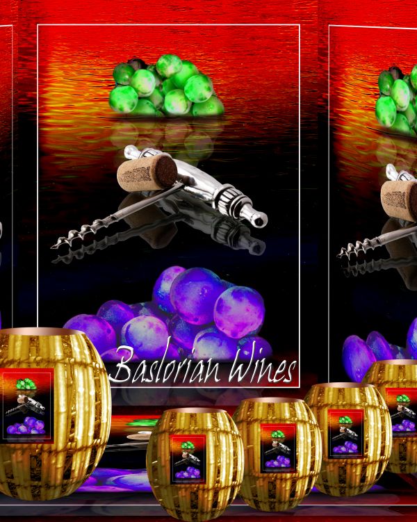
amazing XD
High res would be good...
The labels on the barrels need some curves... 
great colors...good luck author
The colors of this one are my favorite
Howdie stranger!
If you want to rate this picture or participate in this contest, just:
LOGIN HERE or REGISTER FOR FREE
source and my pic
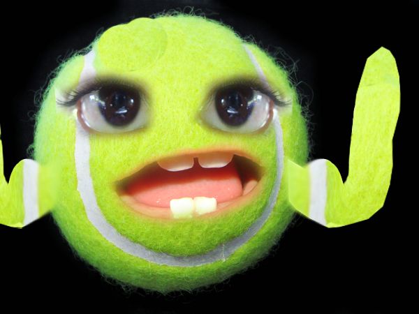
Named after the fuzzy creature in the Dark crystal and the Writer Character Investigator on NCIS
I wanted to name him Abby but he didn't look girly or goth enough.. hehe (5 years and 3788 days ago)
WOW!!!! i really like this 
:edit: WTF is his name 
this is really good
very cute work
Awesome!


very nice work.I like the charisma of the cute creature...great colors as always...good luck author


fantastic!!
Hahaha...cute lil guy...
This is probably what my cat would turn into after 5 hits of micro.  Nice work. GL!

 Great imagination!
Good work author !
Howdie stranger!
If you want to rate this picture or participate in this contest, just:
LOGIN HERE or REGISTER FOR FREE
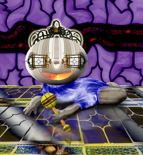
I would try to improve the arms.
this will be an awe entry if you work on the arms... reffer any hands and work on it.. Now i am holding my vote... and good luck to you
You can see the straight finish of the eye source. See if you can fade that out author.
Howdie stranger!
If you want to rate this picture or participate in this contest, just:
LOGIN HERE or REGISTER FOR FREE